The network for creativity
Join 1.25M professional creatives like you
Connect with clients, get discovered, and run your business 100% commission-free
Creatives on Contra have earned over $150M and we are just getting started
Back to feedPost
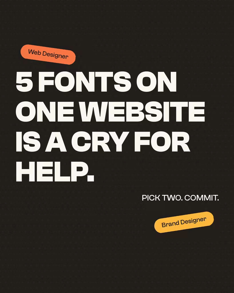
5 fonts on one website is a cry for help.
Every extra typeface is a new voice arguing in the same room. Pick two — one with character, one that shuts up and works — and commit.
Typography isn't decoration. It's the tone of voice your brand speaks in before a single word is read.

Pick two and commit is the right call. Which pairing do you reach for most on web projects?

My default: one grotesque that shuts up and works — Inter, or General Sans when I want a touch more warmth — for body and UI, paired with one display face that carries the brand's personality. Clash Display and Bricolage Grotesque get a lot of mileage. The rule I actually...
The network for creativity
Join 1.25M professional creatives like you
Connect with clients, get discovered, and run your business 100% commission-free
Creatives on Contra have earned over $150M and we are just getting started





Related posts




🔥 🔥

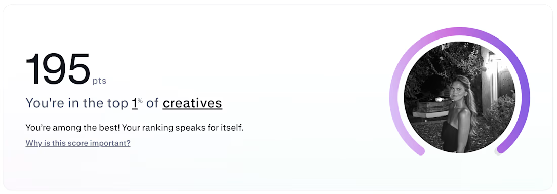
Top 1% of creatives on Contra with a 195 score 🎉 What I'm most excited about is who's showing up because of it: new clients, designers, new conversations, projects I wouldn't have found on my own. Grateful, and ready for more.


Huge congrats! 🎉 Top 1% is an incredible milestone.

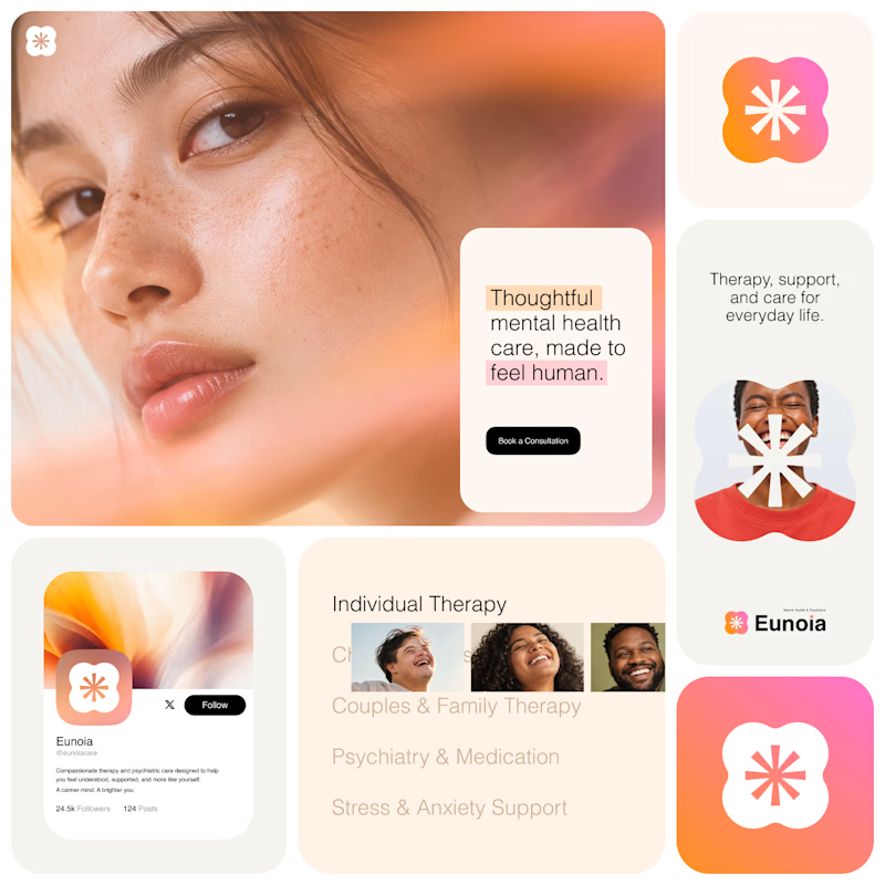
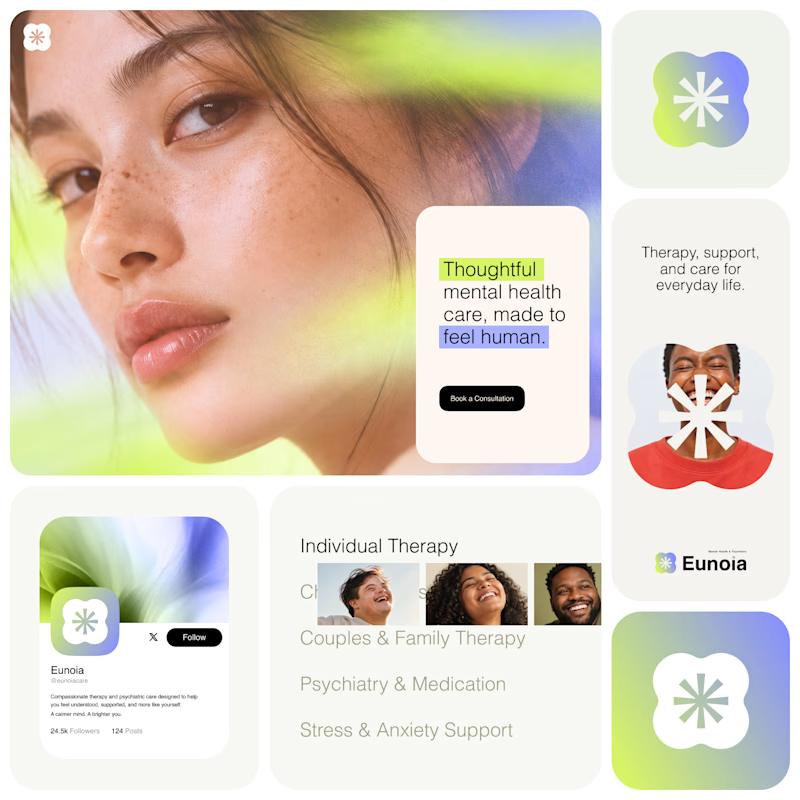
Exploring two visual directions for Eunoia, a mental health & psychiatry brand.
Direction 01 - Warm peach, orange and soft pink tones for a calm, human and comforting feel.
Direction 02 - Lime and periwinkle tones for a fresher, more optimistic and contemporary expression.
Same brand system. Different emotional energy.
32 voted
52%
29 voted
48%
61 votes
Closed

That's impactful, love to see fresh styles