The network for creativity
Join 1.25M professional creatives like you
Connect with clients, get discovered, and run your business 100% commission-free
Creatives on Contra have earned over $150M and we are just getting started
Back to feedPost

For years, Kindred Organizational Consulting did the hard work of helping organizations grow healthier from the inside.
Their clients trusted them.
Their results spoke for themselves. Their logo did not.
The mark they walked in with had been with them for a long time. It was simple, a little dated, and it no longer matched the level of work the team
was delivering. But it also carried something real.
People knew it.
It held the warmth and the human side of what Kindred stands for.
So we made a clear decision early on. We would not throw it away.
A full rebrand would have cost them the recognition they spent years building. Keeping it as it was would have kept holding them back.
The answer sat in between. We kept the essence of the original mark and rebuilt everything around it with a professional hand. Cleaner structure, better balance, sharper detail. Then we gave it a new colour palette that feels modern, confident and calm, the way a trusted advisor should feel.
The result is a brand that existing clients still recognise instantly, and new clients take seriously from the first look.
Kindred didn't need a new identity. They needed their identity to finally look as good as their work.
Full Case: https://www.behance.net/gallery/255835989/Kindred-Organizational-Consulting-Branding-Project
Site Visit: www.oovert.com



The network for creativity
Join 1.25M professional creatives like you
Connect with clients, get discovered, and run your business 100% commission-free
Creatives on Contra have earned over $150M and we are just getting started



Related posts

Branding Design for a AI Startup
The client wanted a solution to its boring and non-convertible logo and we came with with a solution by creating a branding that converts and speaks to its clients.

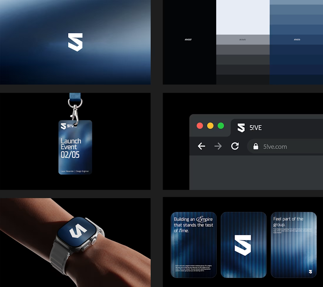

This color palette is nice🙌


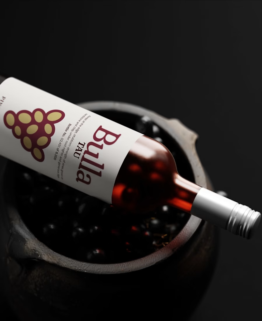

Amazing work

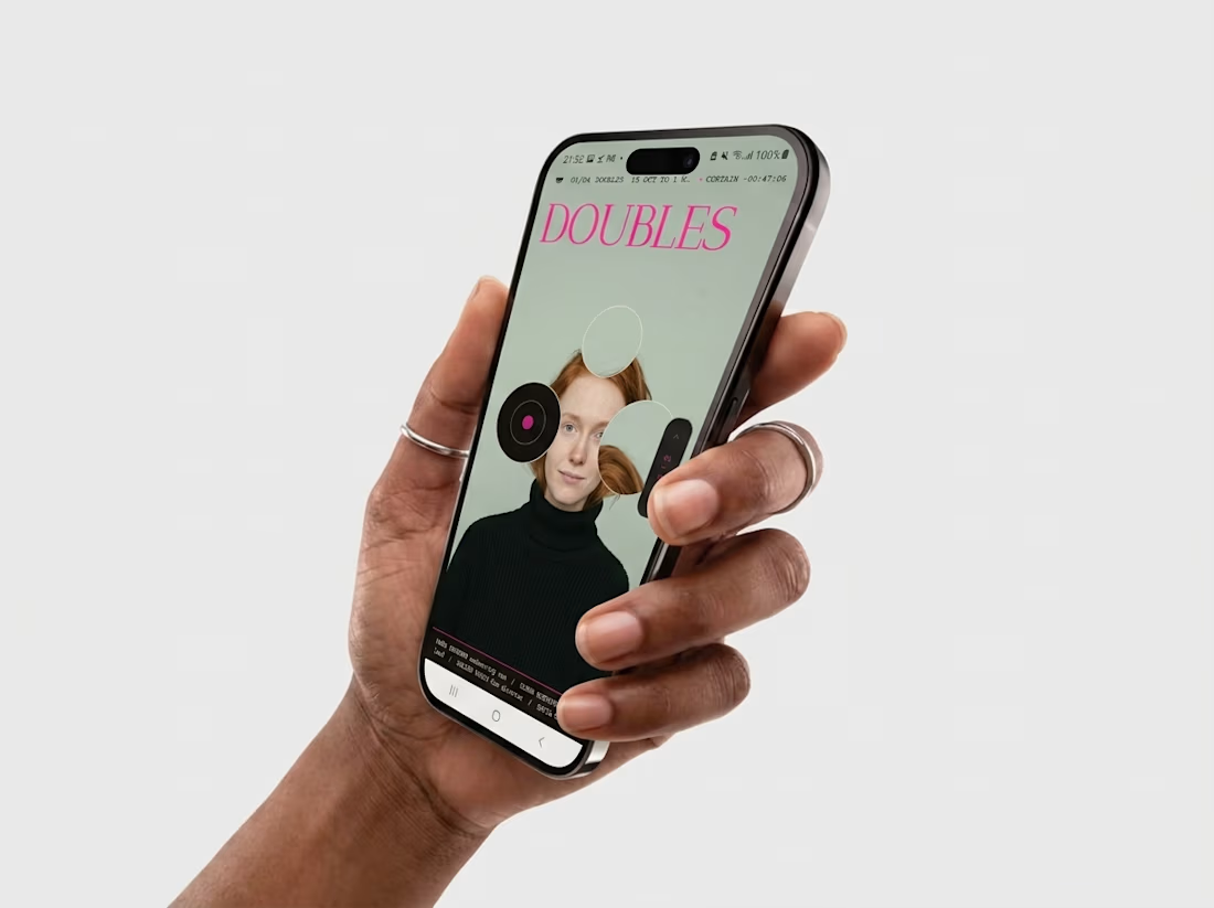
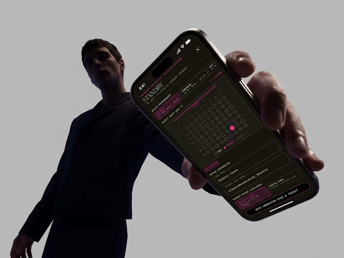
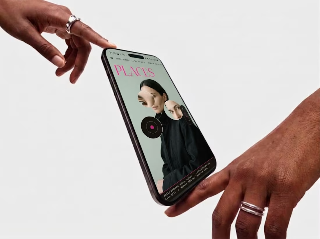
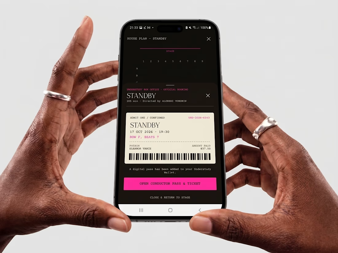
Friday app: Understudy
What if an app’s menu was a hole in a face?
UNDERSTUDY turns one circle into the interface: eyes open shows, voids open seat plans, and a typewriter clock counts down to curtain.