The network for creativity
Join 1.25M professional creatives like you
Connect with clients, get discovered, and run your business 100% commission-free
Creatives on Contra have earned over $150M and we are just getting started
Back to feedPost

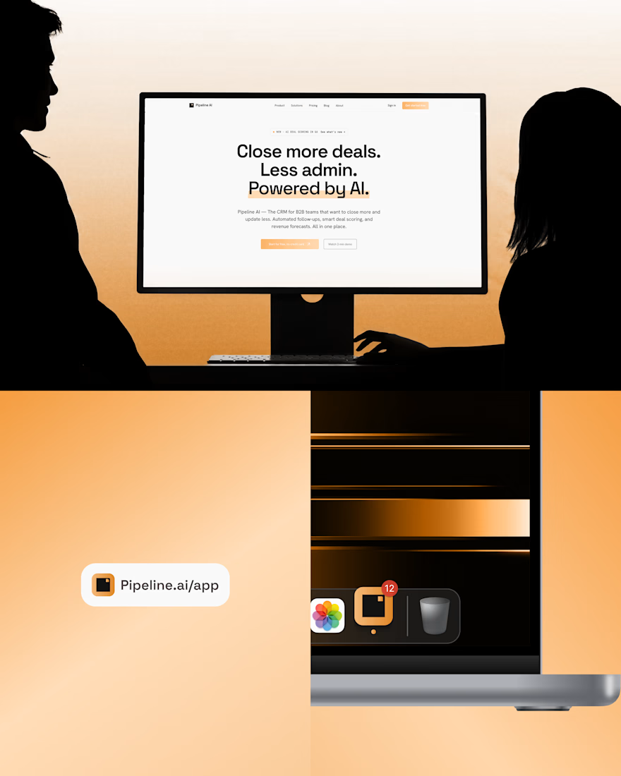
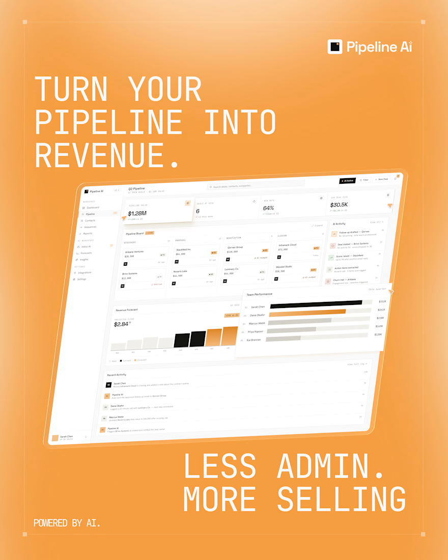
I designed a concept CRM landing page and deals dashboard that help B2B sales teams close more deals with less admin, using clear UI and AI-driven insights.
Why I took on this project
I wanted to explore how AI can actually help sales teams close more deals instead of just adding another buzzword to a cluttered CRM. Pipeline AI is a concept for B2B teams who feel stuck doing admin instead of selling, so I focused on two key touchpoints: the marketing landing page and the core deals dashboard.
The problem I tried to solve
From my experience looking at existing CRMs, most of them are great at tracking data but not at helping reps close deals. Opportunities quietly die in long tables, reps spend hours updating fields and chasing emails, and leaders have low visibility into what’s working and what’s at risk. I wanted the interface and the story to make these pains obvious and honest.
My goals for the design
I set three simple goals for myself:
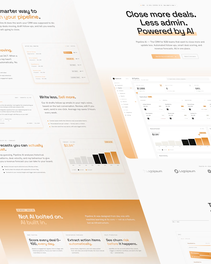
Craft a hero message that speaks directly to outcomes: “Close more deals. Less admin. Powered by AI.”
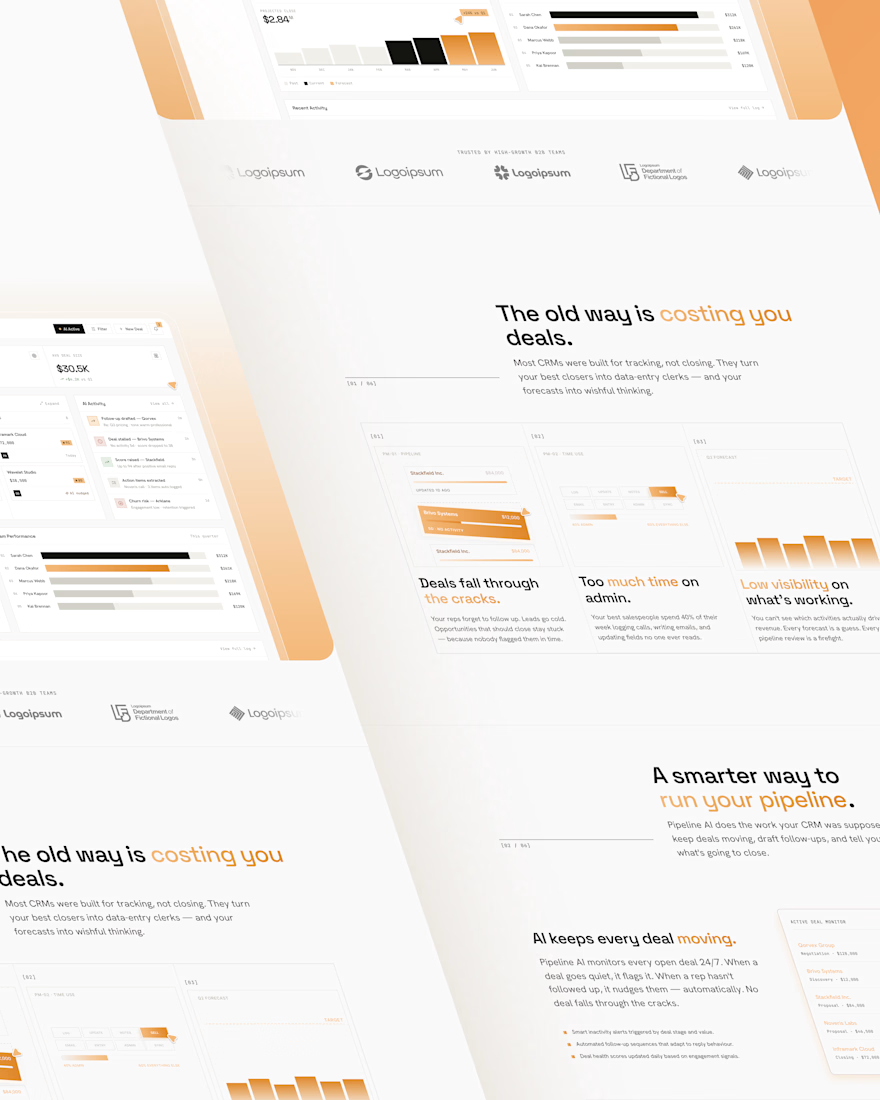
Use the landing page to contrast the “old way” of using CRMs with a smarter, AI‑driven workflow.
Design a dashboard that answers one core question: “Where should the team focus today?”
How I approached the landing page
I structured the page as a narrative. First, I call out the old way: deals falling through the cracks, too much time on admin, low visibility on what’s working. Then I introduce Pipeline AI as the smarter way to run the pipeline, with sections that explain how AI keeps every deal moving, drafts better follow‑ups, and surfaces forecasts you can actually trust. Clear CTAs guide visitors to see the product or start a trial.
How I approached the dashboard UI
For the dashboard, I focused heavily on hierarchy and calm visual design. Top‑level metrics, pipeline stages and risk indicators are visible at a glance so reps don’t have to dig for answers. AI suggestions highlight next actions and at‑risk deals without overwhelming the screen. Charts turn messy sales data into simple revenue projections that are easy to read, not just pretty.
Design decisions I made
I chose a minimal SaaS layout with plenty of white space and a warm orange accent to highlight key actions and AI areas. Typography is tuned for B2B: strong headings, readable tables and clear metric styles. Behind the scenes, I built a small design system of cards, tables, filters, tags and charts so the UI can scale across future views of the product.
What I learned from this concept
Working on Pipeline AI helped me practice narrative‑driven design for SaaS: starting from the sales team’s pain, telling a clear story on the landing page, and backing it up with a practical dashboard. It also reinforced my interest in data‑heavy products, where the job of UI is to make complex information feel honest, simple and actionable.
If you’re building a CRM or B2B SaaS product and need help with landing pages, dashboards or design systems, I’d be happy to collaborate through Contra.


The network for creativity
Join 1.25M professional creatives like you
Connect with clients, get discovered, and run your business 100% commission-free
Creatives on Contra have earned over $150M and we are just getting started
Trending
retrofuturism
Share your favorite designs from the past exploring the distant future. Or your own take on the aesthetic 🚀
halftone
Dots. Texture. Grain. Let's see your designs using the halftone technique.

Midjourney
Creatives are showing off what they're making with Midjourney.
colorgrade
Video editors sound off: How do you enhance the mood of your video in color grading?





Related posts

New Framer Template: Outline Studio 🔥
A minimal, editorial portfolio template for agencies, creatives & digital studios.
→ 7 pages
→ 30+ sections
→ Case Studies CMS
→ Light & dark themes
→ Modular component system
→ 3D logo component
🔗 Available now on the Framer Marketplace

Great template

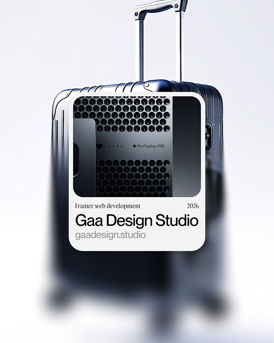
New client project → Framer development
For GAA Design Studio.
Earlier this year, I developed an MVP website for this studio, but this time we rebuilt it entirely for scalability, to optimize processes and client management inside the website.
I prepared this little video to showcase the project.
Hope you like it → Aspirational vibes only
Sound ON
FramerWeb DevelopmentaftereffectsFramer Website DevelopmentInteraction DesignAdobe After EffectsFigma



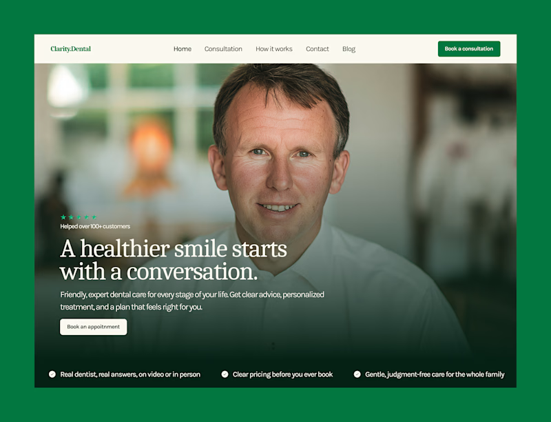
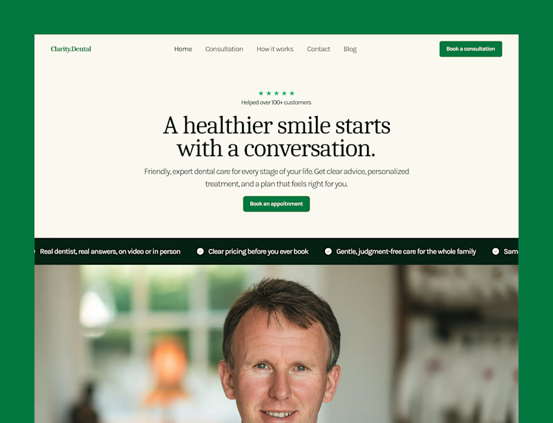
Some hero explorations for a dental clinic.
Which one are you picking?
26 voted
76%
8 voted
24%
34 votes
Closed

A seems fair but you can make it more better by just scaling the background picture a bit and I have seen your designs you can definitely find a way to make it more appealing.