The network for creativity
Join 1.25M professional creatives like you
Connect with clients, get discovered, and run your business 100% commission-free
Creatives on Contra have earned over $150M and we are just getting started
Back to feedPost

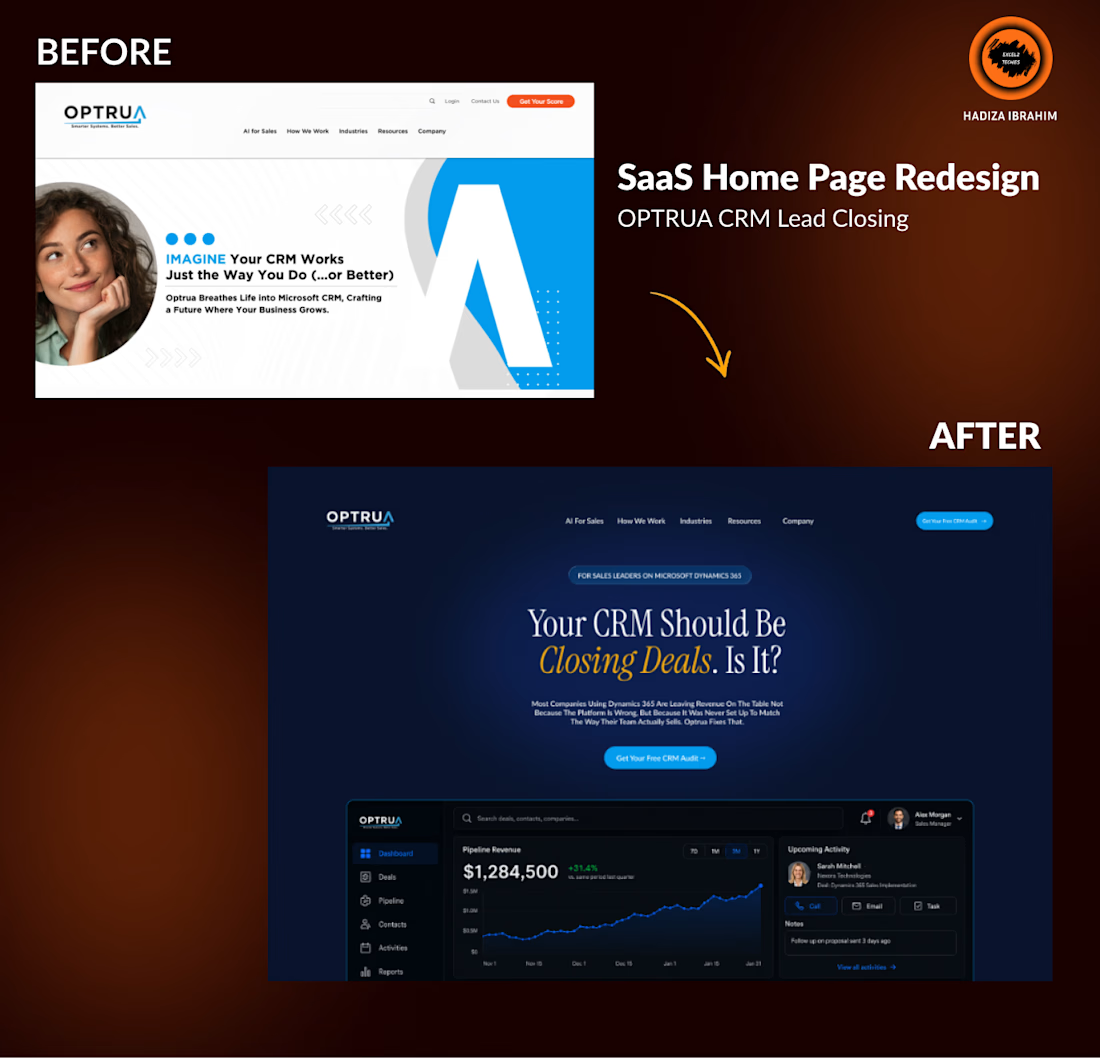
The original OPTRUA homepage had the right product but the wrong story.
A generic stock photo, a soft headline, and a layout that could've been anyone's SaaS.
It wasn't landing.
The Fix:
I stripped it back and rebuilt from the core insight: sales leaders don't want inspiration; they want confidence.
The new design leads with a bold, direct headline ("Your CRM Should Be Closing Deals. Is It?"), anchored by a live-looking product dashboard that proves the platform delivers.
What changed:
→ Dark, premium aesthetic that signals trust and sophistication
→ Headline rewritten to speak directly to Dynamics 365 users leaving revenue on the table
→ Product UI embedded in the hero, social proof before a single scroll
→ CTA repositioned from passive ("Get Your Score") to active ("Get Your Free CRM Audit →")
The result:
A homepage that doesn't just describe the product; it IS the product.


The network for creativity
Join 1.25M professional creatives like you
Connect with clients, get discovered, and run your business 100% commission-free
Creatives on Contra have earned over $150M and we are just getting started

Challenges
View all


Related posts

Thaw — AI Mental Wellness Platform Landing page
Designed the landing page and dashboard preview for Thaw — an AI platform that tracks anxiety, mood, and burnout, framing emotional buildup as frost that gradually melts through guided sessions.
Mental health apps tend to land in one of two places: too clinical to feel human, or too soft to feel like it takes anything seriously. So the whole design leans on one strong metaphor instead — a head encased in melting ice — and lets oversized typography wrap directly around it for real visual weight.
Below the hero, the dashboard preview does the harder work: mood stability, anxiety signals, sleep quality, and a specific AI-detected insight that makes the product feel genuinely perceptive rather than generic.
A warm dark palette with cool blue type keeps the tone serious without tipping into heavy.
Creative - Midjourney
Animation - Jitter


Most B2B tech brands try to look "disruptive." But when your business model is managed IT and technical operations for the world's largest enterprises, disruption is the last thing your clients want.
They want resilience. They want 24/7 global coverage. They want a team that can resolve 725,000+ tickets while maintaining a 99.9% uptime.
We redesigned Anovia’s digital presence to match that operational reality.
Anovia (formerly Innovatia Technical Services) supports organizations at a massive scale: LVMH, iFit, and Tempo rely on their 300+ certified specialists to handle the heavy lifting of infrastructure.
The design reflects that "extended team" philosophy. We used high-density grid systems, a deep enterprise palette, and a focus on transparency. It doesn't just describe their 98% customer satisfaction; it demonstrates the rigor that earns it.


The 2097 numerals against that olive green backdrop give the posters a strange, almost architectural feel. Are you designing toward a full set for the interior company, or is this poster series more of an exploratory direction you're pitching them?