The network for creativity
Join 1.25M professional creatives like you
Connect with clients, get discovered, and run your business 100% commission-free
Creatives on Contra have earned over $150M and we are just getting started
Back to feedPost

I built DearSkin — a client management platform for an independent skincare consultant who was running her entire business through Instagram DMs, email, and scattered notes.
The network for creativity
Join 1.25M professional creatives like you
Connect with clients, get discovered, and run your business 100% commission-free
Creatives on Contra have earned over $150M and we are just getting started
Related posts

What if your favorite skincare brand got a Halloween makeover? 🕷️
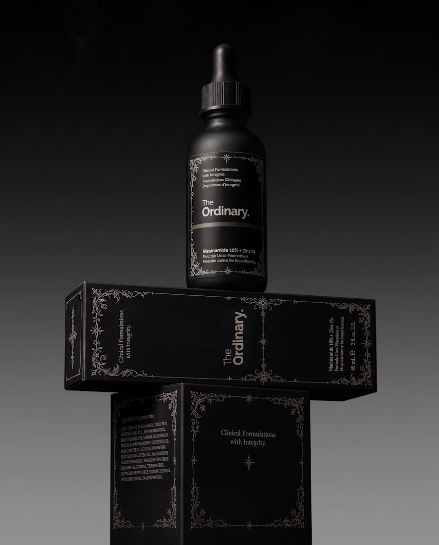
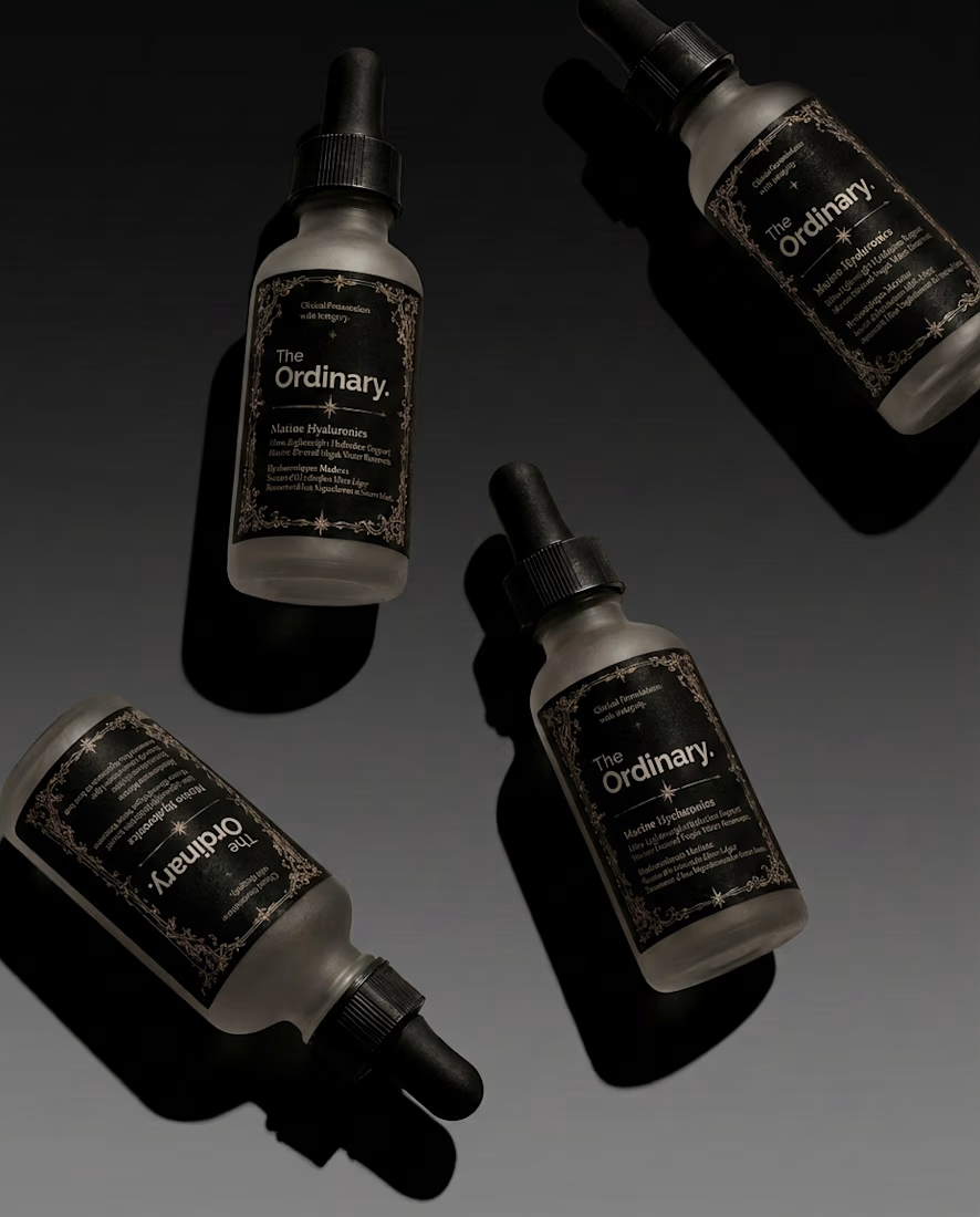
For this little experiment, I’m giving The Ordinary a 𝔤𝔬𝔱𝔥 alter ego.
The challenge was keeping the things that make the brand instantly recognizable: its straightforward logo and typographic editorial layout, clinical packaging, and no-nonsense aesthetic.
Instead of turning it into a completely different brand, I wanted to push those same elements into darker territory with 𝔢𝔢𝔯𝔦𝔢 tones🕸️ , gothic details, and a more mysterious product presentation.
Even in costume, you should know exactly who you're looking at.
Which brand would you love to see get a Halloween makeover next? 👻

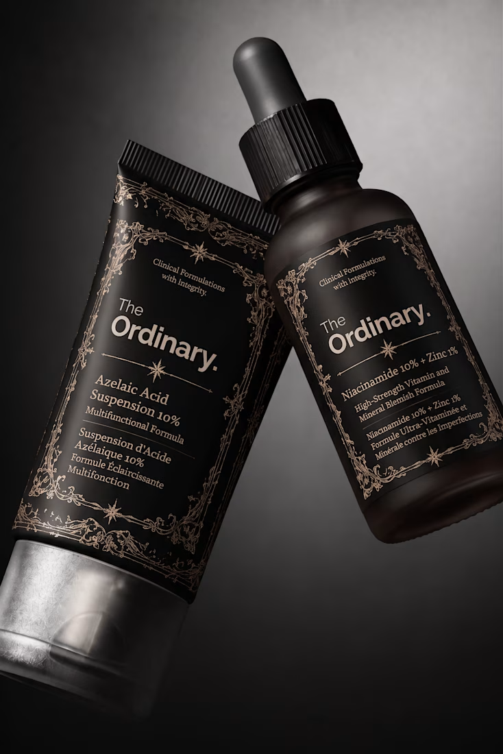

This is genius Anita! 🕷️ Giving The Ordinary a goth alter ego but keeping it instantly recognizable - that's the real challenge and you nailed it! The black bottles with that vintage gothic border still feel so The Ordinary. Love how you kept the typographic editorial but made it spooky. The Ordinary but make it Halloween! 🖤

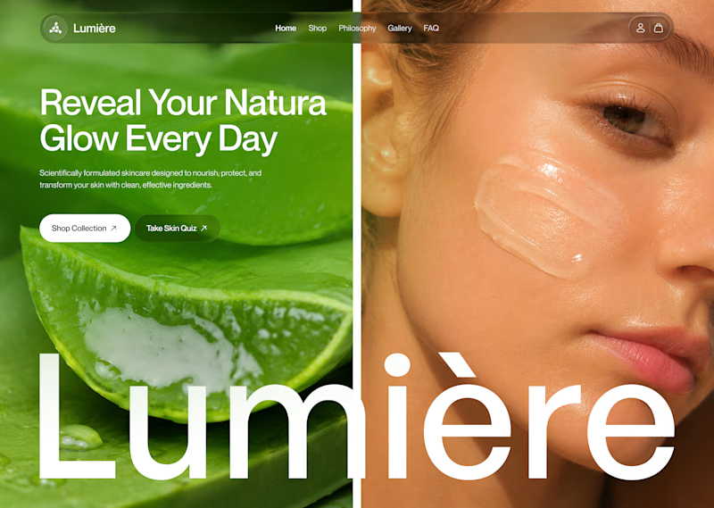
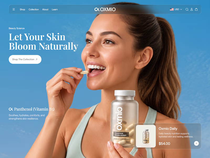
Your design has 3 seconds to earn attention. Which skincare brand wins?
A leads with confidence, energy, and aspiration. B builds trust through nature, freshness, and simplicity.
Great design doesn’t just look good. It makes people feel the brand before they read a word.
A or B? Which would make you stop scrolling?


30 voted
52%
28 voted
48%
58 votes
Closed


B without questions

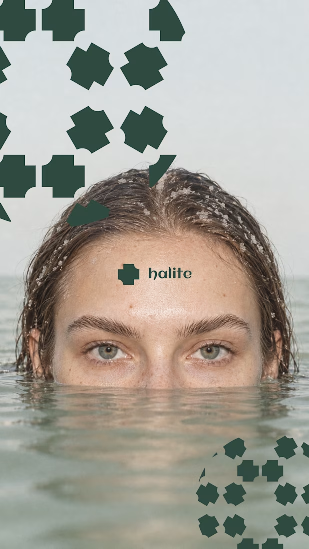
Nothing rots in salt.
So I put a skincare brand in a salt flat and let it crystallize. Name, mark, palette, campaign, packaging. One idea, zero moodboards.
HALITE. Case study live soon.
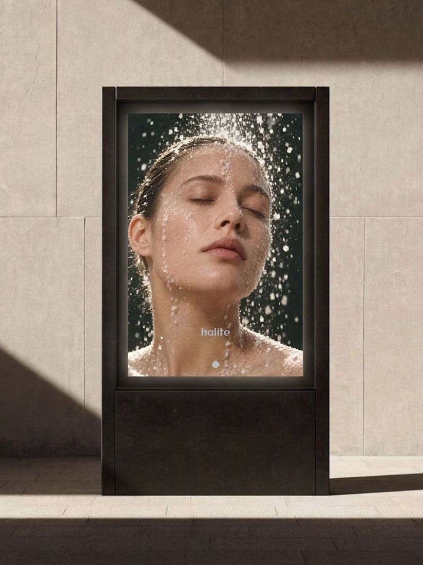
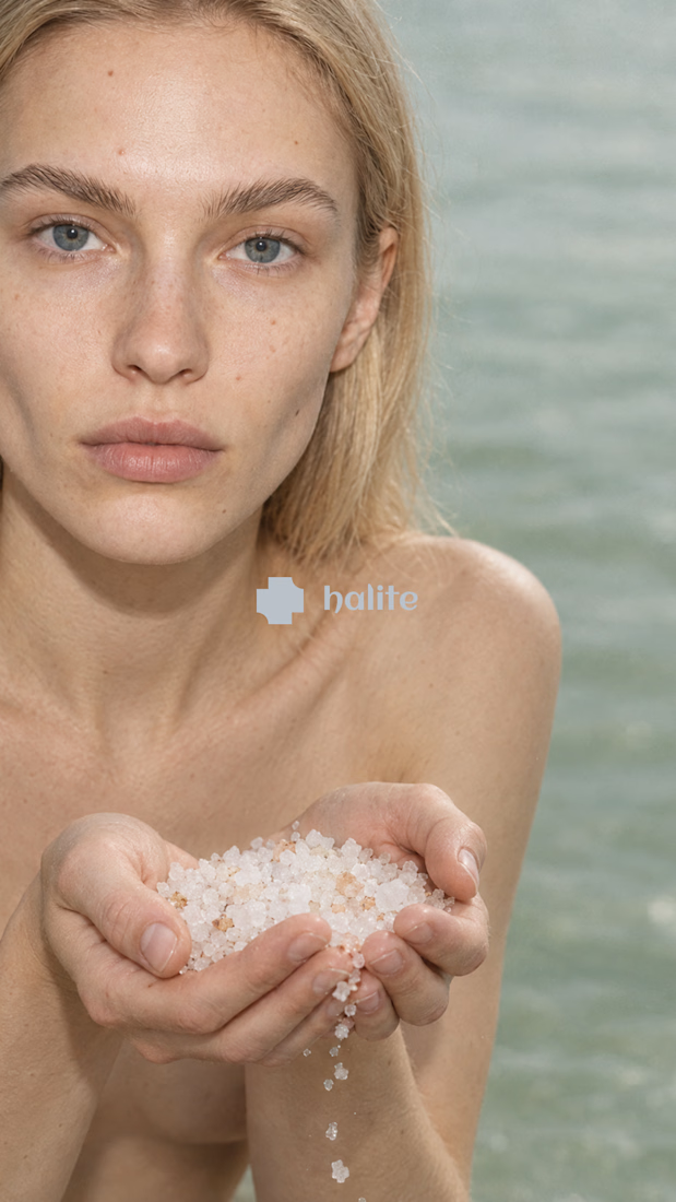
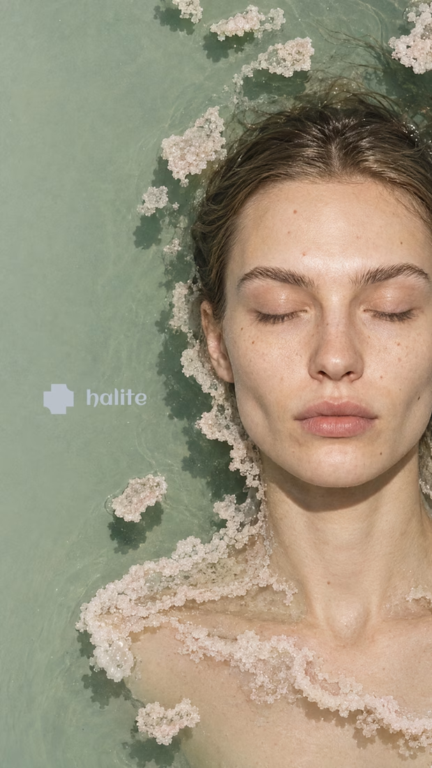

Salt as the core idea is clever. It says preservation, purity and texture in one move, which is exactly what skincare is trying to say. Curious how the crystal motif holds up at small sizes, like a cap or a sachet. Looking forward to the full case.