The network for creativity
Join 1.25M professional creatives like you
Connect with clients, get discovered, and run your business 100% commission-free
Creatives on Contra have earned over $150M and we are just getting started
Back to feedPost
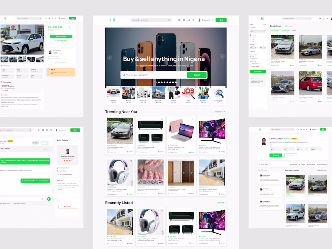
I just completed a full UX/UI redesign of Jiji.ng, Nigeria's largest online marketplace.
Jiji serves millions of users, but the web app experience has significant usability gaps. I took on the challenge of redesigning 5 core screens to address real problems users face every day.
Here's what I found and how I solved it:
Problem 1: The homepage had no visual hierarchy. Ads, banners, and listings were all competing for attention with no clear structure.
Solution: Introduced labeled content sections ("Trending Near You", "Recently Listed", "Recommended For You") with a clean 4-column product grid.
Problem 2: Search results had no filtering. Users scrolled endlessly through irrelevant results.
Solution: Added a structured sidebar with Location, Price Range, Condition, and Seller Type filters, plus breadcrumb navigation and a results count.
Problem 3: No seller trust signals. The #1 complaint in Jiji's app store reviews is scam concerns.
Solution: Designed a trust-first product page with verified seller badges, star ratings, response time indicators, store hours, and safety tips.
Problem 4: Seller profiles lacked credibility. Just a name and listing count.
Solution: Built a comprehensive profile with verification status (Phone, ID, Address, Business), customer reviews, and seller statistics.
Problem 5: The chat was basic with no context. Users couldn't tell which product a conversation was about.
Solution: Created a split-panel messaging experience with the product embedded in the chat header, quick-reply chips, and a seller details sidebar.
Every decision was informed by actual user feedback from Google Play and App Store reviews.
Tools: Figma
Screens: Homepage, Search Results, Product Detail, Seller Profile, Messages
I'd love to hear your thoughts. What would you have done differently?
The network for creativity
Join 1.25M professional creatives like you
Connect with clients, get discovered, and run your business 100% commission-free
Creatives on Contra have earned over $150M and we are just getting started
Related posts
Every new Figma file starts the same way.
Variables. Page structure. Base frames. Annotation components. Cover slide.
Twenty minutes of setup before a single design decision gets made. If you're a product designer, you'll know exactly what I mean.
𝗦𝗼 𝗜 𝗯𝘂𝗶𝗹𝘁 𝗮 𝗽𝗹𝘂𝗴𝗶𝗻. Meet Starter, one click, and your entire foundation is ready.
→ Core variables: Typography, grids, spacing, and colours
→ Page structure: A clean, organised file hierarchy
→ Base frames: Pre-configured frames hooked up to your grids
→ Helper components: Sticky notes and status labels for quicker documentation
→ Base cover: A customisable project thumbnail
https://www.figma.com/community/plugin/1616860142658349536/starter?q_id=1e2ab7fb-d8fc-40f5-a2db-72164930f2df
Brilliant work! I'm testing it now!
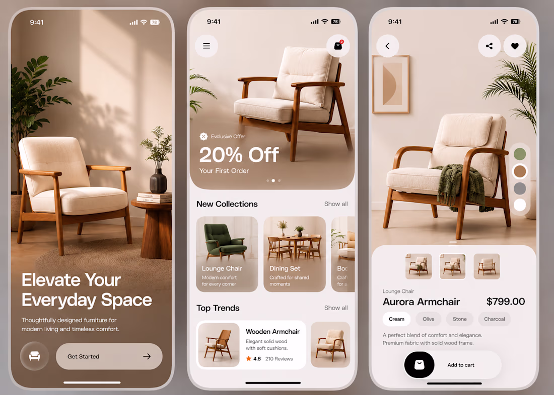
Working on a minimal furniture shopping app today.
A few things I focused on:
- Creating a clean and premium visual experience.
- Letting the product be the hero instead of the UI.
- Using soft, neutral colours to create a warm feel.
- Keeping the layouts simple and easy to scan.
- Designing a smooth flow from onboarding to product details.
- Paying attention to spacing, typography, and small details.
I believe good design isn't about adding more.
It's about making every element feel intentional.
I'd love to hear your thoughts.
Feedback is always appreciated.
Great hierarchal structure 👌✨️
Amazing.
Challenges
View allTrending
Claude
Claude has entered the design space. How are you using Claude Design?
Contra University
Learn from expert creatives how to earn more using next-gen AI tools.
fifaworldcup2026
The World Cup is here and the whole world's watching. How are you designing for the world stage?
creativeaiflow
Creative AI workflows are evolving. What tools do you use, and what are their strengths and weaknesses?
freelancerlife
Freelancer life is wins, pivots, and everything in between. What’s yours right now?