The network for creativity
Join 1.25M professional creatives like you
Connect with clients, get discovered, and run your business 100% commission-free
Creatives on Contra have earned over $150M and we are just getting started
Back to feedPost

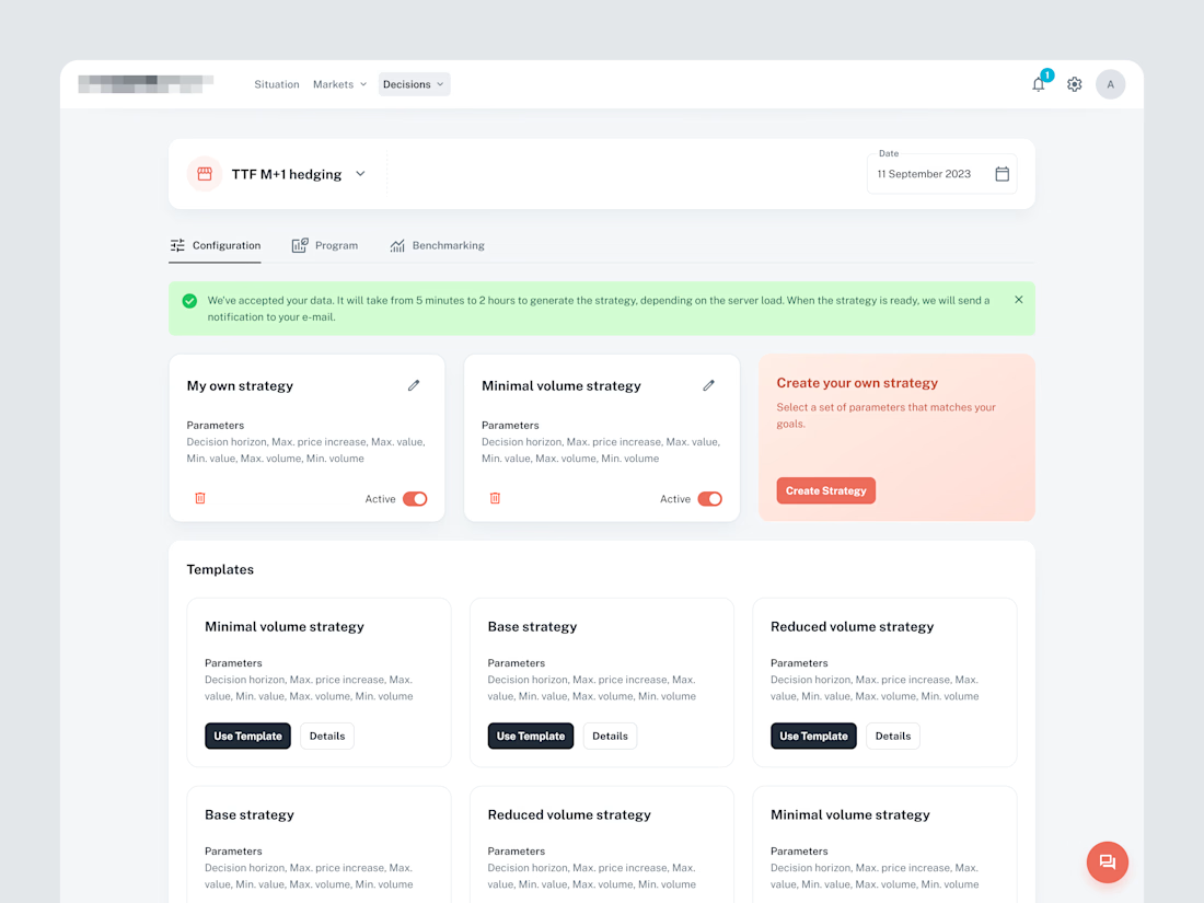
SaaS UX Audit & Design System Transformation for Energy Procurem



The network for creativity
Join 1.25M professional creatives like you
Connect with clients, get discovered, and run your business 100% commission-free
Creatives on Contra have earned over $150M and we are just getting started

Challenges
View all


Related posts

When your landing Page is so goated that you no longer need a launch video.


Thats what a landing page do for you hahahaah


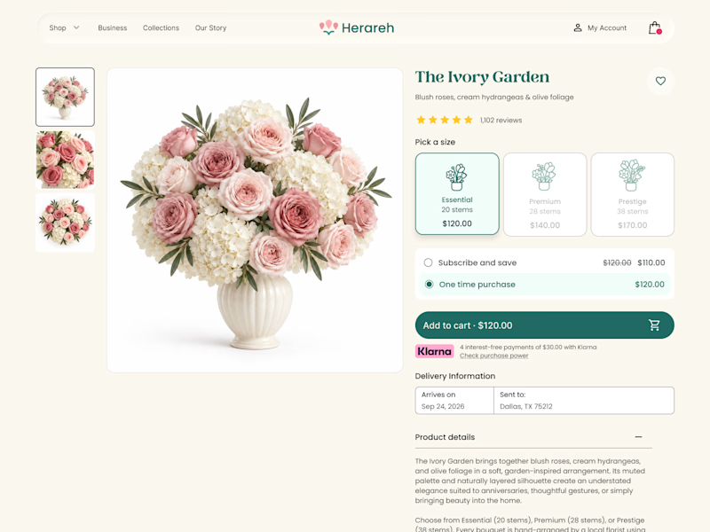
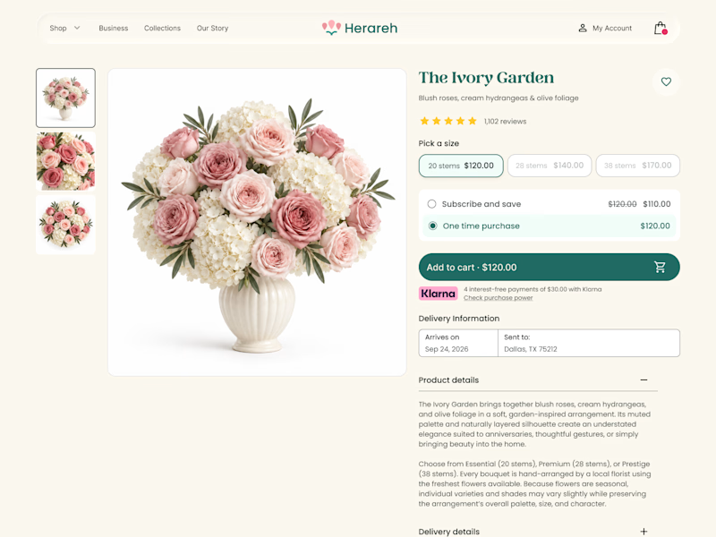

Icon cards for me, bouquets are such a visual purchase that a scannable icon beats reading "small/medium/large" every time. Did the compact chips version convert worse in testing, or are you still gathering data on that?


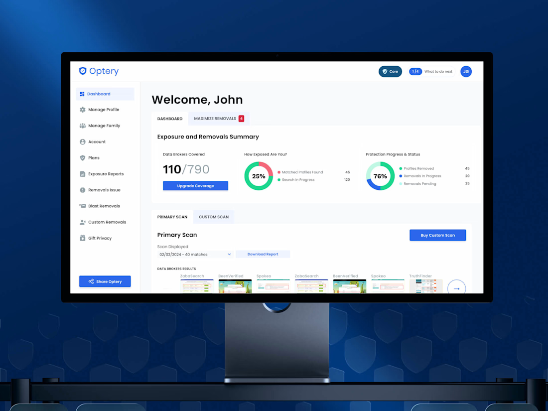
Nobody churns because a dashboard is ugly, they churn because they can't tell whether anything is happening.
Optery was quietly pulling users' data off hundreds of broker sites and almost none of that work was visible to the person paying for it, so the biggest win in this redesign wasn't a new screen; it was making invisible work visible. Free-to-paid hit 30%
Check it out
Making the invisible work visible is such a sharp way to frame it, that 30% lift proves people will pay once they can actually see the value happening in the background. How did you decide which data points were worth surfacing without overwhelming someone who just wants reassurance?