The network for creativity
Join 1.25M professional creatives like you
Connect with clients, get discovered, and run your business 100% commission-free
Creatives on Contra have earned over $150M and we are just getting started
Back to feedPost

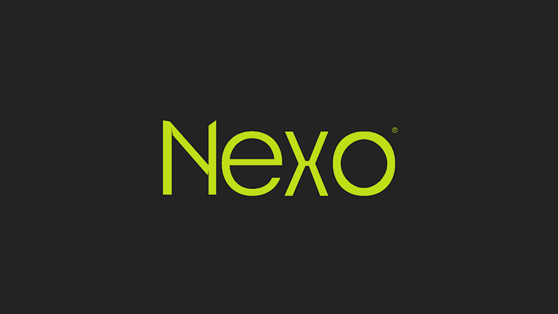
The Nexo visual identity was developed to convey innovation, modernity, and trust — essential pillars for an accounting platform aiming to position itself in a more technological and contemporary way within the market.
The logo is built from a fully customized hand-crafted typography, bringing exclusivity and personality to the brand. The more squared and structured shapes were intentionally designed to reinforce a sense of seriousness, stability, and professionalism — important characteristics within the financial and accounting industry.
At the same time, the clean structure, proportions, and minimal approach of the typography create a balance between corporate and modern aesthetics, allowing the brand to feel innovative and contemporary without losing credibility.
The vibrant green combined with the dark background strengthens this technological positioning, creating strong contrast, visibility, and a bold visual identity that feels memorable and current.


The network for creativity
Join 1.25M professional creatives like you
Connect with clients, get discovered, and run your business 100% commission-free
Creatives on Contra have earned over $150M and we are just getting started
Related posts



Cool branding


A little throwback to one of our favorite collaborations with Lion Pose! 🧡
We worked with the founders to bring their vision to life through core brand identity, logo, and packaging design, creating a bold, playful visual language that feels fresh in the skincare space.
So lovely to see Lion Pose grow from its early days to the shelves of Sephora, with our packaging work recognized at the 2024 Dieline Awards!


Nice work


Celvana brand identity & packaging for a red light therapy brand launching in the US.
The category is crowded with identical, unbranded panels. Celvana sells precision, so the brand had to look like medical equipment you can trust: clinical, exact and professional.
Brand identity case study
Packaging case study
This is high end branding


