The network for creativity
Join 1.25M professional creatives like you
Connect with clients, get discovered, and run your business 100% commission-free
Creatives on Contra have earned over $150M and we are just getting started
Back to feedPost

The brief said "make it pretty." I said let's talk about why pretty isn't working.
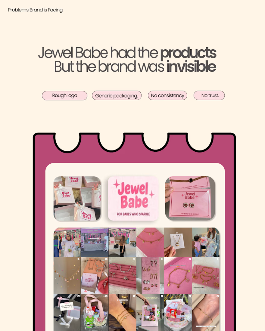
Most jewelry brands in Pakistan look the same. Pink. Sparkly. Generic tagline. A logo that could belong to any of them. Jewel Babe was no different until we decided it should be. Before I designed anything, I asked one question: who is she, exactly?
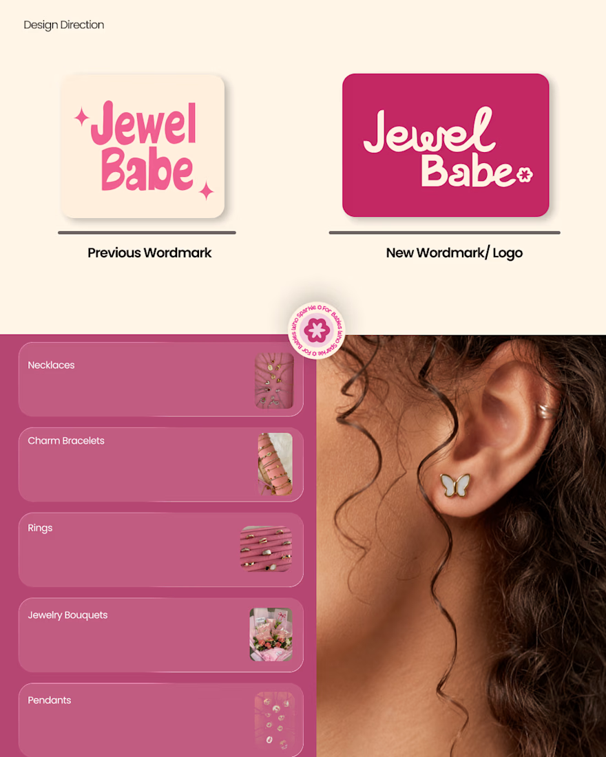
She's 18 to 30. Jewelry isn't luxury to her it's the finishing touch. The thing that makes an ordinary outfit feel intentional. She wants to look effortless. She wants to feel like herself, just elevated. That's not a customer profile. That's a creative brief. Two pinks. Not one. Hot pink for confidence. Blush for softness. The same girl contains both. The brand should too.
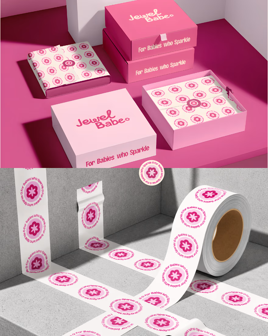
For Babies who Sparkle not because it's cute. Because it hands her an identity. She's not buying a bracelet. She's buying the version of herself that sparkles without trying.
That's what creative direction actually is. Not choosing colors. Choosing what the brand believes about the person buying it.
Pretty is a result. Positioning is the decision that makes pretty mean something.
Enjoy full casestudy here ..
The network for creativity
Join 1.25M professional creatives like you
Connect with clients, get discovered, and run your business 100% commission-free
Creatives on Contra have earned over $150M and we are just getting started







Related posts

One brand, very different variety products. 👀
BASYX is one of my favorite projects because the packaging had to work across categories, from skincare to food, while still feeling like one cohesive brand.
That’s the fun challenge of multi-product brands: creating a visual system flexible enough to grow without losing its identity.

wow amazing

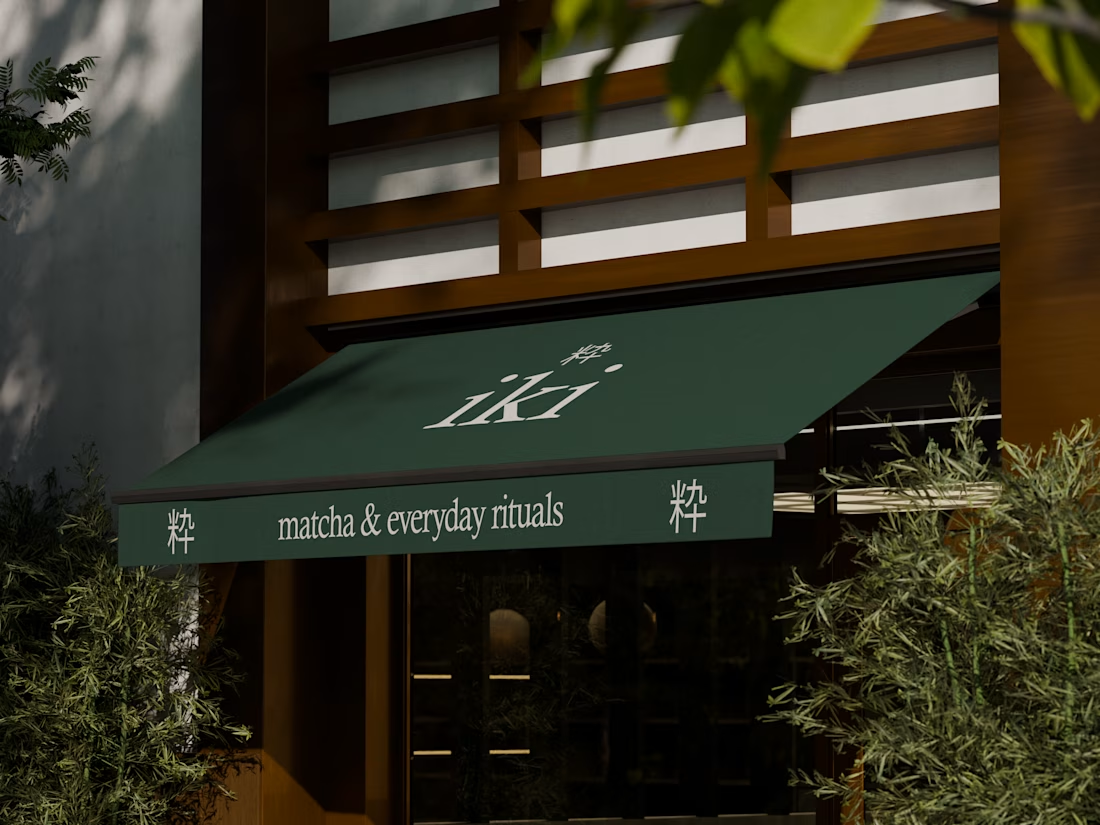
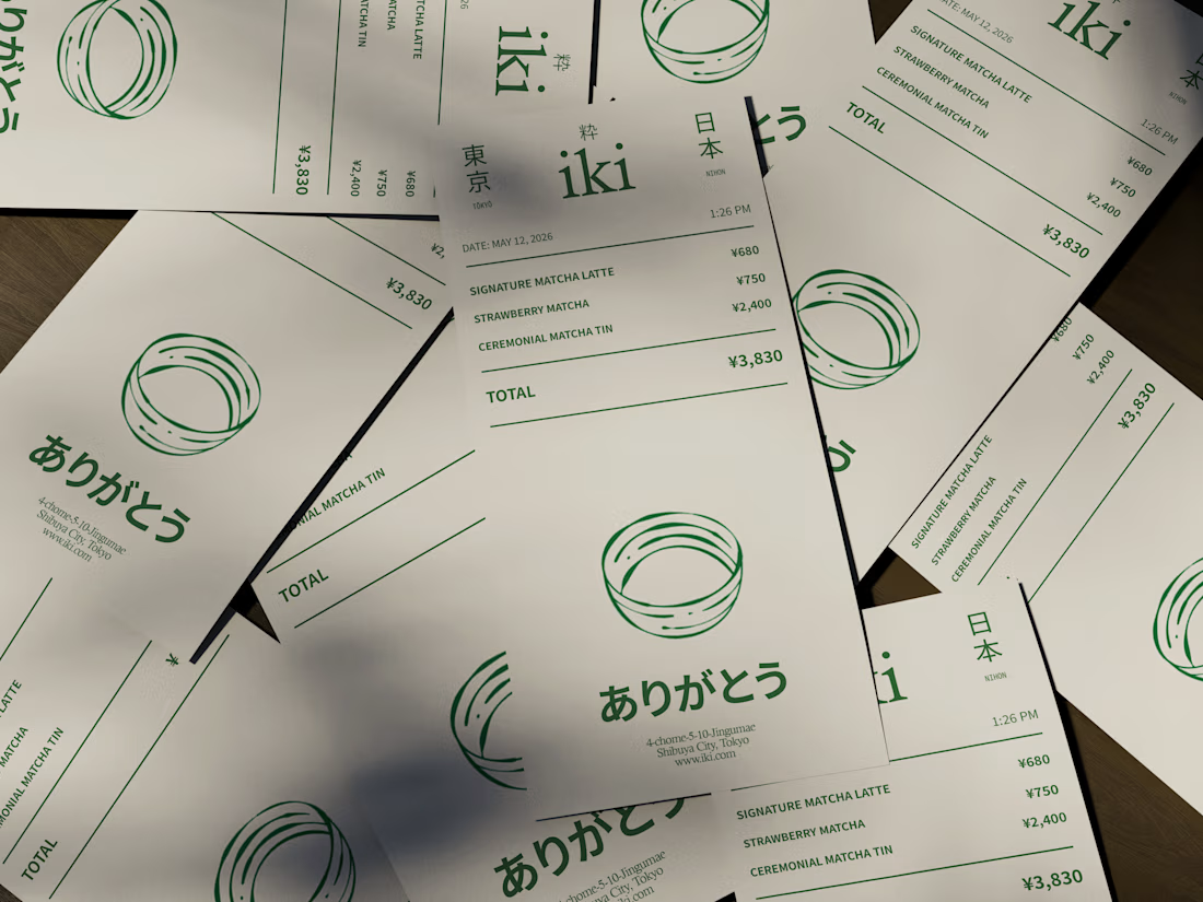
some visuals from iki, a matcha shop i’m currently working on 🍵
one of the most interesting parts of this project has been figuring out how to turn an abstract concept into something people can actually see and feel.
from the typography to the illustrations and overall visual language, every element is an opportunity to give the brand more personality and make it feel like its own world.
still exploring, but i’m really enjoying where this is going.
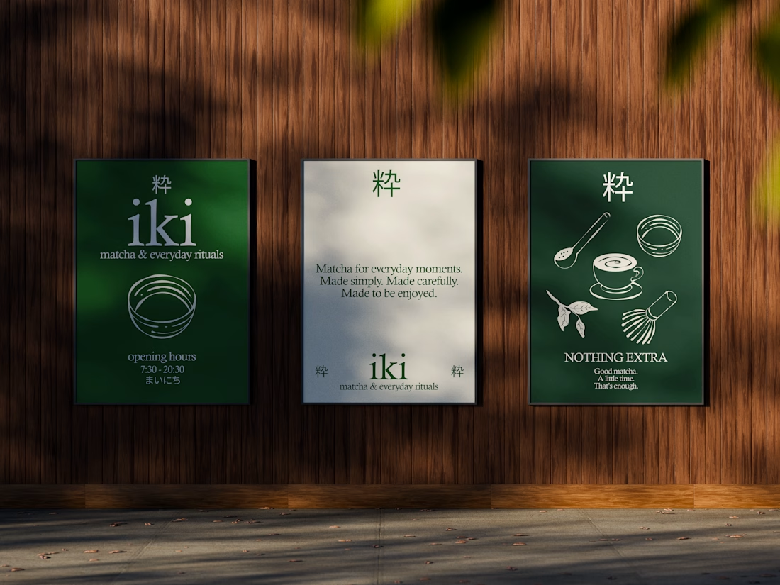
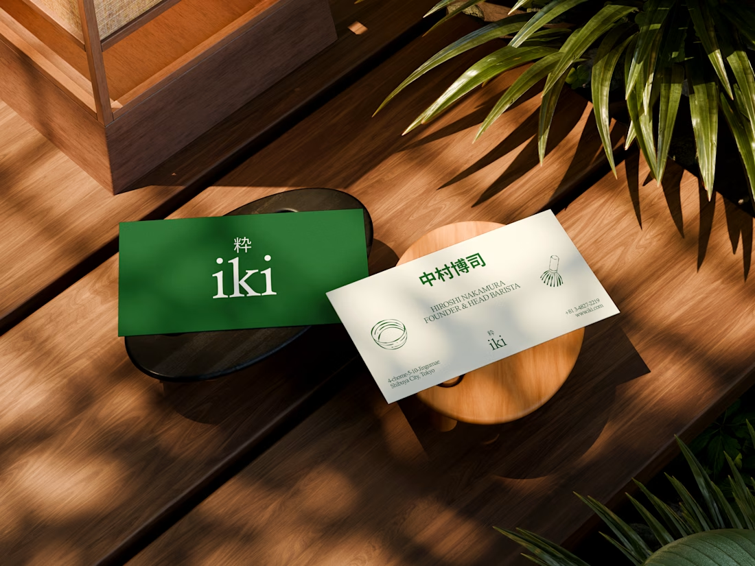


the illustration direction feels like it could take over the whole shop interior, not just the cups. thats usually where these projects fall apart


GoTeacher found our Sunbeam template and asked us to make it theirs.
GoTeacher is backed by Harvard Innovation Labs and helps 100+ K-12 school districts see every app they pay for and whether it's safe for student data.
We kept Sunbeam's structure and animations and built the rest: GoBot the 3D mascot, shader clouds, real product dashboards and five product pages. Live in one week.
Full case study on my profile. Want one of our templates turned into your own site? Message me.


The work is interesting


