The network for creativity
Join 1.25M professional creatives like you
Connect with clients, get discovered, and run your business 100% commission-free
Creatives on Contra have earned over $150M and we are just getting started
Back to feedPost

The most expensive warehouse problem usually isn't inventory.
It's repetitive work.
Recently, I analyzed a warehouse process where the team was manually creating SAP transactions every day. The process itself wasn't difficult—it was just repeated hundreds of times.
By building an Excel VBA automation integrated with SAP, I was able to:
✅ Reduce processing time by around 80%
✅ Cut manual effort by 70%
✅ Eliminate repetitive data entry
✅ Allow the team to focus on operational decisions instead of administrative work
The best part?
It required zero additional software investment. We improved the existing process instead of replacing it.
Many companies believe they need a new WMS or another expensive platform.
In reality, the biggest opportunities often come from improving the systems they already have.
I specialize in helping manufacturing and warehouse teams streamline operations through:
• SAP process optimization
• Excel VBA automation
• Warehouse SOP development
• Inventory management improvements
• Custom operational dashboards
• Power Apps solutions
If your warehouse team spends hours every week on repetitive tasks, there is probably a faster way.
Let's optimize the process before investing in new software.


The network for creativity
Join 1.25M professional creatives like you
Connect with clients, get discovered, and run your business 100% commission-free
Creatives on Contra have earned over $150M and we are just getting started







Related posts

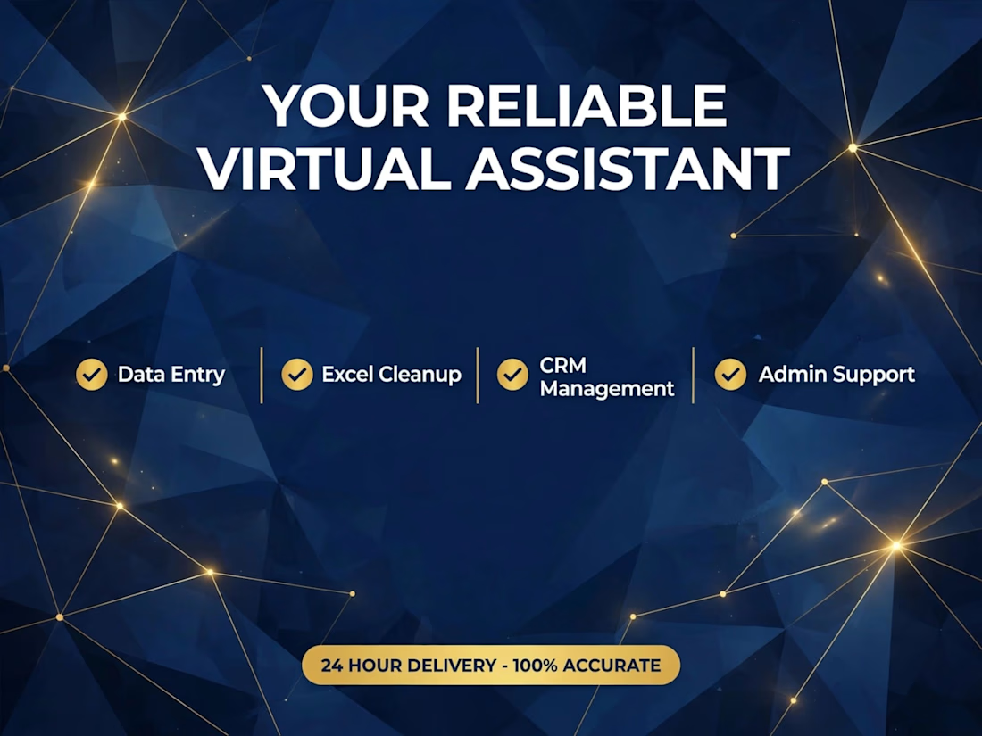
Are you overwhelmed with data entry, Excel, CRM and admin tasks?
I will help you get organized and save 15+ hours every week.
Trusted by CEOs, founders, small business owners, coaches and busy professionals who need a reliable extra hand.
What I handle:
Data Entry
Excel Cleanup
CRM Management
Admin Support
24 hour delivery — 100% accurate, confidential and on-time.



One business problem. Three analytical routes. One data-driven story. ☕📊
I turned raw business data into actionable decisions—not just another Power BI dashboard.
For the Onyx Data October 2026 Challenge, I worked on the Sunrise Coffee Chain analytics project, analyzing store performance, profitability, customer loyalty, revenue mix, and trading patterns across 60 UK stores (2023–2024).
🔹 My Analytical Approach
1️⃣ Python — Data Preparation
Cleaned and prepared the source datasets to establish a reliable foundation for analysis.
2️⃣ SQL — Business Analysis
Investigated store-level profitability, cost pressure, customer loyalty, revenue contribution, and trading patterns.
3️⃣ Power BI — Interactive Dashboards
Built a 3-page interactive report featuring advanced DAX measures, KPI cards, YoY comparisons, profitability analysis, and business-focused visualizations.
📊 Key Findings
• £89.7M Revenue | £16.9M Net Profit
The business recorded an aggregate net profit margin of 18.8% across the analysis period.
• Store Location Matters
Transport-Hub stores achieved a 25.1% aggregate net profit margin, compared with 18.6% for High-Street stores.
• An Area Requiring Attention
South London Corner recorded a £50.5K net loss over 24 months.
• Product Revenue Contribution
Espresso contributed 45.7% of daily revenue, while food contributed 26.1%.
• Trading Patterns
Average daily revenue was approximately 24% lower on weekends and 33% lower on UK bank holidays than on regular trading days.
💡 My Biggest Takeaway
Revenue alone does not tell the whole story. Understanding profitability, cost pressure, product contribution, and trading patterns helps businesses identify where to improve performance and make better decisions.
🔗 Explore the Complete Project
GitHub: https://github.com/SajeebTheAnalyst/sunrise-coffee-chain-analytics
If you were advising the management team, which finding would you investigate first—and why?
#DataAnalytics #SQL #PowerBI #Python #DAX #BusinessIntelligence #DataVisualization #OnyxData


I would investigate South London Corner first. Break the 24-month loss into store-month revenue, direct costs and allocated costs, then compare it with similar stores over matched trading periods. Reconcile at store-month grain before joining product or loyalty tables so a...

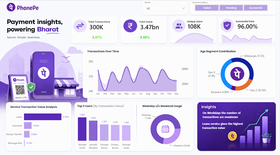
PhonePe Transaction Analysis Dashboard | Power BI
Developed an interactive Power BI dashboard to analyze PhonePe transaction data and present key business insights through data visualization. The dashboard highlights important performance indicators, transaction success rates, and transaction trends to support data-driven decision-making.
Tools Used: Power BI, Data Visualization, Data Analysis
Key Highlights:
Visualized transaction performance using interactive charts and KPIs.
Analyzed transaction success rates to understand payment performance.
Designed a clean, interactive dashboard for easy interpretation of data.
Used slicers to support dynamic filtering and exploration.
Project Objective: Transform transaction data into clear, actionable insights through an interactive dashboard.😍