The network for creativity
Join 1.25M professional creatives like you
Connect with clients, get discovered, and run your business 100% commission-free
Creatives on Contra have earned over $150M and we are just getting started
Back to feedPost

The obvious map stack wasn’t the right one.
While building a property marketplace for East Africa, we needed a map experience that looked polished and worked reliably across local neighborhoods.
Google Maps was too expensive early on.
Mapbox looked great, but search coverage in key areas wasn’t strong enough.
OpenStreetMap had better regional coverage, but not the product experience we wanted.
So instead of choosing one, we combined both:
Mapbox GL for the visual layer
OpenStreetMap for geocoding and search
The result: better coverage, better UX, and lower cost.
Sometimes the best product decisions come from not accepting the first “obvious” solution.


The network for creativity
Join 1.25M professional creatives like you
Connect with clients, get discovered, and run your business 100% commission-free
Creatives on Contra have earned over $150M and we are just getting started



Related posts

Real estate decks are some of my favourite to design. The product already looks good on camera, so the photos carry half the story. The tricky half is the numbers: rental yields and prices per listing have to sit next to a glossy Dubai skyline without killing the mood.
For Elevate Realty I made the numbers visual too. Instead of a plain "93% client satisfaction", the slide shows 100 small figures with 7 of them left grey. Your eye finds the grey ones before it reads the number.
Do you like working with real estate clients?
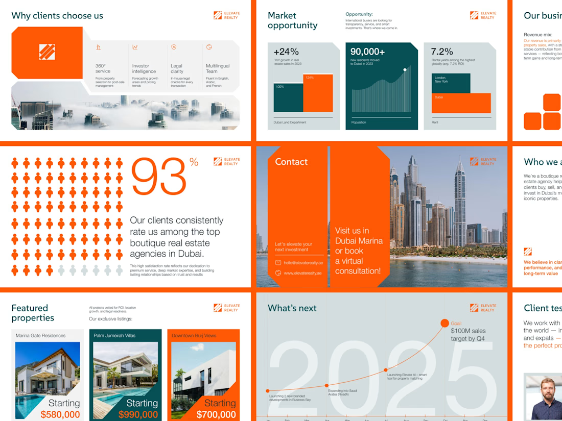

Love the 93 percent visual, 100 small figures with 7 left grey makes the number land in a way a plain stat never does. Real estate clients definitely respond to that kind of clarity.

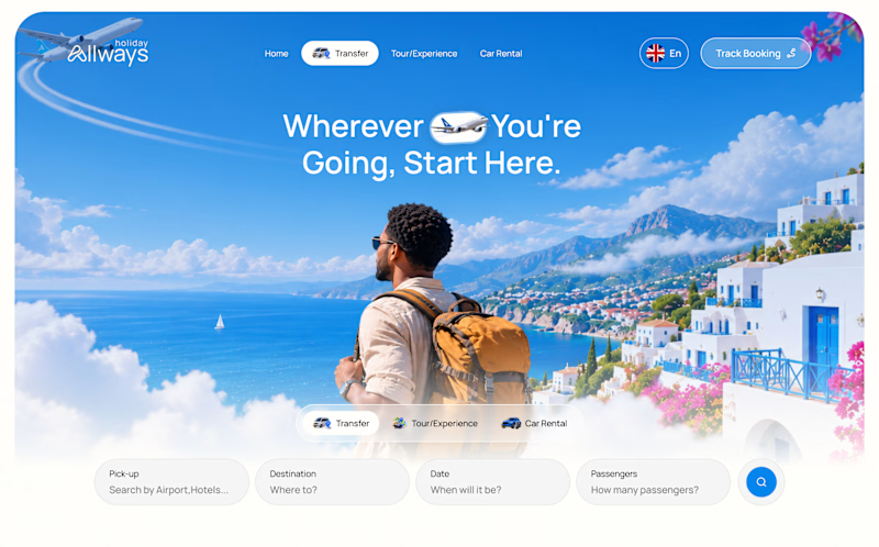
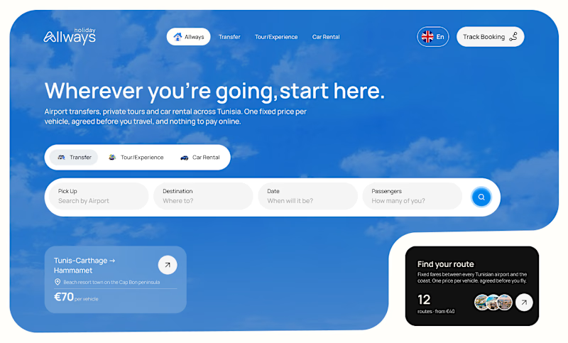
I missed an important detail in th first design direction, and the client rejected it.
After revisiting the feedback, I came up with another directiona nd it got approved
Both designs serve the same product, which one do you think got accepted for a web application?
Direction 1
Direction 2

8 votes
Ends in 21h


How much of a product should someone be able to explore before they book a demo?
That was the UX question behind this site for contact center software.
The comparison cards use the same five criteria in the same order. You can pick a row and scan across all three options.
The coverage toggle keeps the grid in place while the cells, legend and summary update. Your eye stays on the same part of the grid as the view changes.
My favourite detail is in the six-tab product preview. Pick a scoring criterion and the call excerpt and timestamp update right beside the score.
On mobile, the featured comparison card moves to the top and the demo tabs become a horizontal strip.
If you could keep just one interaction here, which would you choose and why: the coverage toggle or the scoring preview?
#B2BWebDesign #InteractionDesign #LandingPageDesign


Matching the comparison rows is so thoughtful.