The network for creativity
Join 1.25M professional creatives like you
Connect with clients, get discovered, and run your business 100% commission-free
Creatives on Contra have earned over $150M and we are just getting started
Back to feedPost
Taste Test

First time using #kittl and am impressed.
I like 'B' which would you chose?
0 voted
0%

2 voted
100%

2 votes
Closed
The network for creativity
Join 1.25M professional creatives like you
Connect with clients, get discovered, and run your business 100% commission-free
Creatives on Contra have earned over $150M and we are just getting started



Related posts

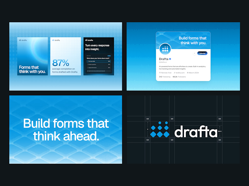
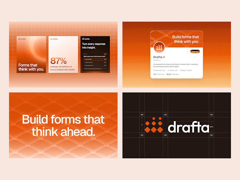
Same brand, two different personalities. 🎨
We explored Drafta’s brand identity in two color directions:
A: Electric Blue 💙 and B: Vibrant Orange 🧡
Color shapes how a brand feels, how people see it, and how easily they remember it, so this choice matters.
Which one would you pick for Drafta? Vote A or B and tell us why in the comments! 👇💬
#BrandIdentity #BrandColor #VisualIdentity #UIDesign #DesignPoll
4 votes
Ends in 1d

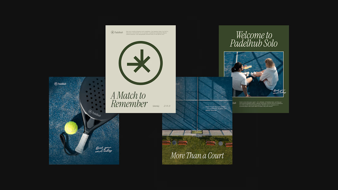
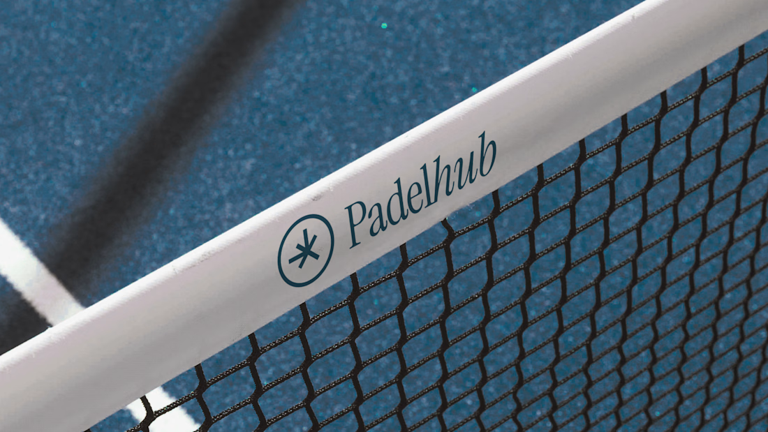
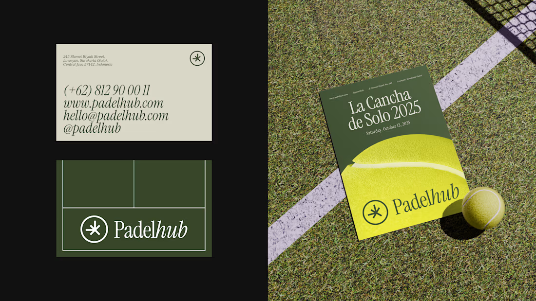
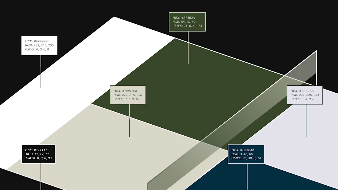
Padelhub is a padel club in Surakarta that wanted its brand to feel as considered as its courts. We built one mark, an asterisk inside a circle, paired it with an italic serif wordmark, and held that lockup across every touchpoint. Deep green and cream carry the posts and business card, while the tennis-ball yellow poster and the net banner show the same mark at a different scale.
Which touchpoint do you trust most when choosing a sports club: the poster, the card, or the website?


A homepage concept with a little more character, a little more contrast, and a lot of attention to detail.
