The network for creativity
Join 1.25M professional creatives like you
Connect with clients, get discovered, and run your business 100% commission-free
Creatives on Contra have earned over $150M and we are just getting started
Back to feedPost
Taste Test


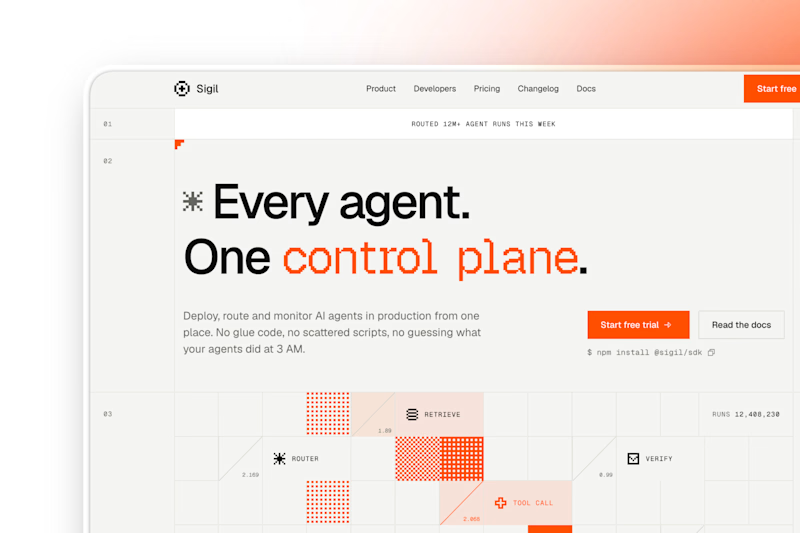
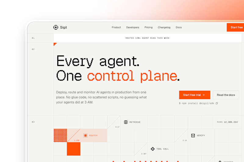

Outstanding work
Thanks

I like Option2. The Structure and placement of elements looks good!!👍
Thanks Sohil

option 1
good choice
The network for creativity
Join 1.25M professional creatives like you
Connect with clients, get discovered, and run your business 100% commission-free
Creatives on Contra have earned over $150M and we are just getting started



Related posts

Kajabi Website Design for Online Coaches & Courses
Designed a Kajabi website concept for online coaches and course creators who need a clear, professional way to present their programs and learning offers.
The website focuses on presenting course information, highlighting program benefits, and guiding visitors toward enrollment or the next step. The layout combines clear content structure, engaging sections, responsive design, and strategically placed calls to action to create a smooth experience across desktop and mobile.
The goal is to help coaches communicate the value of their programs and give prospective students a clear path from discovering the offer to taking action.
#Kajabi #KajabiWebsiteDesign #WebsiteDesign #OnlineCourse #CourseCreator #OnlineCoaching #CoachingWebsite #CourseWebsite #LandingPageDesign #SalesPageDesign #WebDevelopment #Elearning

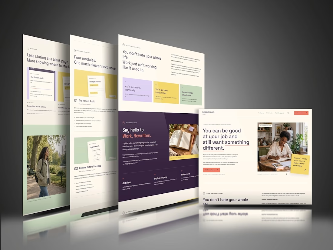

The “Four modules. One much clearer next move.” line makes the course feel manageable before someone gets into the details. That’s a useful choice for coaches whose offers can otherwise feel overwhelming. For this concept, would the main CTA go straight to enrollment, or let visitors preview a lesson first?

Two ad directions for Aura Aesthetics’ Botox Flash Sale. Same offer, different layout and feel.
Option A: split layout, model left, price card right, olive green accents, bold and direct
Option B: model fills the right, soft rounded cards on the left, all warm neutrals, quieter and more elegant
Which one makes you tap “Schedule Your Discount”? 👇
9 voted
53%

8 voted
47%

17 votes
Closed

I'd tap A: the big $179 reads first and the olive block gives the CTA real contrast. Did you run both as live ads? Curious which one won on CTR.

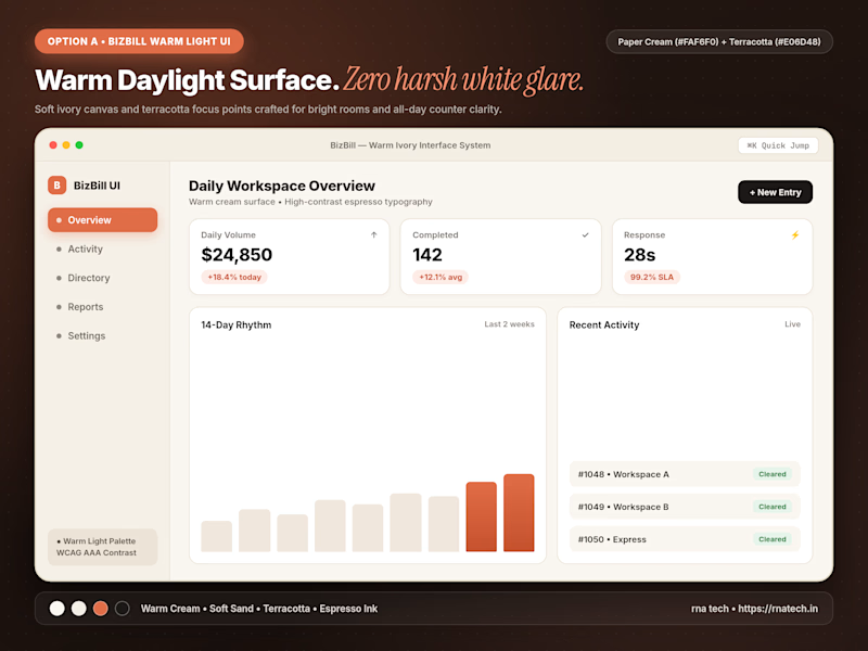
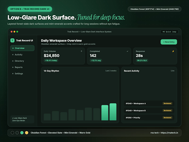
Quick poll for builders & designers here: When you're designing a data-heavy dashboard that people keep open for 6+ hours a day, do you default to Warm Light Mode or Low-Glare Dark Mode first?
4 voted
67%
2 voted
33%
6 votes
Closed

I’d start with warm light mode for a clean, comfortable look, but low-glare dark mode is a great option for long working hours too!