The network for creativity
Join 1.25M professional creatives like you
Connect with clients, get discovered, and run your business 100% commission-free
Creatives on Contra have earned over $150M and we are just getting started
Back to feedPost

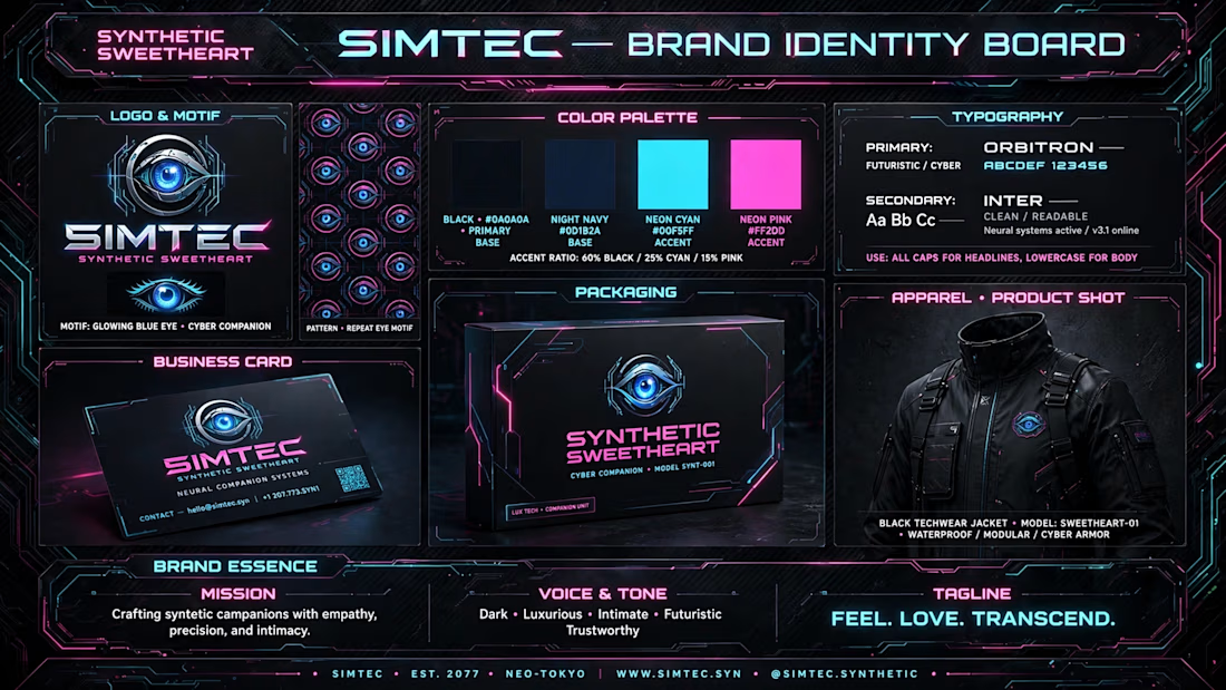
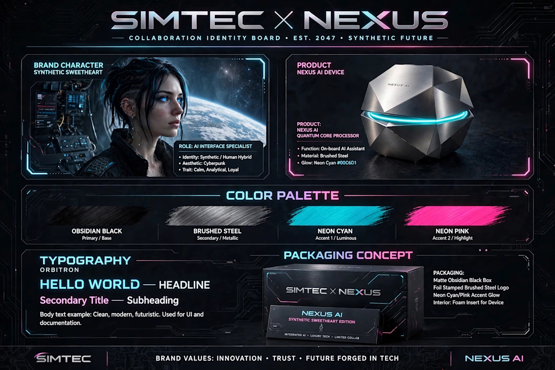
SIMTEC × NEXUS is a concept identity system for a dark-luxury AI device and its brand character, “Synthetic Sweetheart.”
The project explores how a physical product, an AI character, and a complete brand universe can operate as one cohesive visual system rather than separate creative assets.
I developed the concept from product visualization through character identity, packaging, apparel, editorial environments, and brand direction.
Creative Direction
Product Concept
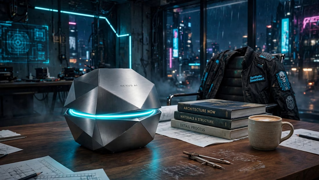
A faceted brushed-steel NEXUS AI device built around a neon-cyan luminous core, designed to feel technological, premium, and slightly mysterious.
Character IP
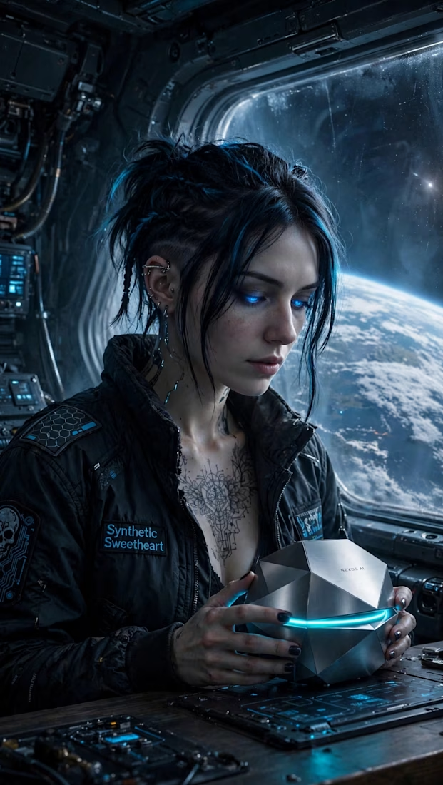
“Synthetic Sweetheart,” the AI interface specialist and narrative face of the brand. The character extends the product identity into a recognizable personality and storytelling system.
Brand Identity
A visual language built around an eye motif, geometric logo system, obsidian black, neon cyan and neon pink, with Orbitron and Inter typography.
Packaging & Apparel
matte obsidian packaging concept, business card system, and branded technical outerwear designed to extend the identity beyond the screen.
Editorial World
A cyberpunk architectural studio environment created to position NEXUS as a physical object inside a larger cinematic universe.
Approach
AI Concepting + Art Direction
AI-generated exploration was used as a visual development tool, followed by manual selection, refinement, composition, and art direction to establish a consistent brand language across the system.
What this project demonstrates
Art Direction · Brand Systems · Product Visualization · Character IP · AI Creative Direction · Packaging · Worldbuilding · Visual Storytelling
The goal was not simply to design an AI device.
It was to create the world that device belongs to.

The network for creativity
Join 1.25M professional creatives like you
Connect with clients, get discovered, and run your business 100% commission-free
Creatives on Contra have earned over $150M and we are just getting started







Related posts

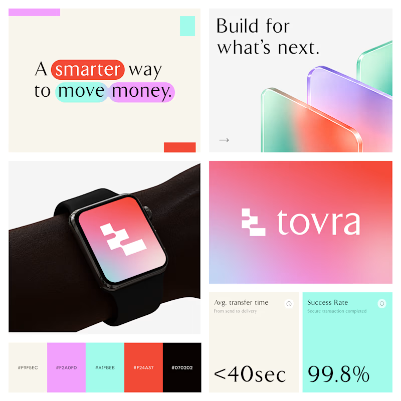
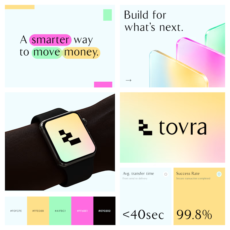
Two Color Directions. One Brand Identity.
Exploring two visual directions for Toyra, a modern fintech brand focused on making money movement smarter and simpler.
Both concepts feature bold typography, vibrant colors, playful gradients, and a clean visual identity.
Which color direction works better for Brand Option A or Option B? 👀
19 voted
40%
29 voted
60%
48 votes
Closed


Visual identity revision for a psychology and management consulting firm



handsome works! anyway did you use any ai to generate mockups on that? or you did manual

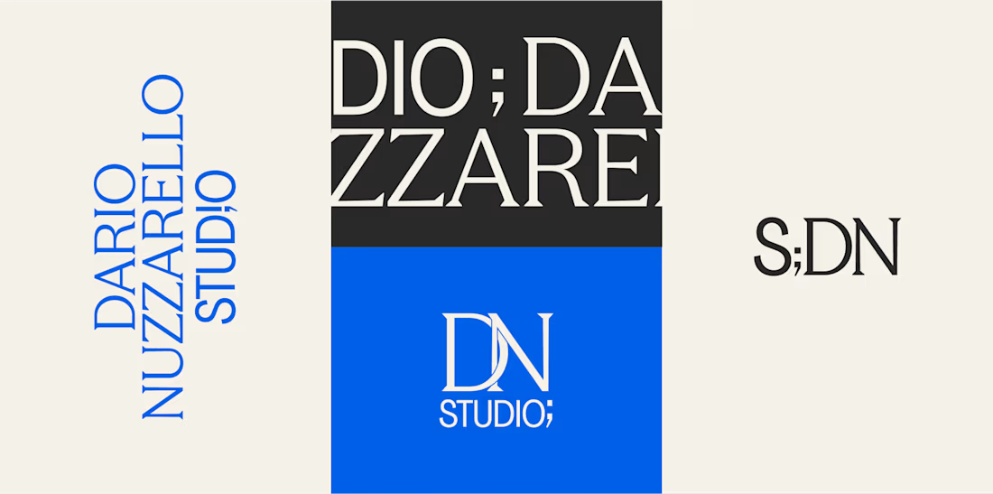
How do you brand a business that doesn’t fit into one box?
Dario Nuzzarello built a Studio that works across engineering, IT, strategy, and software. The challenge was creating a typographic identity that could bring all those disciplines together without limiting the brand to just one.
I wanted to avoid making it feel overly technical or cold. Since Dario’s work is highly custom and interdisciplinary, the identity needed to feel precise and structured while still being human and approachable.
Sometimes, the best solution is finding the right type, proportions, and details to make a name stand on its own.
What do you think about the final result?


A studio that spans engineering, IT, strategy and software is a naming and typography problem more than a logo problem, so leading with type was the right call. Precise but human is a hard line to walk. Did Dario push for a symbol at any point?