The network for creativity
Join 1.25M professional creatives like you
Connect with clients, get discovered, and run your business 100% commission-free
Creatives on Contra have earned over $150M and we are just getting started
Back to feedPost
Taste Test

Scribbled, my newest framer template releases today, which is a better banner for the listing?

1 voted
50%
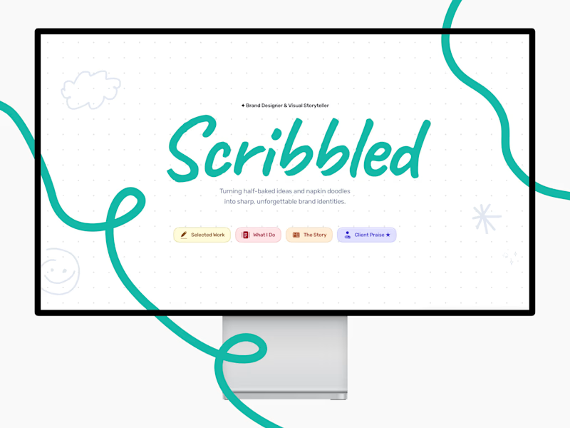
1 voted
50%
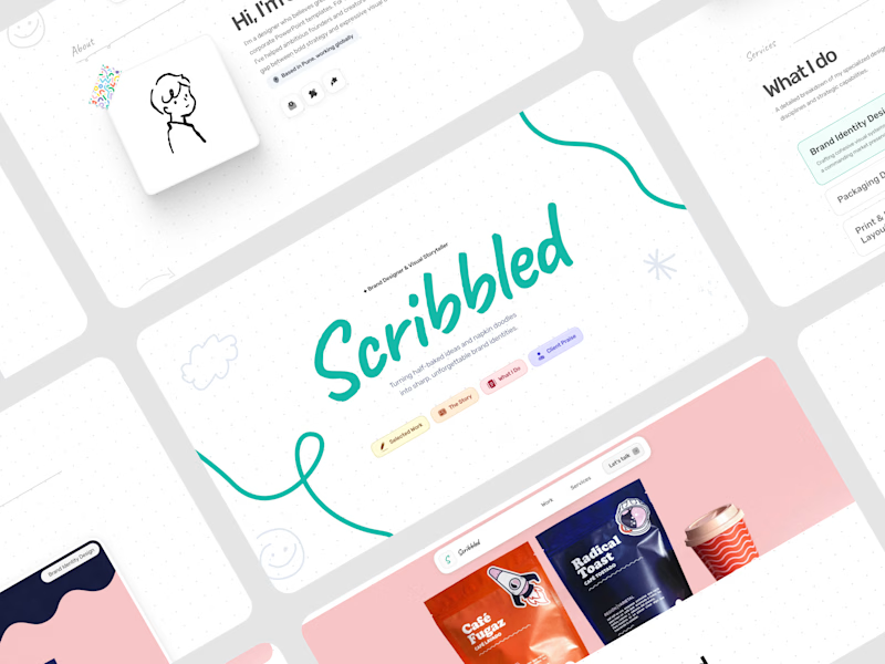
2 votes
Closed
The network for creativity
Join 1.25M professional creatives like you
Connect with clients, get discovered, and run your business 100% commission-free
Creatives on Contra have earned over $150M and we are just getting started





Related posts

Small preview of my free Framer template for weddings 💒👰🏽♀️
Remix for free (and use as you wish!): https://framer.link/OVLj7Ay

That deep wine band framing the hillside shot gives it such an invitation-card feel. Giving this away for free is really kind. Have you seen what people end up doing with it once they remix, or does it mostly disappear into the wild?

Two cuts of the same opener for Pletor 2.0. Same copy, same timing, different composition.
In the first one the words sit at opposite corners and the product cards drift in loose. In the second the cards arrive as tight stacks and the words swap corners.
I keep going back and forth on which one reads faster.
Vote in the comments, 1 or 2.
35 voted
65%
19 voted
35%
54 votes
Closed

2 for me. The tight stacks give the eye one clear place to land, so the message reads quicker. The loose drift in 1 looks beautiful but I found myself chasing the cards a bit

Designed two directions for a health tracking app
Same data, but two very different feelings
One is dark and focused, built for athletes. The other is warm and friendly, built for everyday people
What do you think?
Which one would you open every day, A or B?

21 voted
39%
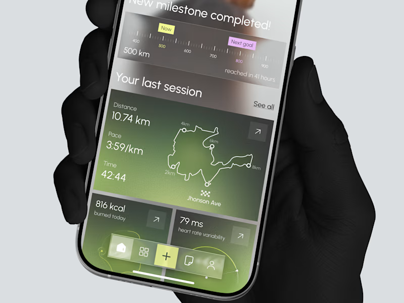
33 voted
61%
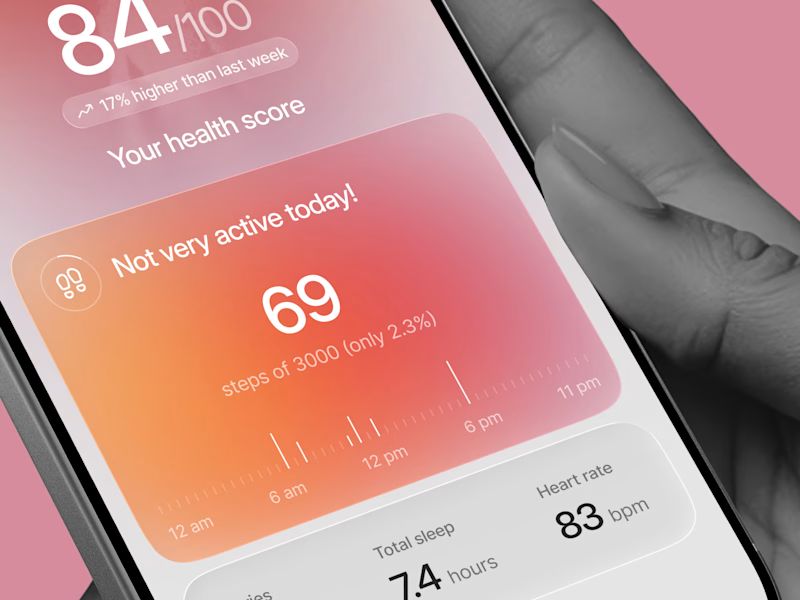
54 votes
Closed

Option 1 gave me a very fin-tech feel and option 2 feels like my health is in danger, sorry 😂