The network for creativity
Join 1.25M professional creatives like you
Connect with clients, get discovered, and run your business 100% commission-free
Creatives on Contra have earned over $150M and we are just getting started
Back to feedPost

The hero section for my dark fantasy Framer template.

The network for creativity
Join 1.25M professional creatives like you
Connect with clients, get discovered, and run your business 100% commission-free
Creatives on Contra have earned over $150M and we are just getting started








Related posts

made this hero section as a framer component and the great part is it's easy to customize and edit as per your needs.
lemme know hoe you like it, i'll publish it then.
will keep it free for 11 days in marketplace


WHAT IS A HERO SECTION?
When there is a website where you enter and the first stuffs your eyes caught drew you attention to the remaining part of the website, that is the power of an HERO SECTION.
If you want a website like this for your business, message me now with your scope and lets build your business together!!!!


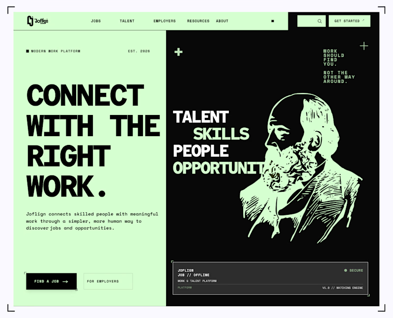
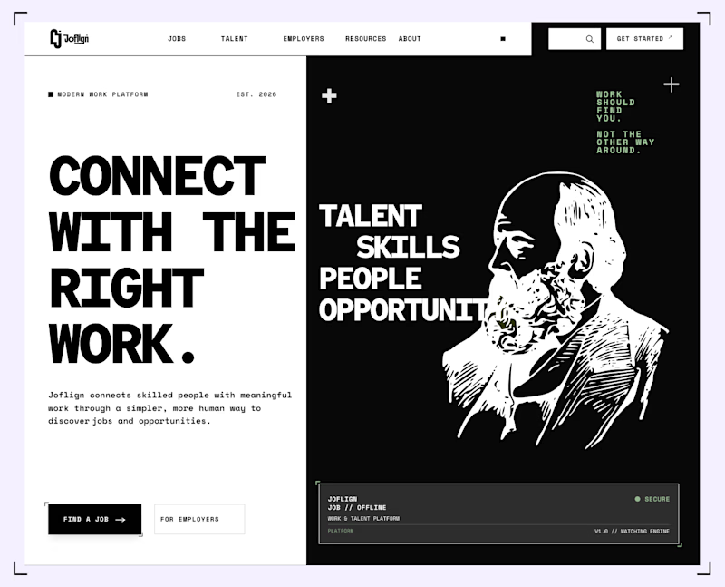

I lean light green because it carries through both the copy panel and the illustration, making the two halves feel connected. I’d keep “Find a job” clearly stronger than “For employers” if jobseekers are the main audience. That hierarchy matters more than the background preference alone.