The network for creativity
Join 1.25M professional creatives like you
Connect with clients, get discovered, and run your business 100% commission-free
Creatives on Contra have earned over $150M and we are just getting started
Back to feedPost

Introducing TransitGo AI: Your Intelligent Mobility Partner
TransitGo AI is not just another navigation app; it's a revolutionary mobility platform that leverages the power of Artificial Intelligence to redefine your travel experience. We understand that urban mobility is complex, and our system is designed to provide you with smart, context-aware solutions for every journey. Here’s a detailed breakdown of how TransitGo AI optimizes your commute:
Key System Capabilities
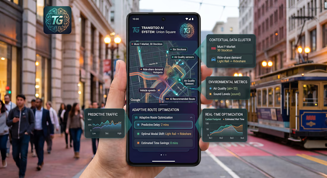
1. TRANSITGO AI SYSTEM: Union Square (San Francisco Context)
The core interface provides an overview of your current context. It dynamically identifies your location (e.g., Union Square) and connects to a real-time data visualization of the local transport network, illustrating live traffic flow and predictive patterns as a complex neural network over a familiar map.
2. CONTEXTUAL DATA CLUSTER
We process millions of data points to deliver immediate, personalized context for your trip:
Live Public Transit Integration: Instantly displays specific, high-frequency public transit lines nearby (e.g., Muni F-Market, 30 Stockton).
Intermodal Ride-Share Demand Forecasting: Predicts demand shifts between modes (e.g., showing high rideshare demand that suggests public transit is the faster option).
3. ENVIRONMENTAL METRICS
For the conscious commuter, we integrate environmental data into your decision-making:
Live Air Quality Index: Track localized air quality scores (e.g., AQI 35) along your prospective routes.
Real-time Sound Levels: Avoid noisy construction or high-decibel areas with acoustic mapping.
4. PREDICTIVE TRAFFIC & PERFORMANCE
We look ahead so you don't have to. Our "Predictive Traffic" widget provides complex time-series forecasting (low-mid-high trends) over the next hour. The "Performance" metric predicts overall route efficiency, helping you anticipate and avoid congestion before it happens.
5. REAL-TIME OPTIMIZATION ENGINE
TransitGo AI offers a sophisticated multi-criteria comparison engine. Our interactive "Real-time Optimization" graph allows you to visualize and weigh competing factors:
Carbon Footprint vs. Wait Time: Dynamically compare different travel modes (Ro1-Ro4) on a single chart to find the perfect balance between sustainability and speed.
6. ADAPTIVE ROUTE OPTIMIZATION
Our AI doesn't just present data; it recommends definitive, optimized travel plans:
Predictive Delay Reduction: Anticipates future delays and highlights the minimal impact path (e.g., predicting a delay of only 2 mins).
Optimal Modal Shifting: Recommends the smartest, intermodal combinations (e.g., switching from Light Rail to Rideshare at a specific junction).
Verified Time Savings: Explicitly calculates and displays the time you will save by following the AI recommendation (e.g., Estimated Time Savings: 8 mins).
By unifying data streams, predictive modeling, and real-time intermodal comparisons, TransitGo AI empowers you to travel smarter, greener, and more efficiently. We don't just guide you to your destination; we optimize every step of the journey.


The network for creativity
Join 1.25M professional creatives like you
Connect with clients, get discovered, and run your business 100% commission-free
Creatives on Contra have earned over $150M and we are just getting started

Challenges
View all


Related posts


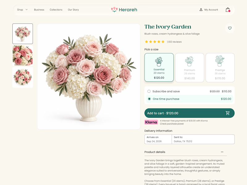
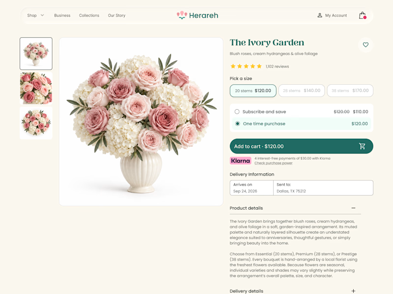

Icon cards for me, bouquets are such a visual purchase that a scannable icon beats reading "small/medium/large" every time. Did the compact chips version convert worse in testing, or are you still gathering data on that?

Working on the homepage for Still Blooming, a wedding and floral studio, I explored two different layout directions for the hero section. Same brand, same copy, just a different structure and visual rhythm.
Option 1 : Left Aligned. Text sits on the left with supporting content beside it, giving an editorial, asymmetrical feel.
Option 2 : Centered. Everything is stacked and centered, giving a clean, balanced, more classic hero layout.
Would love your honest UX/UI take which direction feels more elegant, functional, and true to a wedding/floral brand, and why?
22 voted
41%
32 voted
59%
54 votes
Closed

Great Design :)

Yesterday, I posted my first (one of my favorite complete case study on 0 → 1 product design (award winning app) on Contra.
I never been loud about my work 😂 but this time, I am finding my way around contra to improve my scores by showcasing some of my favourite work. Let me know if you like it 🙌

The walkthrough makes the 0→1 journey easy to follow—the tutorial overlay and scan flow explain the product without overloading the screen. The restrained purple framing also gives the case study a memorable visual identity.