The network for creativity
Join 1.25M professional creatives like you
Connect with clients, get discovered, and run your business 100% commission-free
Creatives on Contra have earned over $150M and we are just getting started
Back to feedPost
Taste Test


Which one would you lead the season with?
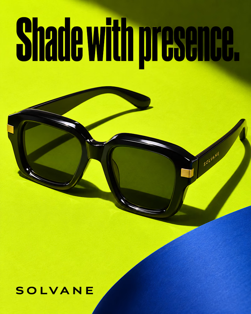
The first is a chunky black acetate frame with green lenses and brushed gold hinges, lying open on acid green, a cobalt curve cutting in from the corner, hard shadow beneath, heavy condensed black headline.
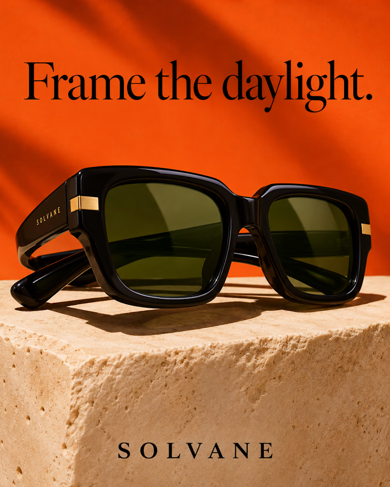
The second is the same frame resting on a rough travertine block against bright orange, folded arms catching the light, palm shadow across the wall, the headline in black serif.
One sells attitude. The other sells summer.
👇 #eyeweardesign #brandconcept #productphotography
4 votes
Ends in 1d
The network for creativity
Join 1.25M professional creatives like you
Connect with clients, get discovered, and run your business 100% commission-free
Creatives on Contra have earned over $150M and we are just getting started





Related posts

Very close to finish a website project! Help me out!
Blue or orange scheme?
38 voted
47%
43 voted
53%
81 votes
Closed

The orange scheme was stunning 😍

Fine tuning and testing on real client's project. That tool works perfectly, love it, especially when I use it for myself!
#startup #design #designsystem #tool #founder
1 voted
33%
2 voted
67%
3 votes
Closed


real client work is the only honest test for tools like this tbh

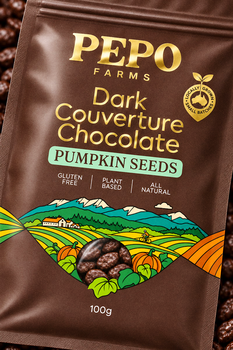
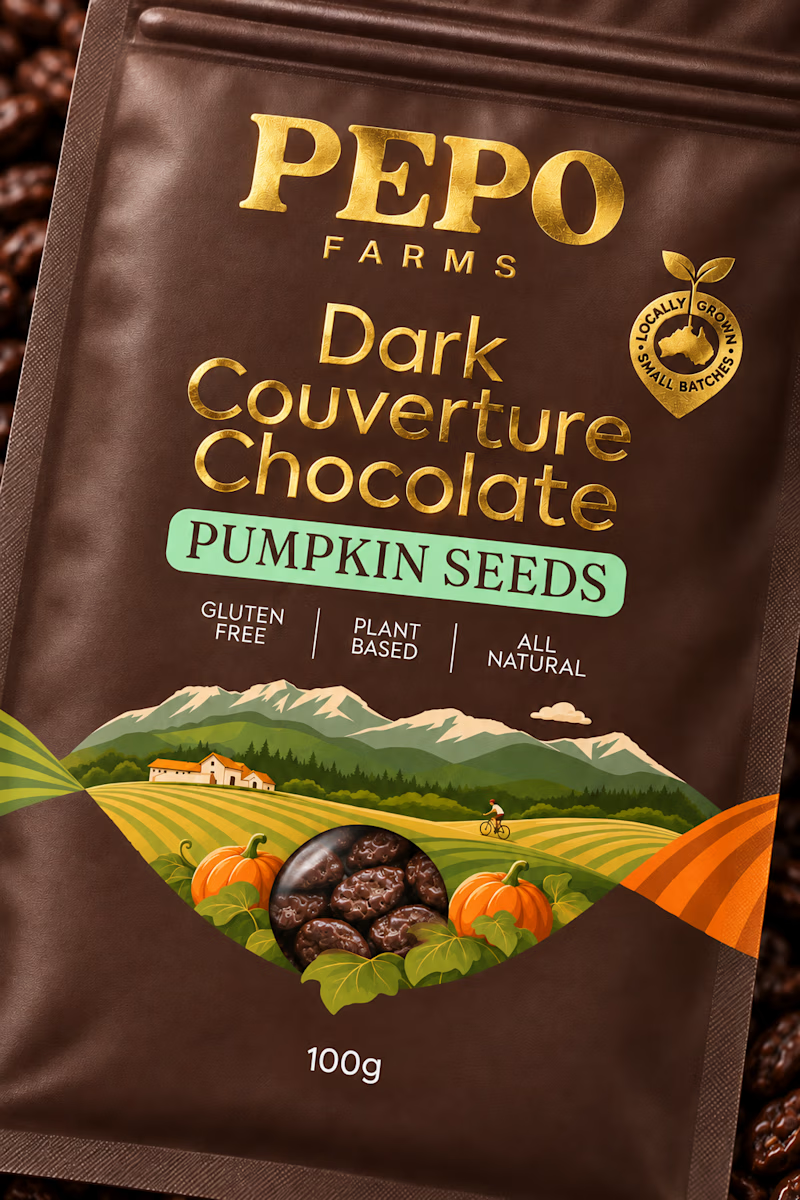
I need another set of eyes to check which version works better with this design. The main thought behind this design is the illustration created in the shape of a DNA strand to showcase the brand and how it originated.
Since this is a chocolate product, I personally felt that a more expressive and bold illustration with outlines would be better suited. I would love to hear what you think as a fellow creative.
4 voted
67%
2 voted
33%
6 votes
Closed