The network for creativity
Join 1.25M professional creatives like you
Connect with clients, get discovered, and run your business 100% commission-free
Creatives on Contra have earned over $150M and we are just getting started
Back to feedPost
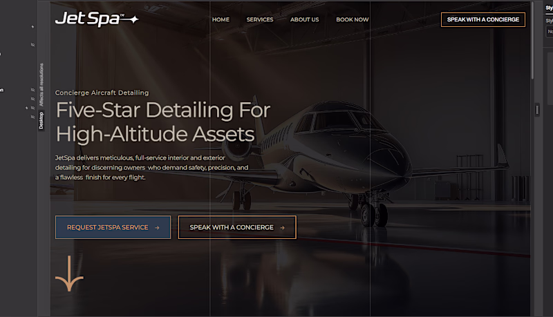
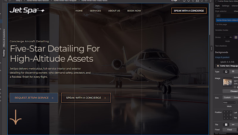
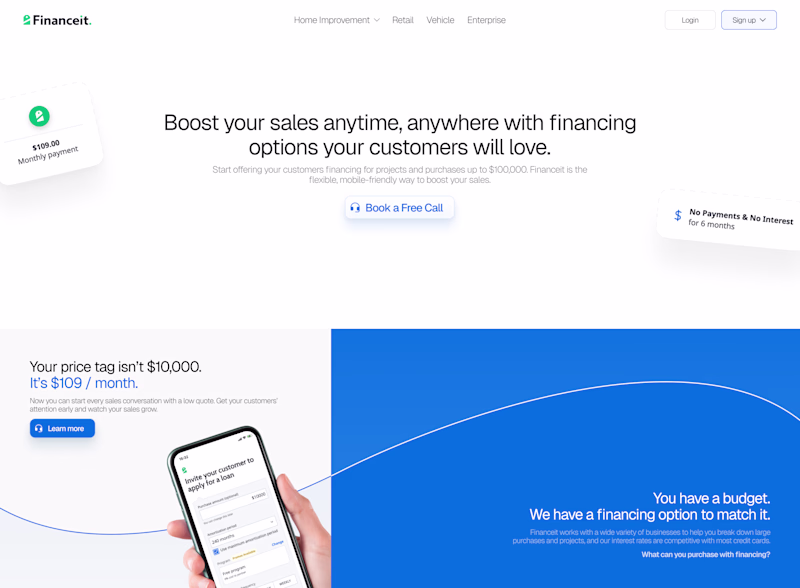
Taste Test
Testing background image alignment for a new hero section concept. Which version feels more balanced and visually aligned to you?
A or B?
Would love to hear your feedback from a UX/UI perspective.
#Webflow #cmsdevelopment #websitedesign
1 voted
50%
1 voted
50%
2 votes
Closed
The network for creativity
Join 1.25M professional creatives like you
Connect with clients, get discovered, and run your business 100% commission-free
Creatives on Contra have earned over $150M and we are just getting started
Related posts
Update on Building in Public • 6-month challenge 🚀
Decided to go with this direction for the hero section of my first Framer template.
Lots of iterations ahead, but I'm excited to see where this goes.
More updates coming soon. 👨💻
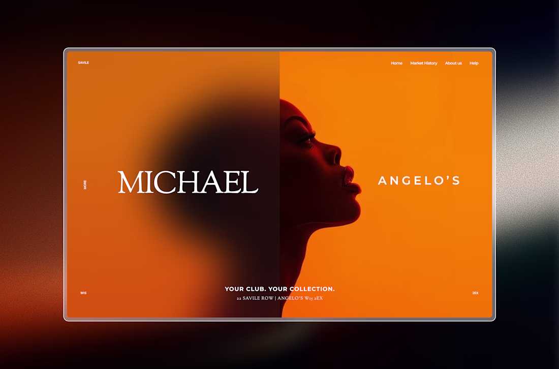
This is living rent-free in my head.
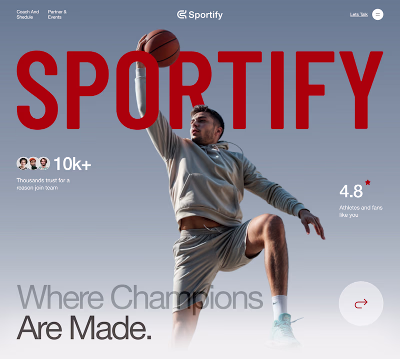
Which landing page wins in the first 3 seconds?
Same product. Same goal. Two different creative directions.
A focuses on energy, motion, and emotional impact.
B prioritizes clarity, structure, and instant readability.
If you landed on this website for the first time, which version would make you stay longer?
Vote A or B and tell me why.
Your feedback helps shape the final design.
12 voted
50%
12 voted
50%

24 votes
Closed
I really appreciate the subtle positioning of the 'Sportify' branding across both versions. Letting the player's head and the basketball layer overlapping the text in Version A gives it such great depth, while keeping it crisp and structural underneath the countdown in Version B...
I attempted to redesign a website's hero section and can't decide between these. Do you prefer the subtle gradient or the simple and informative?
5 voted
36%
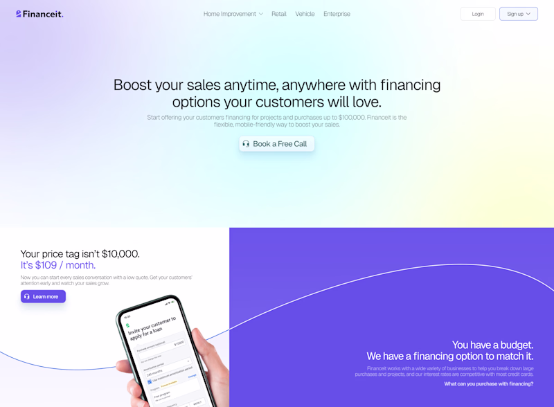
9 voted
64%
14 votes
Closed
Simple
Trending
Claude
Claude has entered the design space. How are you using Claude Design?
Contra University
Learn from expert creatives how to earn more using next-gen AI tools.
fifaworldcup2026
The World Cup is here and the whole world's watching. How are you designing for the world stage?
creativeaiflow
Creative AI workflows are evolving. What tools do you use, and what are their strengths and weaknesses?
freelancerlife
Freelancer life is wins, pivots, and everything in between. What’s yours right now?