The network for creativity
Join 1.25M professional creatives like you
Connect with clients, get discovered, and run your business 100% commission-free
Creatives on Contra have earned over $150M and we are just getting started
Back to feedPost

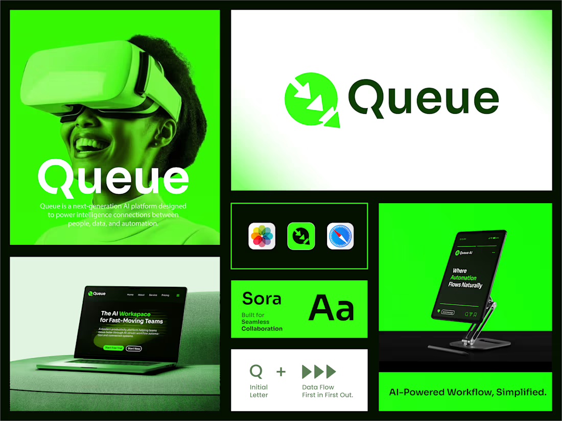
Queue — Visual Identity for an AI Workflow Platform
Queue needed a mark that could carry "AI-powered" without falling into cliché — something sharp enough for a landing page hero, but small enough to hold up as an app icon.
The logomark builds off the Q's negative space: three overlapping arrows forming a spiral, nodding to the product's core idea — data queued and flowing first-in, first-out. Rendered in a high-contrast neon green against near-black, it reads as fast and automated rather than soft and generic-SaaS.



The network for creativity
Join 1.25M professional creatives like you
Connect with clients, get discovered, and run your business 100% commission-free
Creatives on Contra have earned over $150M and we are just getting started
Challenges
View all


Related posts


Which 404 page design for a world-class film production studio would you choose - Pink or Black? ✨👠
404pagecreativedesignfashionwebsiteCreative Design Frontend DevelopmentWeb DesignFigmaJavaScriptWebflow


31 voted
40%
46 voted
60%
77 votes
Closed

Black version looks more editorial, tho the pink one is rly eye-catching

Creative Direction for Innerceuticals


The pivot from the real product bottle into that geometric particle animation is a smooth way to move from proof to brand world. Was Innerceuticals specifically asking for that split, ground it in the actual product first then get conceptual after, or did that pairing come together in the edit?

Whenever I get time, I like to do mockups to keep my creativity sharp. In this case, nature backgrounds were my inspiration to showcase all four seasons.
Long before Apple began using them, Windows offered a range of wallpapers that brought beautiful scenes from around the world to their user's desktop.
Here's some I felt best captured the essence of each season.

