The network for creativity
Join 1.25M professional creatives like you
Connect with clients, get discovered, and run your business 100% commission-free
Creatives on Contra have earned over $150M and we are just getting started
Back to feedPost

bitte einbauen
Blade Soundsystems. A logo with an edge.
Blade Soundsystems is a self-initiated concept: a fictional audio brand I created to explore one question. How do you make a name this sharp into a mark that truly belongs to it?
A blade is precise and memorable. It is also an easy cliché, the kind of symbol that ends up placed next to a name and never really belongs to it.
So I didn’t draw a sword beside the word. I made the word the sword.
The mark
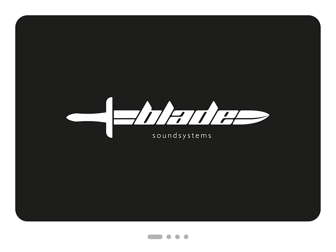
The whole logo is one object that reads in a single line, from grip to tip.
The word is the blade. The letters b-l-a-d-e form the body of the weapon. Their heavy, slanted shapes sit tightly together, so the name holds as one solid piece of steel.
The ascenders are the serrations. The tops of b, l and d end in sharp, angled points that break the silhouette and give the word its bite.
One fine line runs through it. Starting at the guard, a narrow cut splits the bars before the word, like the fuller of a real blade. It returns after the “e” as a thin line sweeping into the tip, and that small detail makes the form feel forged rather than typed.
The guard and grip do the rest. A short crossguard and a tapered grip finish the silhouette. They’re simple enough that the sword is clear at a glance, and they let the word stay the hero.
The slant gives the mark its direction. It leans forward and points right, so it seems to be moving even at rest.
The descriptor
Below the blade, “soundsystems” is set in small, light, widely spaced lowercase. It’s the quiet counterpoint to all that weight and tells you at once what the brand does. It also shifts the tone: without it, the mark could belong to a knife maker. With it, sharpness becomes a promise about sound.
The colour
Black and white, nothing else. A mark this graphic doesn’t need colour to work, and the strict contrast matches the world it lives in: dark hardware, metal grilles and glowing status lights. It works equally well as a positive and a negative version.
The result
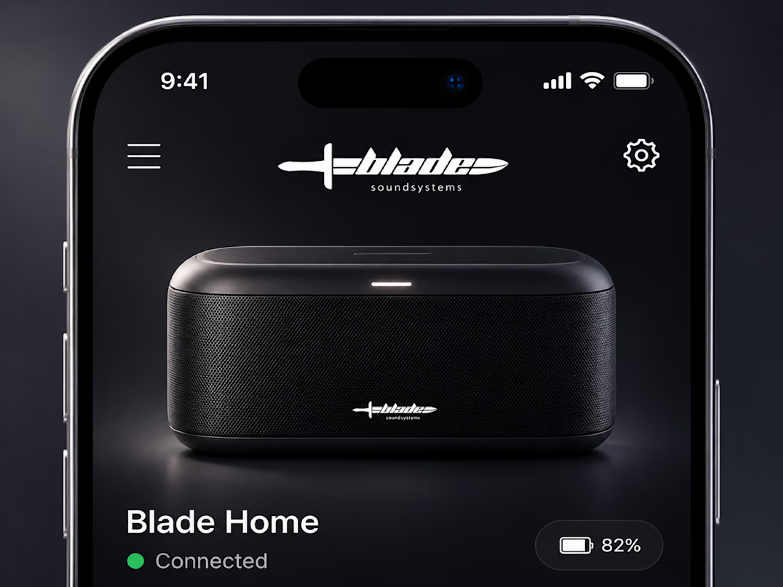
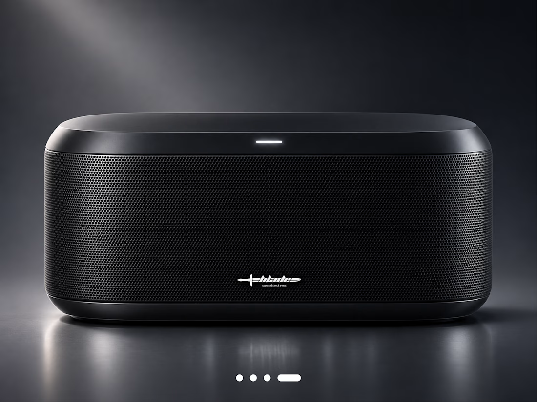
A logo that is a single, ownable shape, and that stays recognizable at very small sizes. The concept mockups test it where it would have to perform: on a speaker grille and at the top of an app screen.

The network for creativity
Join 1.25M professional creatives like you
Connect with clients, get discovered, and run your business 100% commission-free
Creatives on Contra have earned over $150M and we are just getting started
Related posts

more glimpses of iki 🍵
the project is almost finished, and i should be wrapping everything up next week.
it’s been a fun one to work on, especially seeing how the initial concept has evolved into a complete visual identity.
excited to share the final result soon :)
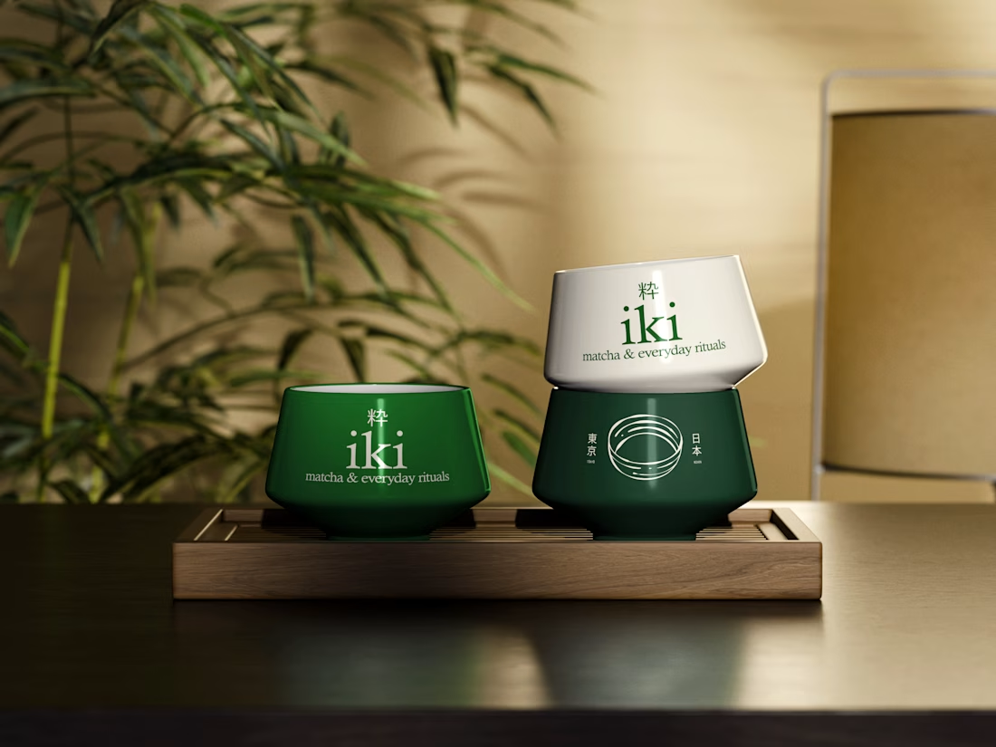
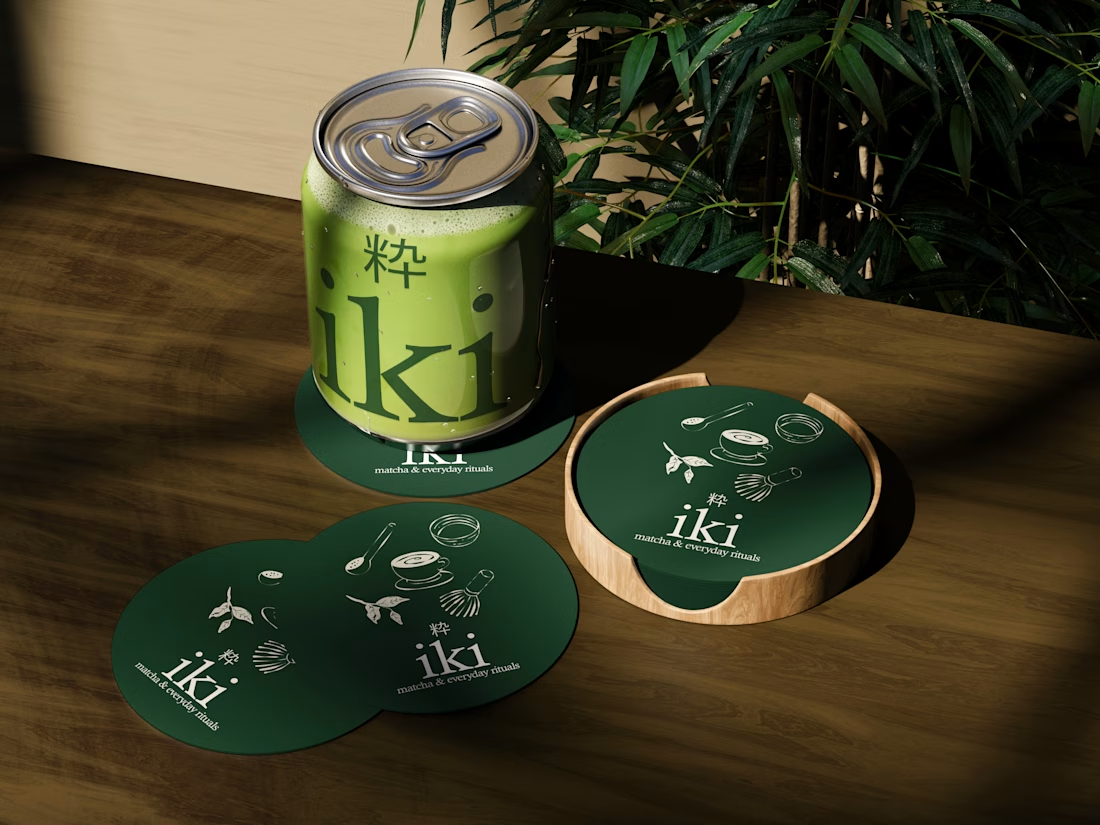
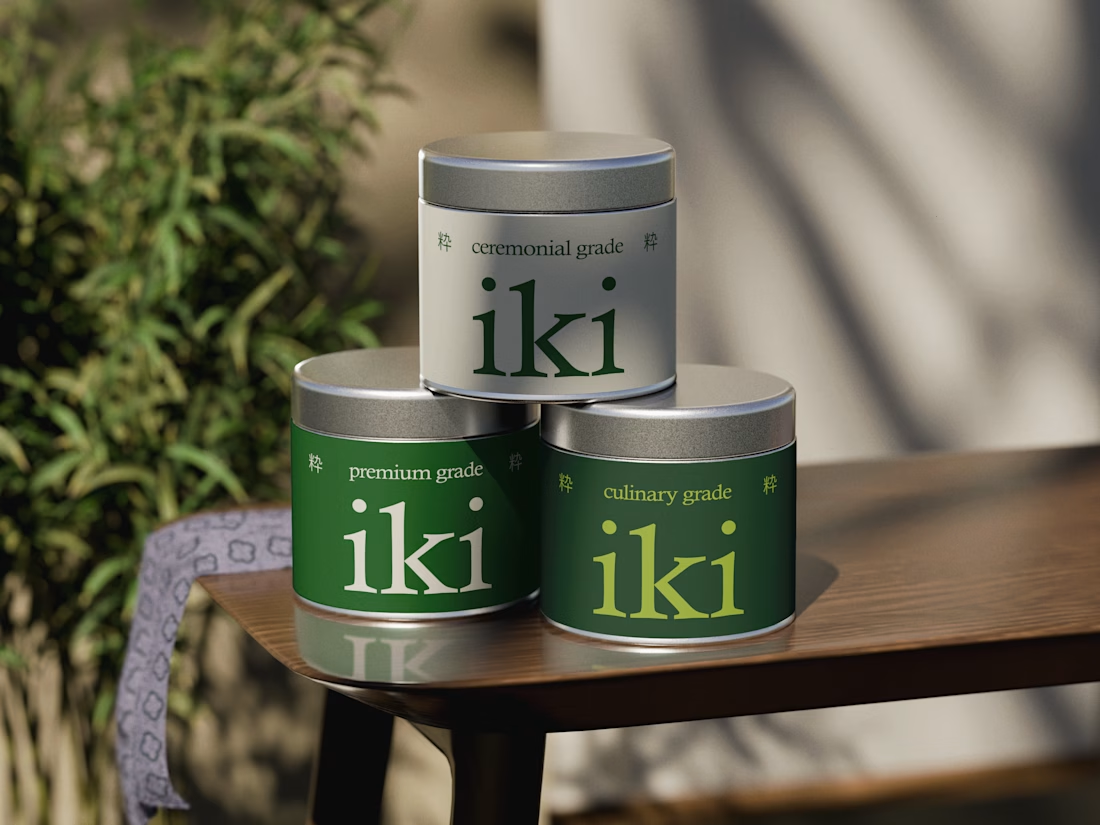
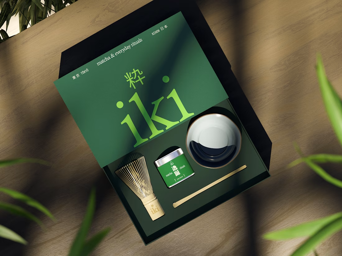

A little behind-the-scenes look at a brand identity coming together.
I'm currently working on a new identity for a coworking space in Austin, TX, with a vintage-inspired direction, warm colors, and a logo that brings a bit of nostalgia into a modern setting.

Carrying the vintage idea onto the coasters and the dot pattern gives the identity somewhere to live besides the logo.

Two warm ups today, both might become full case studies:
Parlata: an audio-postcard service that records and archives local dialects. Every recording becomes a small printed card with a QR link.
MODULO: an Industrial IoT brand. Olive, navy, one wobbly blob.
One is warm and human. One is technical and playful. Which would you want to see go all the way?
31 voted
63%
18 voted
37%
49 votes
Closed

Love it