The network for creativity
Join 1.25M professional creatives like you
Connect with clients, get discovered, and run your business 100% commission-free
Creatives on Contra have earned over $150M and we are just getting started
Back to feedPost
Taste Test
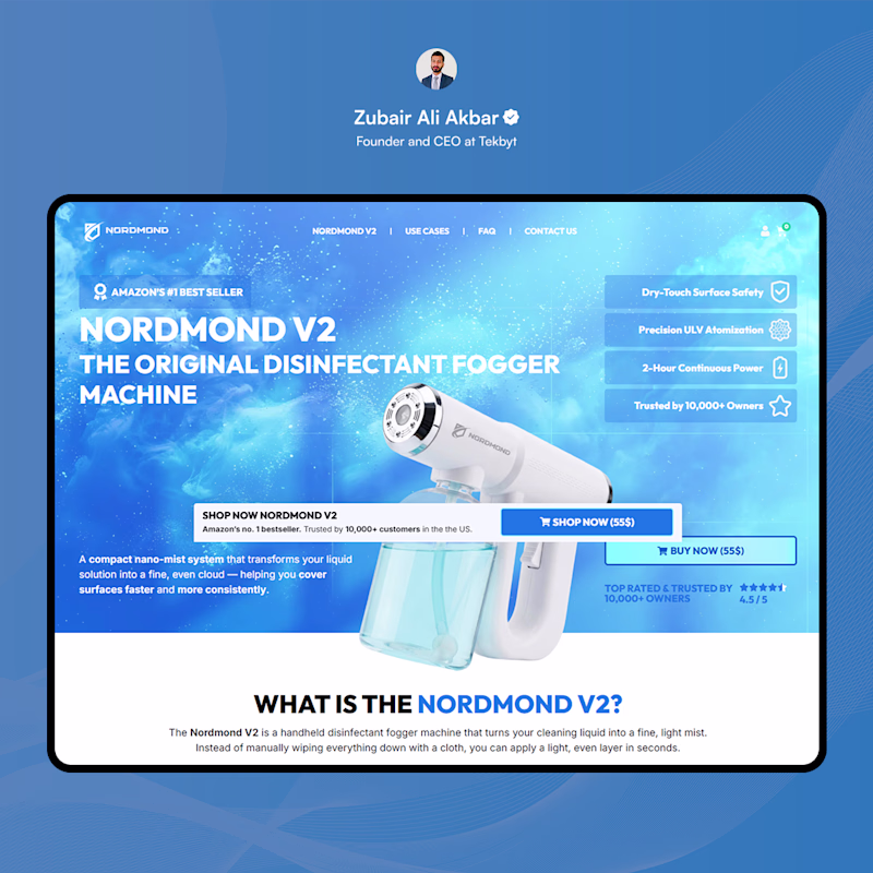
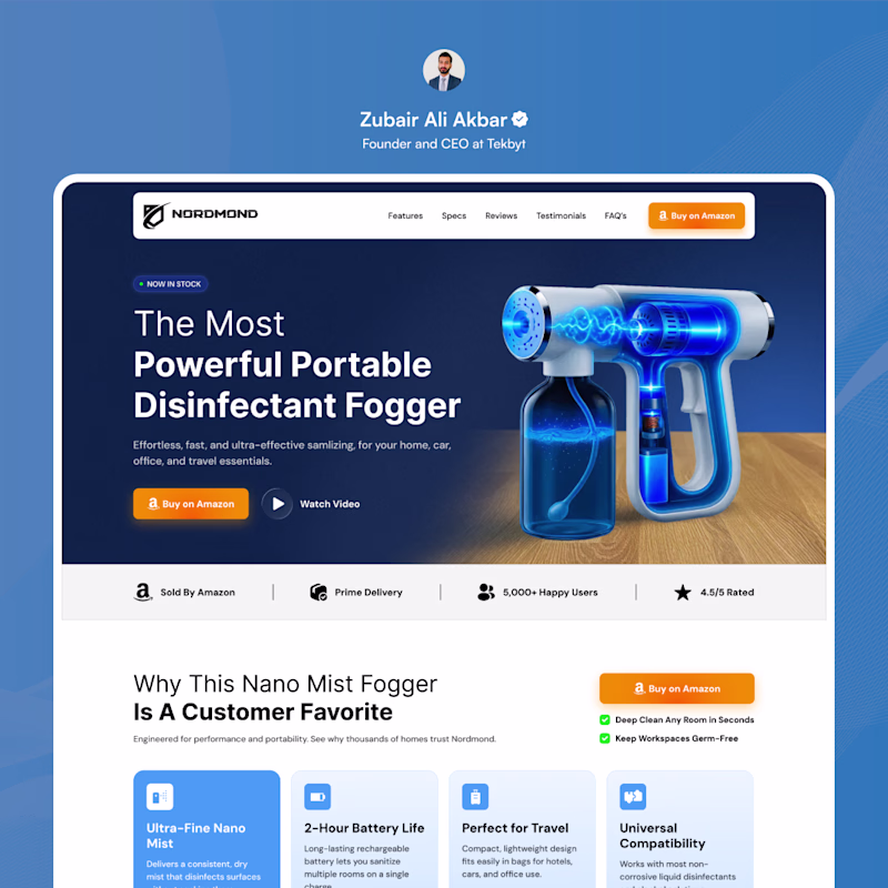
E-Commerce Landing Page: Nordmond – Elevating Conversions & Trust
Transformed a cluttered, text-heavy product page into a premium, conversion-focused landing page designed to lift sales and establish instant brand credibility.
Before: A chaotic layout in Before Post with a distracting background, competing CTAs, and a fragmented visual hierarchy that diluted the product's value.
After: A strategic redesign in After Post featuring a high-contrast aesthetic, streamlined navigation, an Amazon-focused social proof banner, and a scannable feature grid.
Which approach is more effective for high-ticket consumer products: a busy layout attempting to communicate every feature simultaneously or a premium, structured experience that systematically builds trust and removes buying friction?
4 votes
Ends in 16h
The tension is reduced in after
The network for creativity
Join 1.25M professional creatives like you
Connect with clients, get discovered, and run your business 100% commission-free
Creatives on Contra have earned over $150M and we are just getting started
Related posts
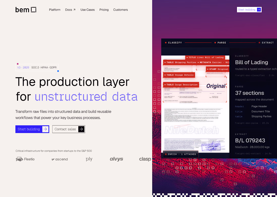
Working on a new website for bem, would you like to see the brand identity behind it?
Yeah sure I will love to
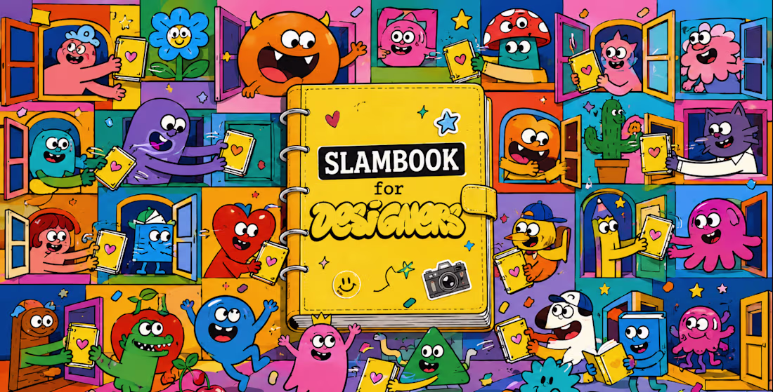
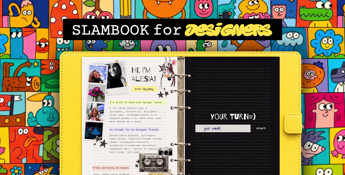
Hi creatives! 👋
For #ConfigMakeathon, I created SLAMBOOK for Designers ✨
https://slambook.figma.site
It's inspired by the slambooks many of us had as kids, but reimagined for the internet.
Designers from all over the world can create their own page by adding photos, favorite music, creative advice, inspirations, and a few fun facts about themselves. It's a playful way to discover people behind the portfolios and build new connections within the design community.
The best part? It lives online and can always be in your pocket, just add it to your home screen like an app.
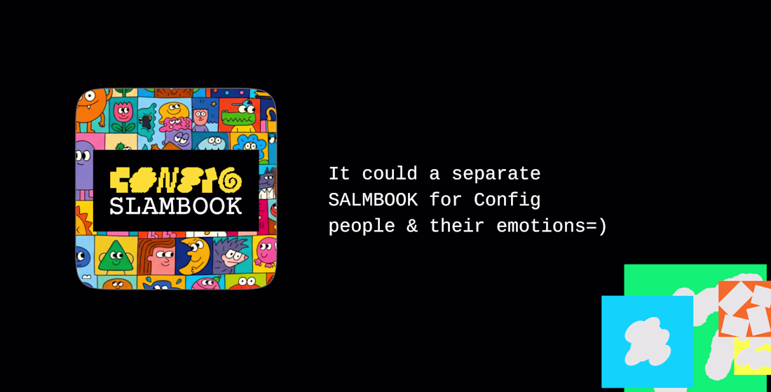
This concept could work for any community.
Imagine a special Config edition where attendees share their photos, inspirations, favorite talks, creative superpowers, or memorable moments from the event.
A little internet corner where creativity, personality, and community come together 💛
If it resonates, pass it on and start your own page 💛
If you really love it, I’d be sooo grateful for your support. Every goat, like, comment, share, means so much for me. Thank you!
Project Link:
https://slambook.figma.site
Video Instagram:
https://www.instagram.com/reel/DZpeUvBo4bs/?igsh=bDhhMnc1aXlzODls
Let's make this slambook really worldwide =))) Add your pages https://slambook.figma.site 😍 WHO NEXT?
Stop making flat Figma prototypes — make them feel 10x more realistic! ❌
Last call to join the Config Makeathon and get a chance to win $100k!
This single feature just changed my entire design workflow forever ✨
Trending
Claude
Claude has entered the design space. How are you using Claude Design?
Contra University
Learn from expert creatives how to earn more using next-gen AI tools.
MagicPath
The canvas is infinite, and exploration is becoming the workflow. How are you using MagicPath?
creativeaiflow
Creative AI workflows are evolving. What tools do you use, and what are their strengths and weaknesses?
freelancerlife
Freelancer life is wins, pivots, and everything in between. What’s yours right now?