The network for creativity
Join 1.25M professional creatives like you
Connect with clients, get discovered, and run your business 100% commission-free
Creatives on Contra have earned over $150M and we are just getting started
Back to feedPost

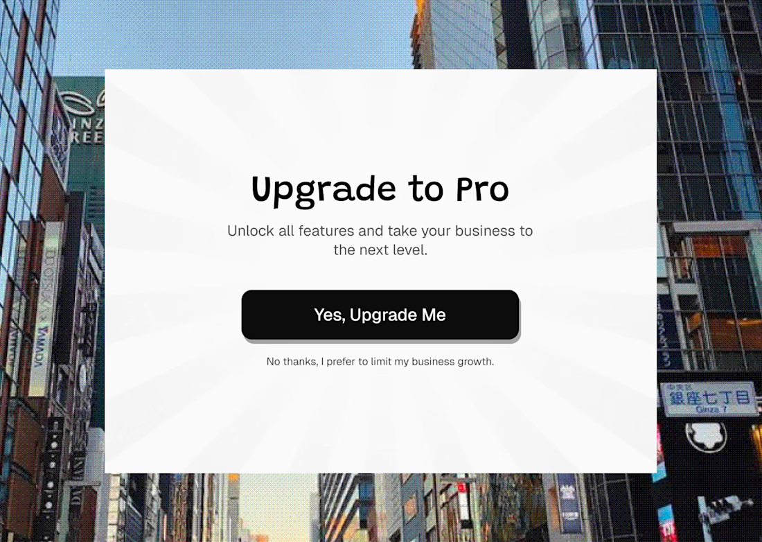
Today I wanna talk about something I see in a lot of products, Confirmshaming.
Have you ever clicked "No thanks" and somehow felt guilty for it?
That’s the trick.
Instead of simply letting you say no, the product makes your decision feel like a bad one.
"No thanks, I prefer to limit my business growth."
Now you’re not just saying no to an upgrade. You’re being made to feel like you’re choosing against your own growth.
And that’s exactly why it works.
The idea is to make saying no uncomfortable enough that saying yes feels like the easier option.
But founders, there’s something worth thinking about here.
A click is not the same thing as trust.
You might get the conversion today, but if users feel manipulated every time they interact with your product, that feeling stays with the brand.
Good UX should make the decision clear.
It shouldn’t make people feel bad for making one.
I put together a quick example of what confirmshaming looks like.
Have you come across this in a product before?

The network for creativity
Join 1.25M professional creatives like you
Connect with clients, get discovered, and run your business 100% commission-free
Creatives on Contra have earned over $150M and we are just getting started
Trending
retrofuturism
Share your favorite designs from the past exploring the distant future. Or your own take on the aesthetic 🚀
halftone
Dots. Texture. Grain. Let's see your designs using the halftone technique.

Midjourney
Creatives are showing off what they're making with Midjourney.
colorgrade
Video editors sound off: How do you enhance the mood of your video in color grading?


Related posts


A peek behind the curtain. ✨🔌
We're deep in production on a new website - and it's loud. Pink, bold, unapologetic, and impossible to mistake for another company's website. 👠
👀 btw, we built this whole backstage flow in @Figma Weave! Prompts, reference nodes, a model running loops until the wires, and every screen sit exactly right.
👇 Guess what industry this one's for!
AI Video ProductionCreative Design Motion DesignAdobe After EffectsFigmaLummifigmaweavecreativeprojectmotiondesign


Waiting for your new case study, they're so spectacular 😍




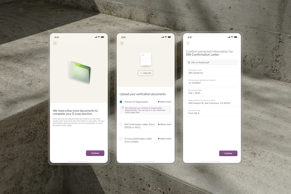
OCR extracts business names, formation dates, and addresses from uploaded documents automatically. But users still need to trust what the system found before anything gets submitted.
We designed the confirmation flow around editable fields that surface extracted data clearly. Users review what the system found and correct where needed, rather than typing everything from scratch. The design choice was to make the AI output feel transparent and controllable.
The design choice was to make the AI output feel transparent and controllable. The result is a flow that reduces data entry to the minimum while keeping users fully in control of what gets submitted.

The editable-fields approach is smart, letting people verify OCR output instead of trusting it blindly probably saves you a ton of support tickets down the line.