The network for creativity
Join 1.25M professional creatives like you
Connect with clients, get discovered, and run your business 100% commission-free
Creatives on Contra have earned over $150M and we are just getting started
Back to feedPost
Taste Test



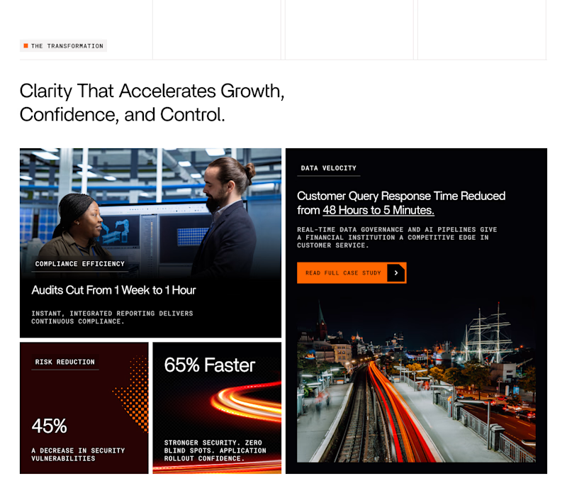
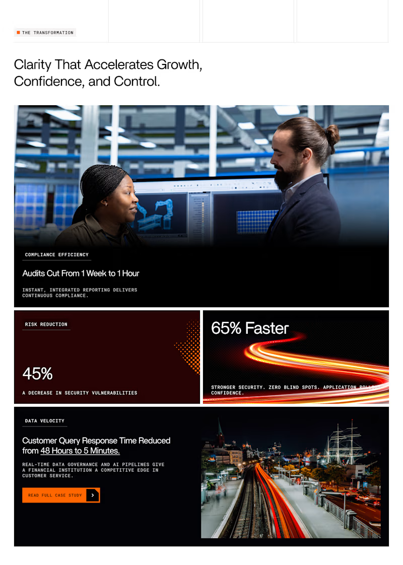

Grid 1.

Grid 1 for me, the diagonal stagger between the two image blocks gives it more movement than the stacked layout in Grid 2. Is this for a live case study page or still in exploration?


Option one just flows better.

grid 1

grid 1 looks better, Also the image are slightly better visible

I personally prefer grid 1

Grid one looks perfect @Anush | Foundrline

Grid 1 shows clarity

Going with the second grid


I like grid one better... It captures everything in one frame without scrolling. Give that quick skimming vibe.

I'm loving Grid 1! The way the text and the left side of the grid align perfectly while the right side brings that unfamiliar shape to the grid really works in my eyes.

I love the option the two

grid 1

i think grid 1 looks better for news letter design

Grid / option 1 feels more spaced out / smoother on the eye. It feels more balanced out geometrically.

I’ll go with grid 1
All card sections are given better hierarchy here
The network for creativity
Join 1.25M professional creatives like you
Connect with clients, get discovered, and run your business 100% commission-free
Creatives on Contra have earned over $150M and we are just getting started
Related posts



Awesome design !


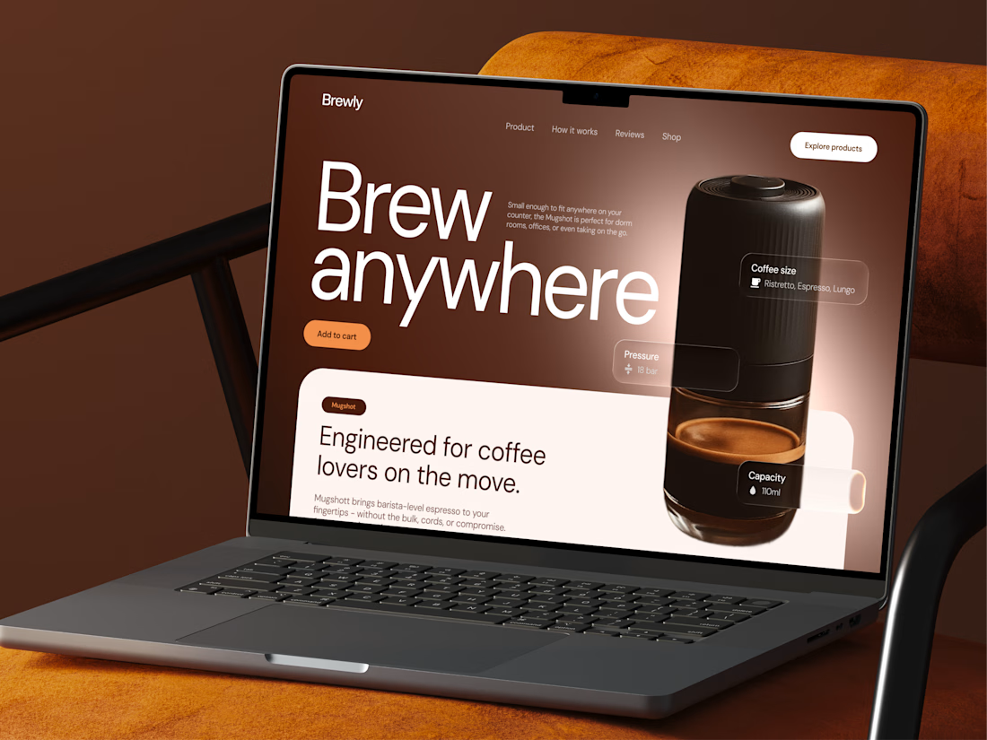
Check out a new concept of coffee maker machine ☕ What do you think?



Great attention to spacing and composition.

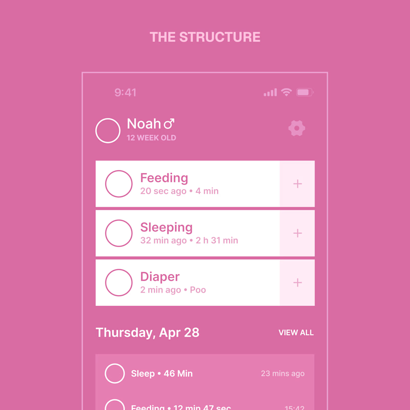
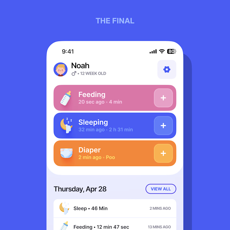
Every screen I design starts flat – structure first, style second.
When a designer shows a case, which do you actually want to see?
Same screen, two stages.
3 voted
21%
11 voted
79%
14 votes
Closed
Love it. The final










Trending

Claude
Claude has entered the design space. How are you using Claude Design?

Contra University
Learn from expert creatives how to earn more using next-gen AI tools.
creativeaiflow
Creative AI workflows are evolving. What tools do you use, and what are their strengths and weaknesses?
freelancerlife
Freelancer life is wins, pivots, and everything in between. What’s yours right now?