The network for creativity
Join 1.25M professional creatives like you
Connect with clients, get discovered, and run your business 100% commission-free
Creatives on Contra have earned over $150M and we are just getting started
Back to feedPost

Idea @Ben Huffman
Hiring workspace and independent workspace should use a different color palette.
I keep forgetting which one I'm in. One time even got to the point of sending a contract using the wrong workspace (almost hire my client 😅).
Maybe I'm just stupid, but having some color or any other type visual distinction won't hurt.
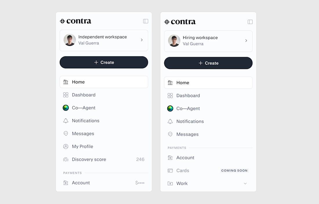

A subtle workspace-specific color system would make the context switch instantly legible. It’s a small visual cue with a big usability payoff.

Those two screens really do look almost identical. A clearer workspace label alongside the color change would help.

Yes, that makes sense


yes please, i mix them up all the time
The network for creativity
Join 1.25M professional creatives like you
Connect with clients, get discovered, and run your business 100% commission-free
Creatives on Contra have earned over $150M and we are just getting started








Related posts


Something About Colour
Visual Storytelling · Creative Direction · Short Form Video
Overview
A three part video series exploring the colours blue, yellow, and red through visual details and everyday moments in Sicily and Lisbon.
My Approach
Developed the concept, hunted for colours, filmed, and edited each video into a cohesive visual storytelling series designed to capture attention on social media.
Results
Over 1.1 million views across the colour hunting series.
Services
Creative Concept · Creative Direction · Visual Research · Filming · Video Editing · Social Media Storytelling

A great workspace is more than a desk and a chair, it’s the light, mood, colors, and little details that make you actually want to create there. This setup gets that balance really well.

Where do you do your best work: desk, bed, another space ??
i love my quiet mornings in my bedroom-office, my two cats keeping me company sometimes. So I built this room around my ideal space: soft natural light coming in through the window, balanced by moody lamps (fluorescents...




The Aisha birthday set is gorgeous, that magenta and orange pairing with the marble texture has real energy. The binder clip detail on the 29 October tag is a lovely touch.