The network for creativity
Join 1.25M professional creatives like you
Connect with clients, get discovered, and run your business 100% commission-free
Creatives on Contra have earned over $150M and we are just getting started
Back to feedPost

About us section for a Personal site i am working on
Need a sales-focused landing page, site, branding?
Book an intro call 👇🏻
https://calendly.com/book-a-15mins-call/theframerdude


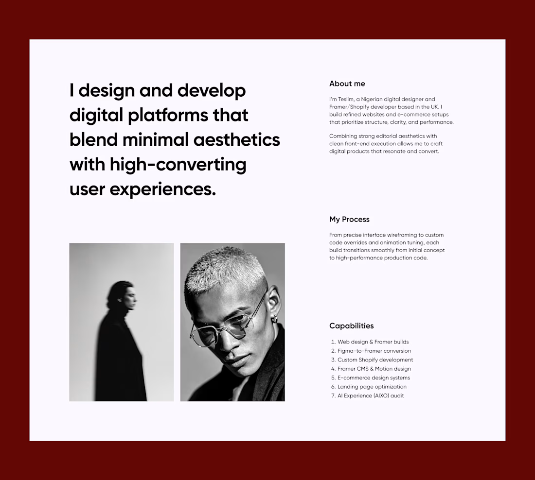

Clean About Us section Teslim! That "minimal aesthetics with high-converting UX" copy is on point for a personal site. Love the layout - bold statement on left, process + capabilities on right with the B&W imagery - super premium and sales-focused without being pushy. Framer build going to look fire!
The network for creativity
Join 1.25M professional creatives like you
Connect with clients, get discovered, and run your business 100% commission-free
Creatives on Contra have earned over $150M and we are just getting started








Related posts


new work is live. quite proud of this one!

I like this


Fresh case study 🚀🚀🚀
Brand identity for Peak, an all-in-one website builder for WordPress that I design and build. A four-letter mark, a warm paper-and-ember palette and one system that runs from the favicon to the packaging.

A four-letter mark that has to hold from favicon to packaging is a tough constraint. Did you draw one letterform first and build the other three from it, or design them together as a set from the start?

Beautiful Grid effect that follows your cursor
Interactive footer built in Framer


