The network for creativity
Join 1.25M professional creatives like you
Connect with clients, get discovered, and run your business 100% commission-free
Creatives on Contra have earned over $150M and we are just getting started
Back to feedPost

Custom Password Component designed in Jetpack Compose.
The network for creativity
Join 1.25M professional creatives like you
Connect with clients, get discovered, and run your business 100% commission-free
Creatives on Contra have earned over $150M and we are just getting started






Related posts


Cargonic is my first Framer template, made for logistics companies. It uses warm neutrals and a single yellow accent, and the hero plane climbs a dotted flight path as you scroll.


New Framer Component: Soft Tools Card
A soft-UI integrations card with working toggles, upload-your-own logos, and a stacked-card look.
You can customize fonts, colors, shadows, toggles, and animations from the property panel.
Great for SaaS integration pages, settings screens, and dashboards.
Quick demo in the video


The soft shadows on that integrations card give it such a gentle, tactile feel, and the working toggles with upload-your-own logos make it feel like a real component rather than a mockup. Being able to tweak fonts, colors and shadows from the property panel is the cherry on top.

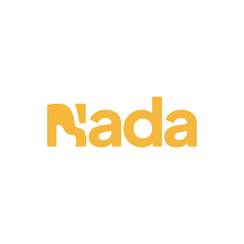
Challenge: Nada's old logo had a unique shape, but the "N" was hard to read and the design didn't connect to music.
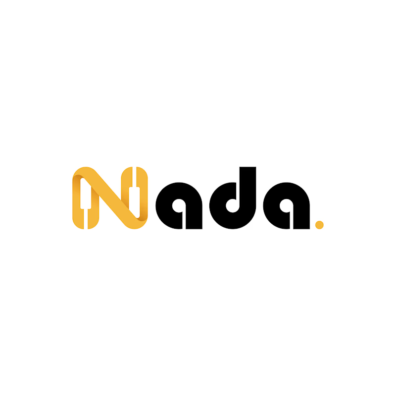
Solution: I redesigned the logo with a piano-built "N" monogram and letterforms that carry music notes. A golden dot closes the wordmark like a final note. The warm gold stays, now paired with black for a more premium look.
Result: A clearer, more memorable logo that tells the brand story at a glance. The client loved it.
1 vote
Ends in 1d

The piano keys forming the N is a smart fix, it solves the readability problem and the music link in one move. The golden dot as a final note is a lovely detail.