The network for creativity
Join 1.25M professional creatives like you
Connect with clients, get discovered, and run your business 100% commission-free
Creatives on Contra have earned over $150M and we are just getting started
Back to feedPost

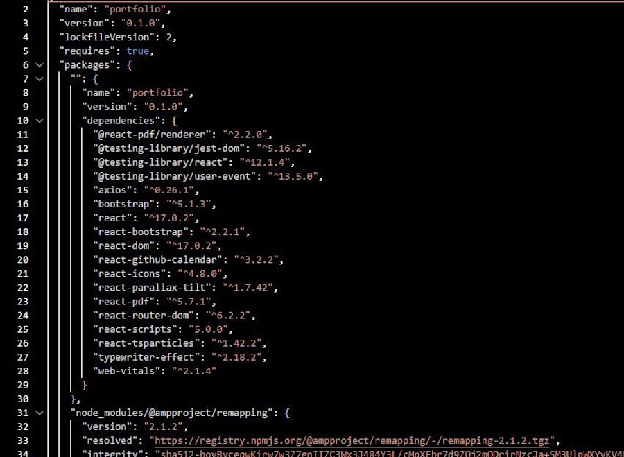
Built my personal developer portfolio with React
A modern, fully responsive portfolio website with a dark purple theme, animated particle background, typewriter intro, project showcase, live GitHub contribution calendar and a built-in PDF resume viewer.
What I focused on:
Clean, responsive UI that works on mobile, tablet and desktop
Smooth animations and interactive effects without hurting performance
Reusable React components and organized project structure
Fast loading and easy-to-update content
Tech stack: React, React Router, React Bootstrap, JavaScript, CSS3, Axios
I am now open for freelance work in web and full stack development, including React front ends, Node.js/Express back ends, REST APIs and MongoDB databases.
Looking for a developer who delivers clean code and clear communication? Let's talk.
The network for creativity
Join 1.25M professional creatives like you
Connect with clients, get discovered, and run your business 100% commission-free
Creatives on Contra have earned over $150M and we are just getting started





Related posts

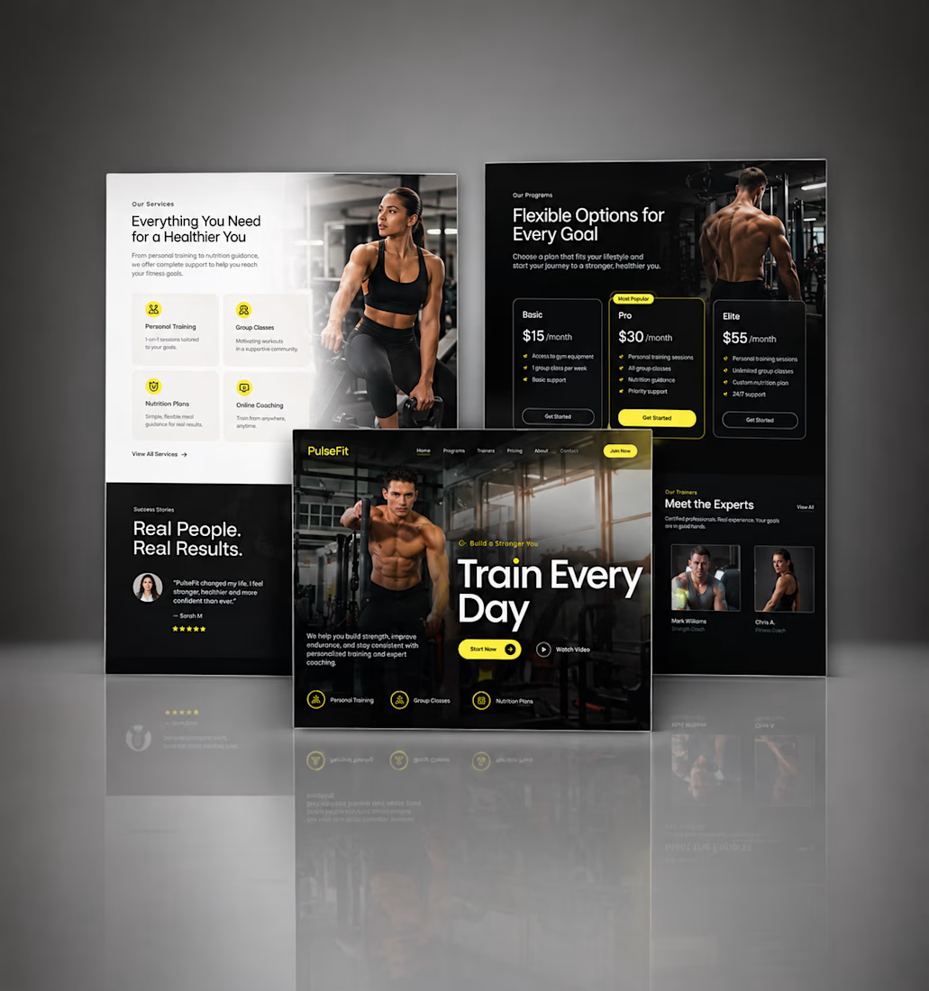
Kajabi Gym & Fitness Landing Page Design
The client needed a focused landing page for their gym and fitness offering that could present the program clearly and encourage visitors to take the next step.
I designed the landing page in Kajabi with a strong visual hierarchy, clear sections for the fitness program, benefits, social proof, and calls to action. The layout was also structured to work smoothly across desktop and mobile.
The result was a clean, focused fitness landing page that makes the offer easier to understand and gives visitors a clear path toward getting started.
#KajabiFitness #KajabiFitnessCoach #KajabiFitnessWebsite #KajabiFitnessLandingPage #FitnessCoachWebsite #FitnessCoachingWebsite #OnlineFitnessCoach #PersonalTrainerWebsite #FitnessLandingPage #GymLandingPage #FitnessProgram #OnlineFitnessProgram #PersonalTraining #WeightLossCoach #FitnessFunnel #FitnessSalesPage #GymWebsite #FitnessWebsiteDesign #FitnessWebDesign




Great work, Hesty. I like how you focused on clear hierarchy, social proof, and strong CTAs instead of just making the page look good. That combination of UX + conversion thinking is what makes a landing page effective.

Heres a project is will soon be starting i wanted to share the web design showcase.


The oversized type and the can bursting out of the peach make this pop. Strong first screen. One small idea: "click now" could say what happens next, like "Shop the 6-pack" or "Find it near you", since a specific action tends to get more clicks than a generic one. If the build...

16:3 Studio is my independent software studio website, designed and developed from the ground up to showcase selected work, services, and my approach to building digital products.
The site combines an editorial-inspired visual system with a clean, structured layout, subtle interactions, and responsive design. I focused on creating a distinct studio identity while keeping the experience fast, accessible, and easy to navigate across devices.
Built with Next.js, TypeScript, Tailwind CSS, and Framer Motion, with an emphasis on reusable components, performance, responsive behavior, and polished frontend details.
My role: Design, Frontend Development & Engineering
Stack: Next.js · TypeScript · Tailwind CSS · Framer Motion




The studio site has a clear way to show both the work and how you build it. I like that you kept the motion subtle. Did you have to make any tradeoffs to keep it fast on mobile?