The network for creativity
Join 1.25M professional creatives like you
Connect with clients, get discovered, and run your business 100% commission-free
Creatives on Contra have earned over $150M and we are just getting started
Back to feedPost

🔥🔥🔥

I built KolaCuts, a premium mobile barber booking platform designed to make booking a grooming appointment simple, fast, and seamless.
The app lets customers explore barber services, view pricing, choose a preferred date and time, enter their location and contact details, review...
The network for creativity
Join 1.25M professional creatives like you
Connect with clients, get discovered, and run your business 100% commission-free
Creatives on Contra have earned over $150M and we are just getting started



Related posts

Started this messages flow in light mode. then I did a dark version just to check. Now I can’t pick, so i’ve handed the decision to strangers on the internet
0 voted
0%
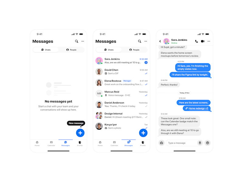
12 voted
100%
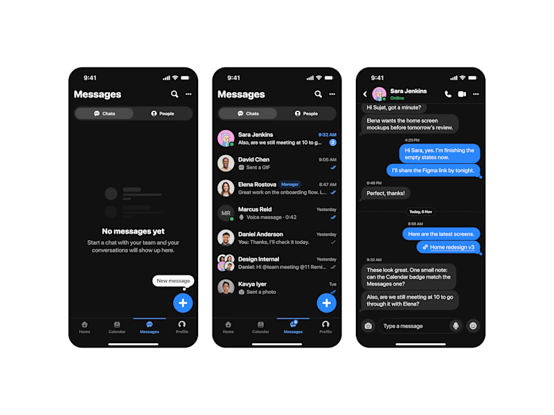
12 votes
Closed

Light mode gets my vote here. The message bubbles and the blue accent have room to breathe against the white, and the timestamps stay readable at a glance. The dark version looks slick, but for a screen people stare at all day, the light one will feel easier on the eyes over a long chat.

Burgy, a mobile concept for burger ordering. 🍔
Bold type, premium food visuals, and a fast path from craving to checkout.
Two color directions for the hero screen. Which one converts better?
Vote and tell me why 👇
Poll options: 🟢 Green | 🔴 Red
#UIDesign #MobileApp #FoodApp #AppDesign #UX #RestaurantApp


13 voted
43%
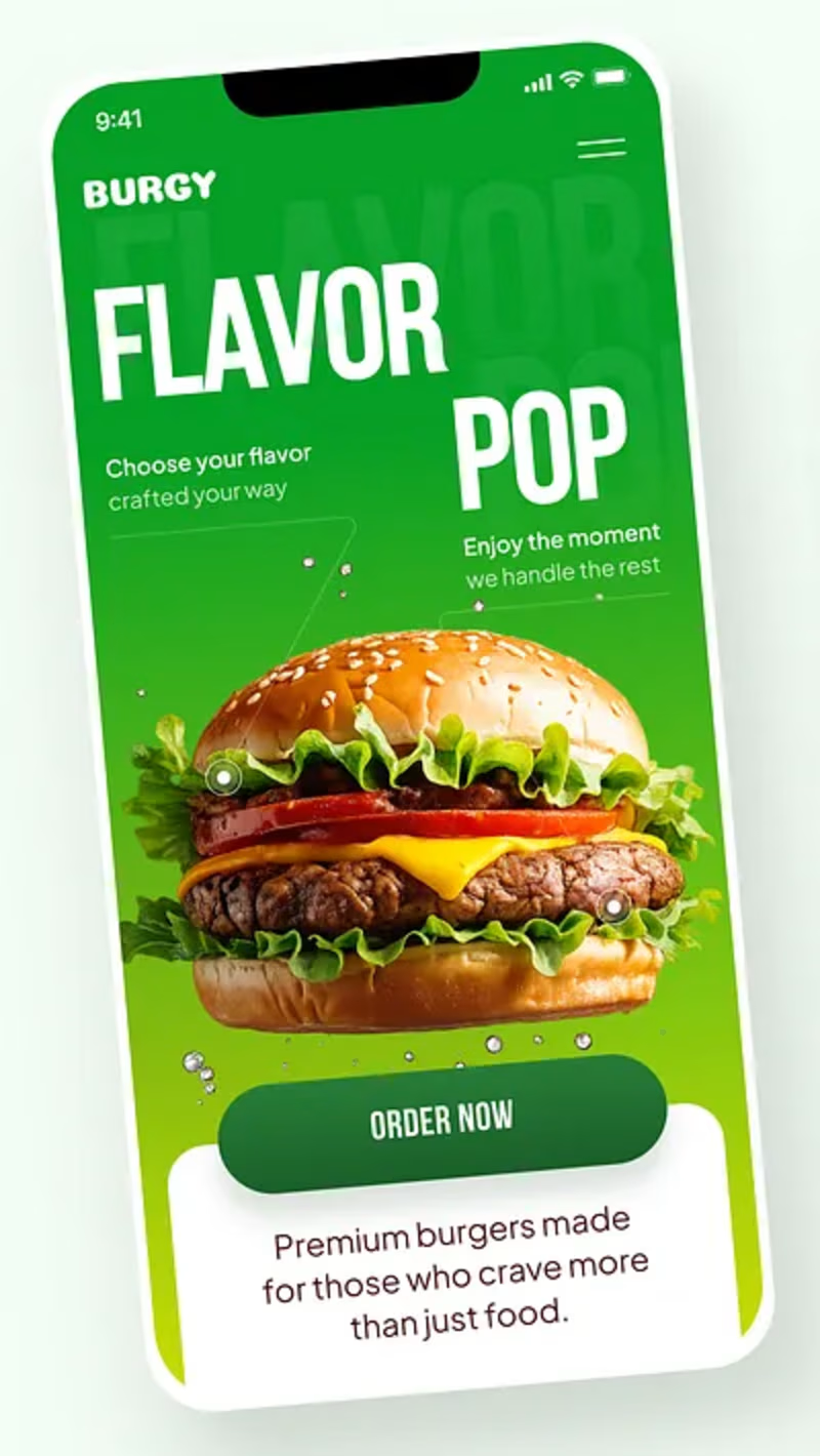
17 voted
57%
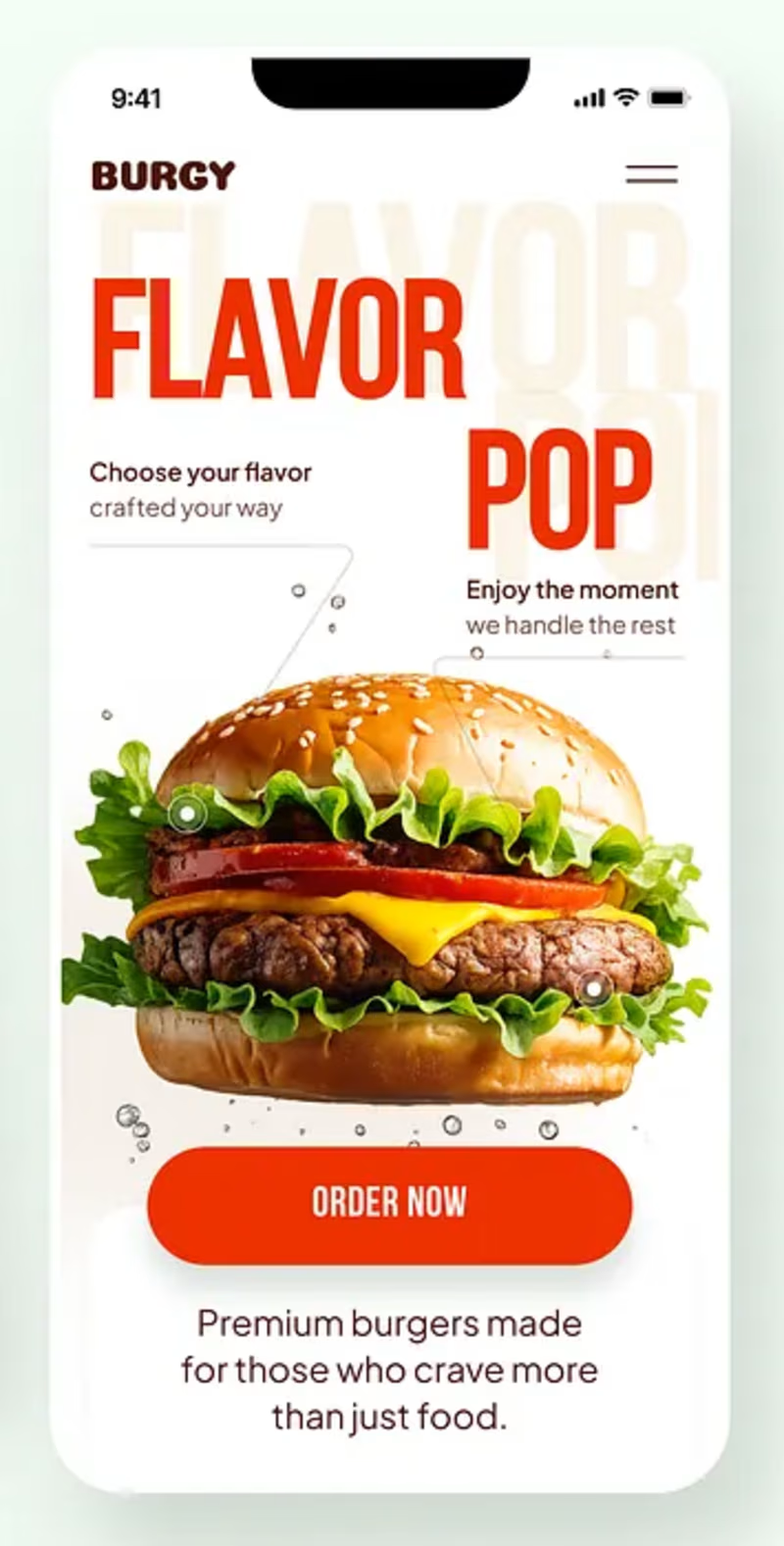
30 votes
Closed
Green for me, and I'd bet on it converting better too. The red version is loud in the way every food app is loud, while the green makes the burger the hero and the screen instantly recognizable in a feed. The green background also gives the white FLAVOR POP type far more contrast, so the message lands a beat faster.

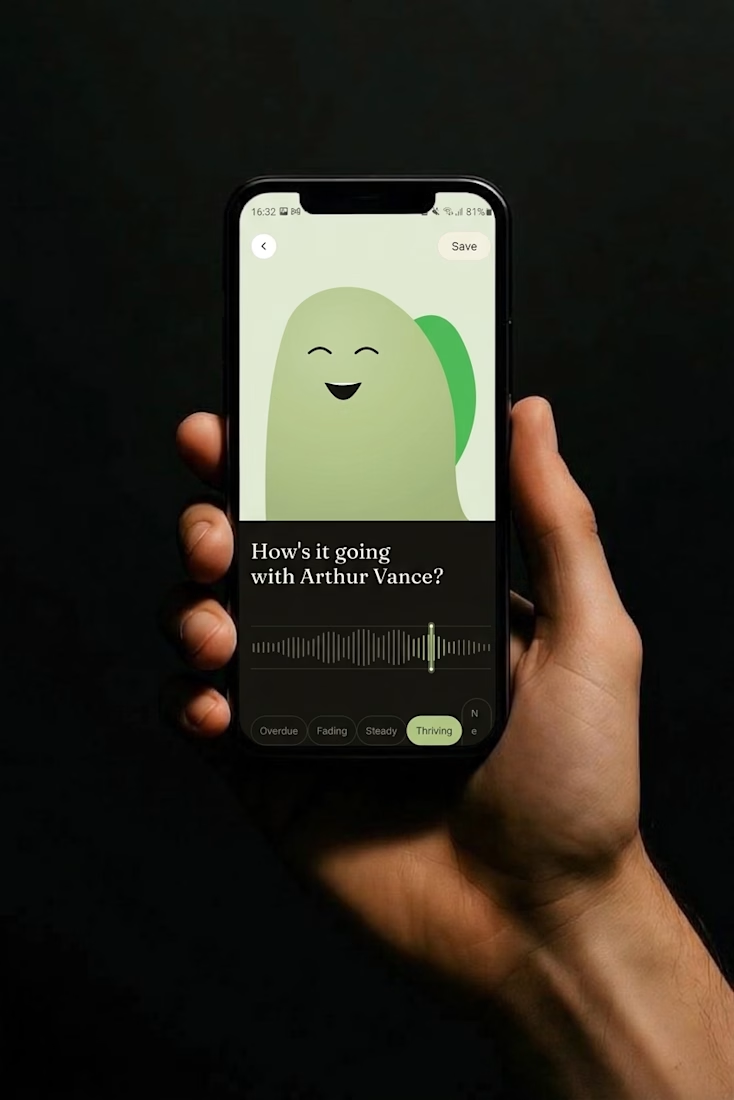
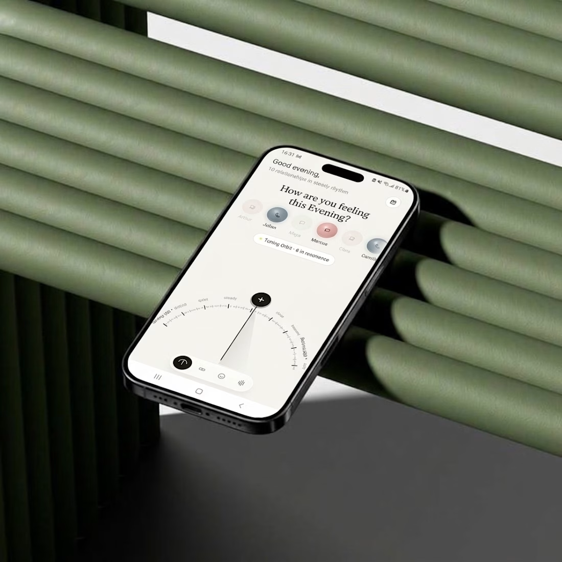
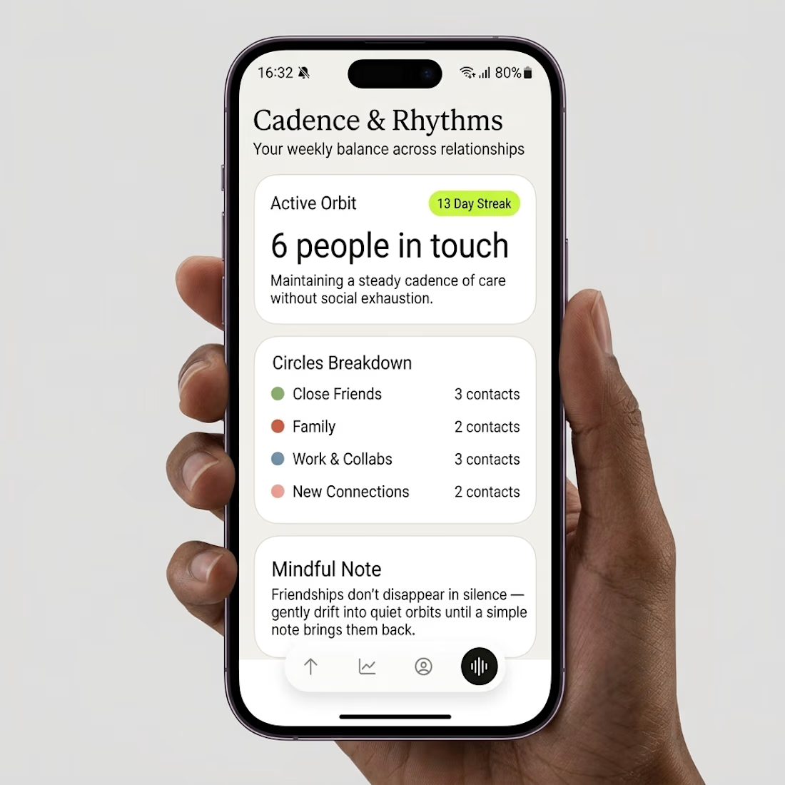
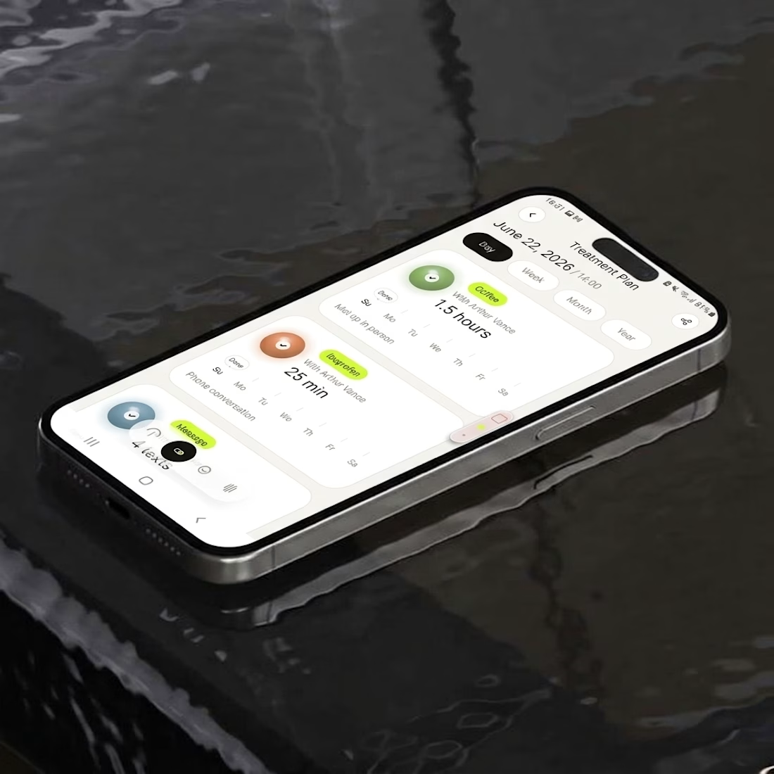
What if your contacts looked less like a phone book and more like a night sky?
Friday app, a day late: Parallax.
Every person is a glowing orb placed by how recently and how often you talk.
Turn a dial to filter by frequency, scrub a word to log how it’s really going.