The network for creativity
Join 1.25M professional creatives like you
Connect with clients, get discovered, and run your business 100% commission-free
Creatives on Contra have earned over $150M and we are just getting started
Back to feedPost

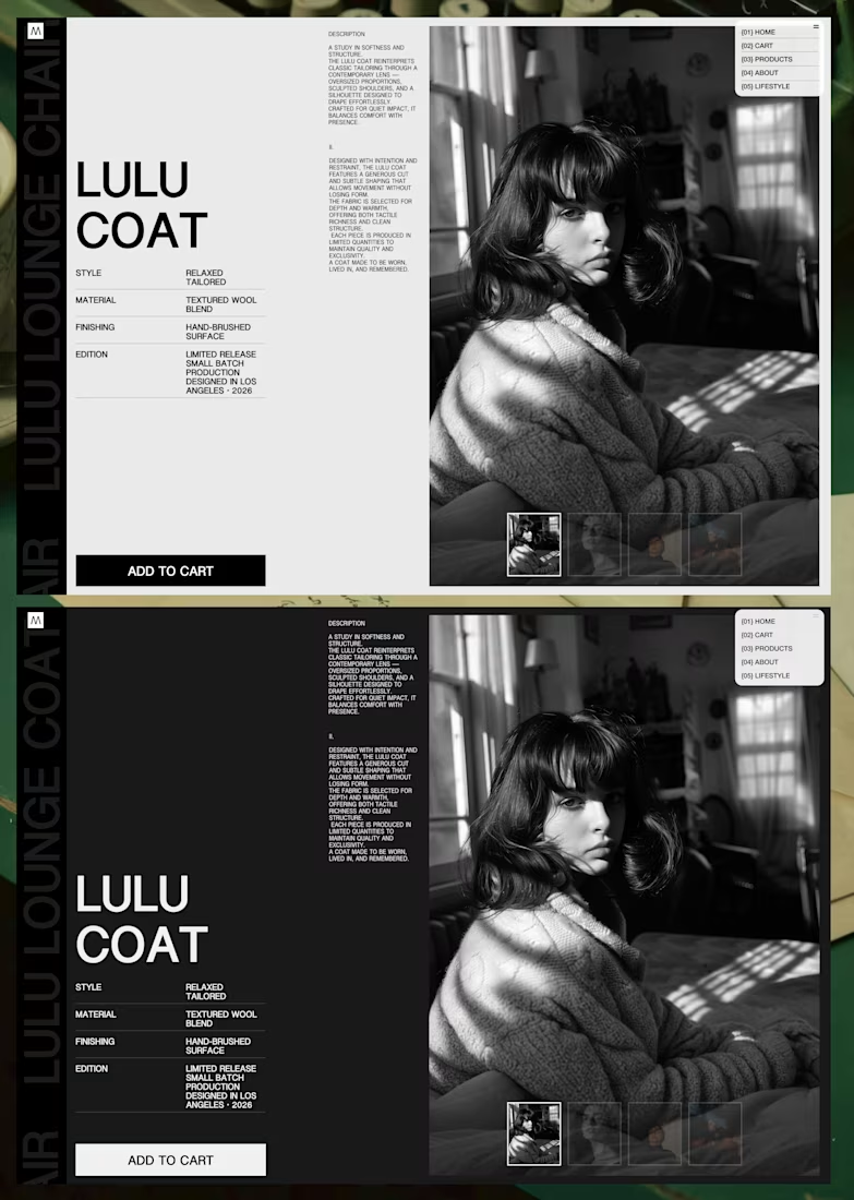
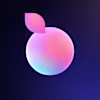
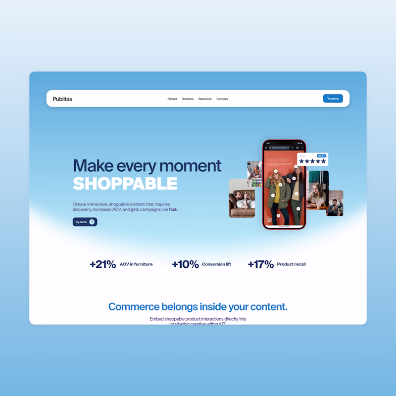
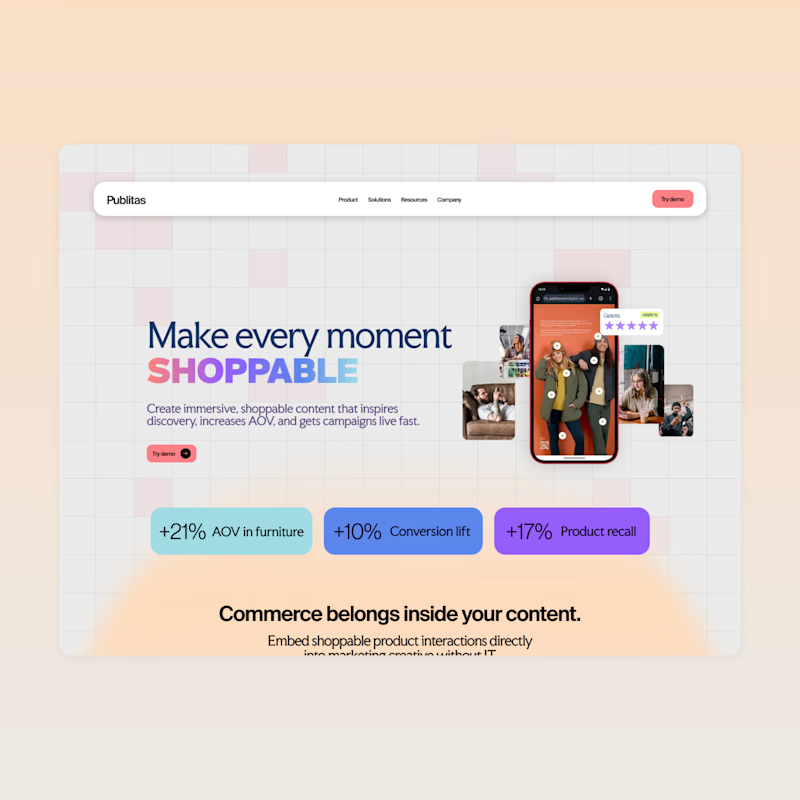
Had a lot of fun refining this product page direction.
Playing around with layout balance, typography weight, and how the imagery carries the mood. Also tested both light and dark versions to see how it shifts the product’s perceived value and overall feel.
Still refining the system, but excited about where this is heading. Would love to hear your thoughts.


Very refined layout balance. Interesting how the light vs dark versions subtly shift the product’s perceived positioning. Curious — did you notice a difference in visual hierarchy or CTA prominence between the two?
The network for creativity
Join 1.25M professional creatives like you
Connect with clients, get discovered, and run your business 100% commission-free
Creatives on Contra have earned over $150M and we are just getting started
Related posts

Designers, we can finally move past building sections and layouts. Threejs is getting easier to make, and we can focus on becoming creative directors.
Using ThreeJS & AI & PeachWeb Builder. I made 3 visual remixes in 1 hour. Just focusing on the brand identity and creative direction. Does that sound like fun?


amazing work done 🔥.

Hero concepts for a new website, which one are we going with?
84 voted
68%
40 voted
32%
124 votes
Closed


blue all the way, brother

Full Branding & Design System


good


Trending
aivideo
AI video tools are moving at warp speed. Which ones are you experimenting with?
illustration
Handcrafted illustration is bubbling up across the web. What are you drawing lately?
aidesignflow
AI tools are redefining design work. What's your current workflow?
returntonature
Spring is a reset for creativity. What’s inspiring you outside the screen right now?
freelancerlife
Freelancer life is wins, pivots, and everything in between. What’s yours right now?