The network for creativity
Join 1.25M professional creatives like you
Connect with clients, get discovered, and run your business 100% commission-free
Creatives on Contra have earned over $150M and we are just getting started
Back to feedPost
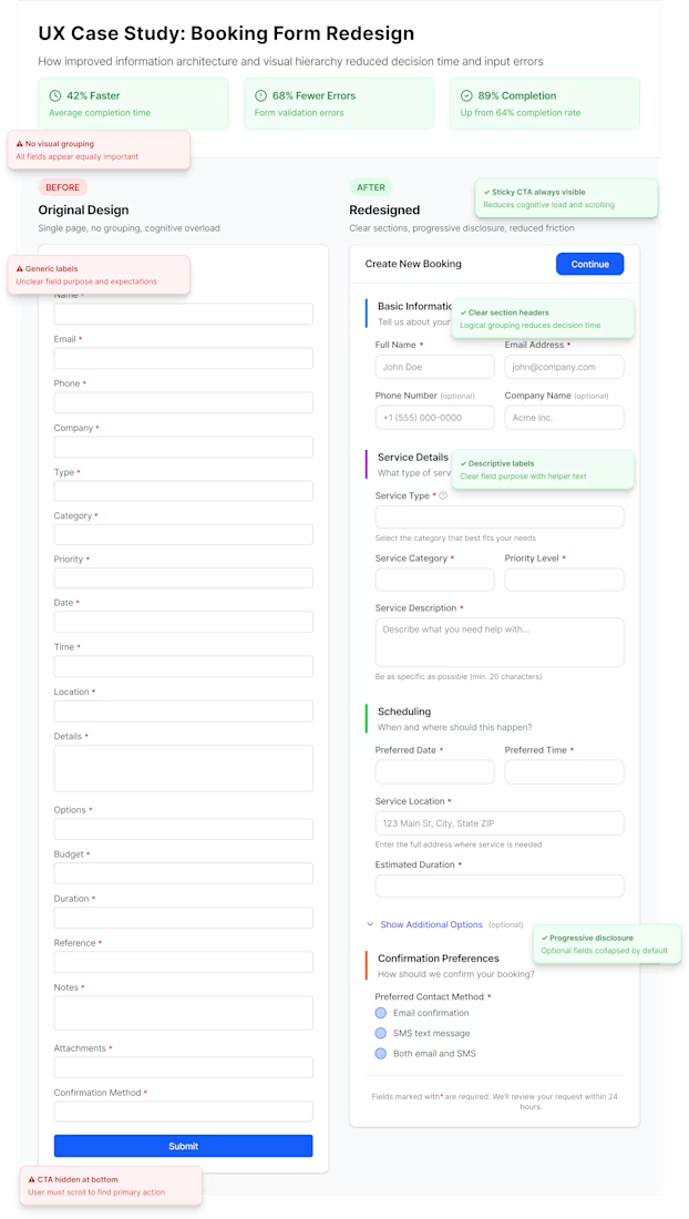
UX Case Study: Booking Form Redesign
The original form had no visual grouping, unclear labels, and a hidden CTA leading to cognitive overload and drop-offs.
I redesigned it using:
• Clear section grouping
• Descriptive labels + helper text
• Progressive disclosure
• Sticky primary CTA
• Stronger visual hierarchy
Results:
🚀 42% faster completion
✅ 68% fewer errors
📈 89% completion rate (up from 64%)
Good UX isn’t just about making things look better; it’s about making decisions easier.
If your product has friction in key flows, let’s fix it.
The network for creativity
Join 1.25M professional creatives like you
Connect with clients, get discovered, and run your business 100% commission-free
Creatives on Contra have earned over $150M and we are just getting started
Related posts
Design is rarely about making things prettier. It's about making better decisions.
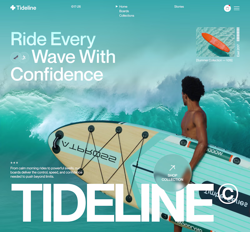
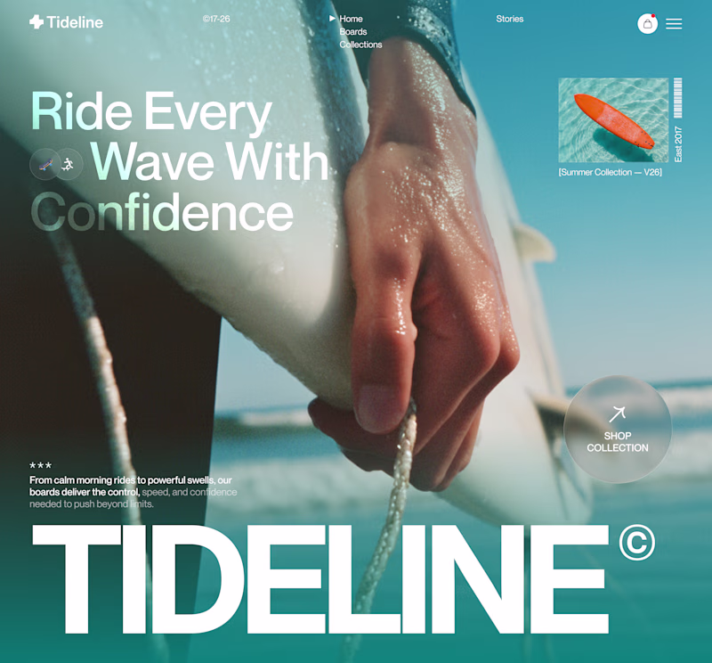
For this surf brand concept, I explored two hero directions.
A → Product-first. Puts the board and experience at the center.
B → Lifestyle-first. Creates a stronger emotional connection before introducing the product.
Which hero creates a stronger first impression?
A or B — and why?
Your feedback helps shape better design decisions.
#UIDesign #LandingPage #WebDesign #Figma #UXDesign #ProductDesign #CreativeDirection #BrandDesign #JuiceLab #DesignProcess
11 voted
32%
23 voted
68%
34 votes
Closed
Both work well, but B feels more premium to me.
Hi Everyone!
Zlotan Speaks is a character based interactive experience built in Rive, where the self proclaimed greatest footballer of all time becomes your personal World Cup oracle.
Players step up to choose a category, and ask a question, and Zlotan gazes into his crystal ball to deliver the answer with facts, flair, and far too much confidence. Every response blends real World Cup history with his signature ego, turning trivia into a mystical audience with a living legend.
The piece is driven by a Rive state machine, each tap moves you through category, question, and answer with the character reacting at every step.
We created the character experience with original illustration, bold typography, and a loud color palette, along with audio and interactive touches.
Link to Project: https://thelittlelabs.com/work/zlotan
Thank you!
really inspiring work
Trending
Claude
Claude has entered the design space. How are you using Claude Design?
Contra University
Learn from expert creatives how to earn more using next-gen AI tools.
fifaworldcup2026
The World Cup is here and the whole world's watching. How are you designing for the world stage?
creativeaiflow
Creative AI workflows are evolving. What tools do you use, and what are their strengths and weaknesses?
freelancerlife
Freelancer life is wins, pivots, and everything in between. What’s yours right now?