The network for creativity
Join 1.25M professional creatives like you
Connect with clients, get discovered, and run your business 100% commission-free
Creatives on Contra have earned over $150M and we are just getting started
Back to feedPost

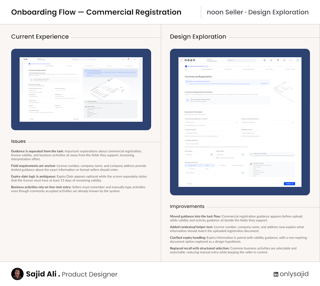
I explored noon Seller’s Commercial Registration onboarding step with one question in mind: Can the seller understand what’s required, complete the step confidently, and know what to do next without searching around the screen?
The current experience contains the necessary information, but some guidance sits away from the fields it supports, sEcommerceputs need more context, and business activities rely on manual entry.
In this design exploration, I moved guidance closer to the task, added contextual helper text, clarified the expiry-date logic, and replaced free-text business activities with a structured searchable selection.
The goal wasn’t to make the form shorter. It was to reduce interpretation effort and make each requirement easier to understand at the moment it matters.
The non-expiring registration option is a design hypothesis and would need validation against noon’s actual compliance rules.
This is an independent exploration based on the publicly visible experience, not a claim that the current solution is wrong.
Which part of seller onboarding usually creates the most uncertainty for you?

The network for creativity
Join 1.25M professional creatives like you
Connect with clients, get discovered, and run your business 100% commission-free
Creatives on Contra have earned over $150M and we are just getting started



Related posts

What if sending money felt a little more like giving a gift?
For Nova, I explored a banking app that brings payments, cards, and a bit of personality together. You can check your balance, browse recent transactions, send or request money, top up, and pay bills.
My favorite part is the digital postcard feature. Before sending a transfer, you can add a little illustrated card—a heart, a birthday greeting, or a playful character. A simple way to make birthday money or a thank-you feel more personal.
I carried that same 3D character into onboarding, pairing it with bold red gradients and large, clear payment details. There’s room for play, while the recipient and amount stay easy to check.
Would you add a postcard to a transfer? I’d love to know what occasion you’d use it for.






AI-Powered Physiotherapy Clinic Dashboard | Smart Appointment Scheduling
A modern AI-powered dashboard concept designed for physiotherapy clinics to simplify appointment scheduling, therapist management, and daily operations. The interface focuses on improving workflow efficiency with an intuitive calendar, smart booking experience, patient scheduling, and a clean visual system.
The design features an elegant and minimal UI, helping healthcare professionals manage appointments, therapists, and patient availability with ease. Every screen is crafted to deliver a fast, accessible, and user-friendly experience while maintaining a premium SaaS aesthetic.


so nice work

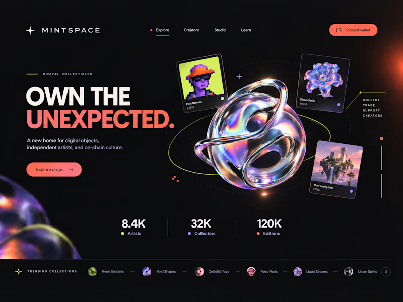
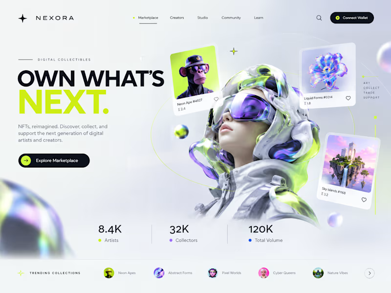
Two directions. One NFT marketplace.
Which visual direction would you choose?
🖤 A — Dark & Futuristic
🤍 B — Bright & Minimal
Both explore the future of Web3, but with completely different visual identities.
Drop your vote in the comments: A or B?
#UIUXDesign #WebDesign #NFT #Web3 #ProductDesign
10 voted
29%
25 voted
71%
35 votes
Closed

Strong design, well done