The network for creativity
Join 1.25M professional creatives like you
Connect with clients, get discovered, and run your business 100% commission-free
Creatives on Contra have earned over $150M and we are just getting started
Back to feedPost

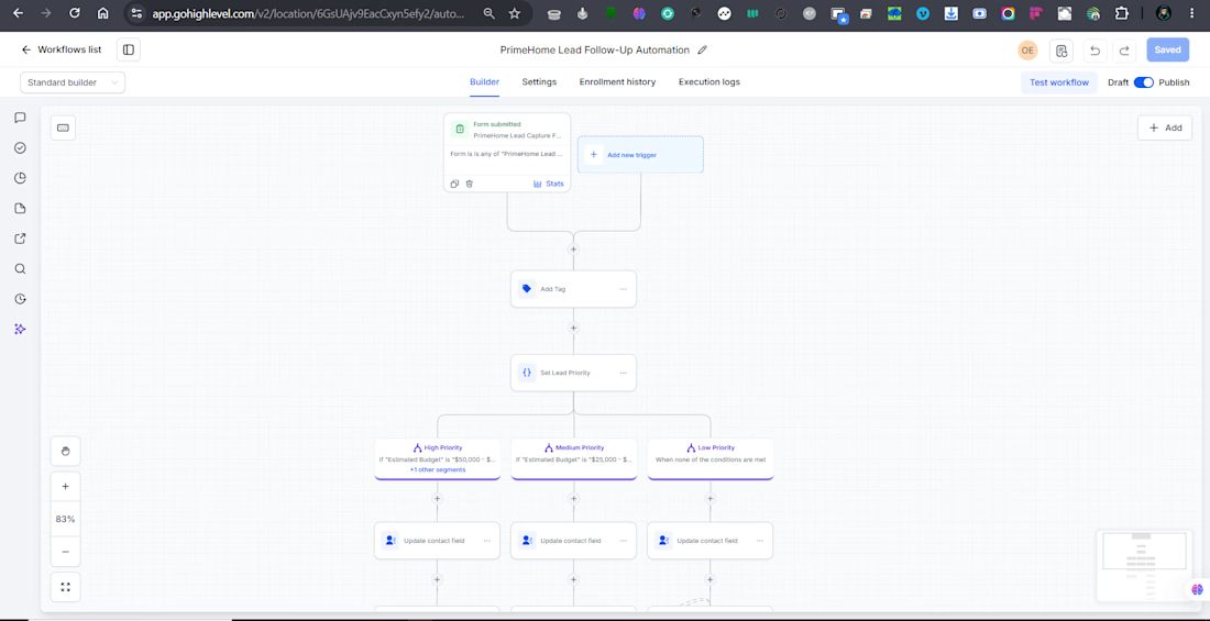
The client wanted a simple way to manage new renovation leads and make sure no inquiry was missed.
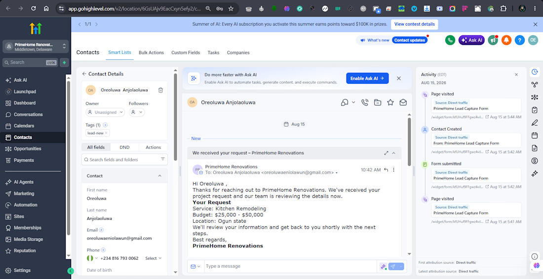
I set up a HighLevel workflow that collects new leads, checks their budget, sorts them by priority, and sends a confirmation email right away.
The client also wanted follow up emails to stop when a lead replied, so I added that as well
After setting everything up, the client had a simple system that handled new leads automatically. Leads were captured, sorted by priority, contacted right away, and followed up without the team having to do it manually.
This helped the client save time, stay on top of new inquiries, and make sure good leads did not get missed.


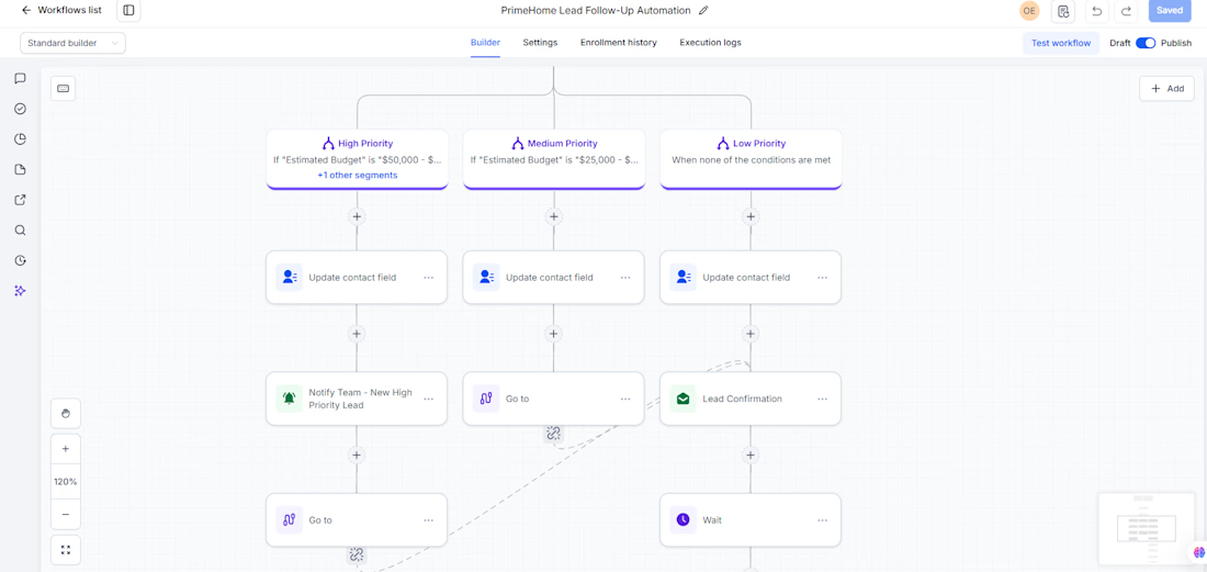
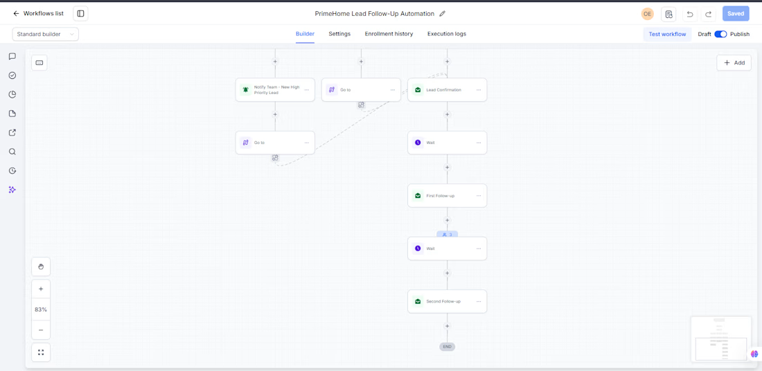


The reply detection stopping the follow up sequence is the detail that separates a well built workflow from one that annoys leads into going cold. most people set up the follow up and forget to add the exit condition. that one addition alone changes how the whole system feels to the person on the receiving end
The network for creativity
Join 1.25M professional creatives like you
Connect with clients, get discovered, and run your business 100% commission-free
Creatives on Contra have earned over $150M and we are just getting started









Related posts

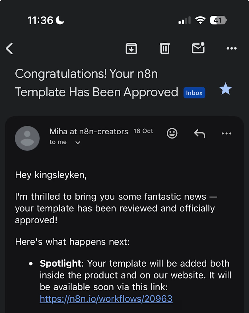
My first n8n template is now live in the official n8n library, and it is free to use.
After a sales call, most people either rush the follow-up email or forget it. This workflow does the first draft for you.
When Fireflies finishes transcribing a call, it:
pulls the full transcript
uses OpenAI to write call notes: a summary, open questions, the next step and the outcome
saves a follow-up email to the contact as a Gmail draft
logs the call in Google Sheets and emails you the notes
Nothing is sent to the contact automatically. The follow-up waits in your drafts until you check it and press send.
Works with the free Fireflies plan and n8n Cloud.
Get it here: https://n8n.io/workflows/20963

Congrats on getting it approved. Drafting instead of auto-sending is the right default. One edge case worth a guard: calls where the transcript comes back empty or cut short, otherwise the model writes a confident follow-up from almost nothing.

AI Automation SaaS Website Design
AUTONIX is a modern AI automation SaaS website concept designed to help businesses streamline workflows, automate repetitive tasks, and manage AI agents more efficiently.
The design combines a clean, minimal interface with bold typography, futuristic visuals, interactive UI elements, and a seamless user experience. From AI-powered task automation to real-time productivity insights, every section is designed to communicate the value of intelligent automation in a clear and engaging way.
This project explores how thoughtful UI/UX design can make complex AI technology feel intuitive, accessible, and easy to use for modern businesses.
Services: SaaS Website Design, UI/UX Design, Landing Page Design, AI Product Design.


Most AI builds break at the wiring, not the model: no retries, no log of what the model actually did, and no clear line for what the agent may do without a human.
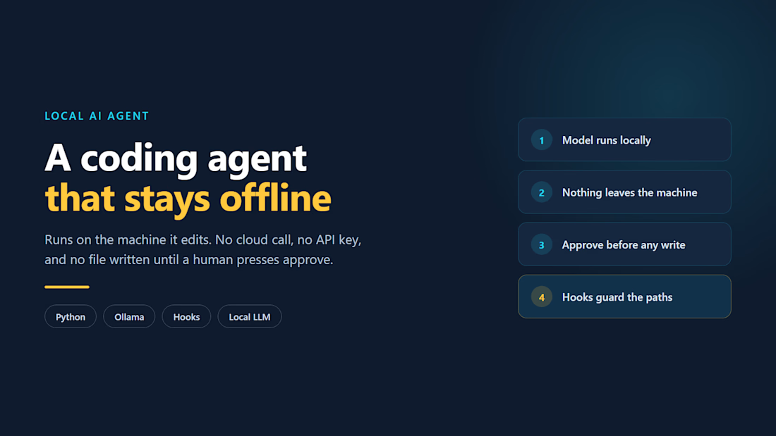
I build that layer. My own products run on it -- an ordering platform where an AI agent handles real orders, and a coding agent that writes no file until someone approves the change.
The question worth answering first is what your agent should never decide on its own.

For me the line is anything irreversible or anything that costs money: refunds, deleting data, messaging customers in bulk. Below that line the agent can act, as long as every tool call is logged with its input and result, so you can replay what it actually did. The detail I'd...