The network for creativity
Join 1.25M professional creatives like you
Connect with clients, get discovered, and run your business 100% commission-free
Creatives on Contra have earned over $150M and we are just getting started
Back to feedPost

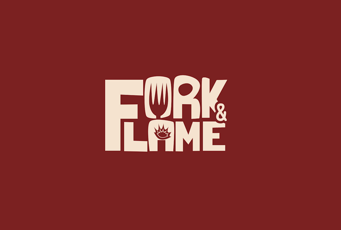
If I ever open a restaurant this is the type of branding I'd want(not loud , just simple enough to carry the message)


Creative

The fork doubling as the K's leg and the flame standing in for the ampersand means the wordmark explains what the place cooks before anyone reads it — more load-bearing than the maroon-and-cream palette people usually praise first.

The network for creativity
Join 1.25M professional creatives like you
Connect with clients, get discovered, and run your business 100% commission-free
Creatives on Contra have earned over $150M and we are just getting started



Related posts

What if your instant noodles were louder than your neighbors? 🔥
LOUD NOODLE is a brand with a big mouth, a red-hot palette and zero chill. The full case study is almost here.
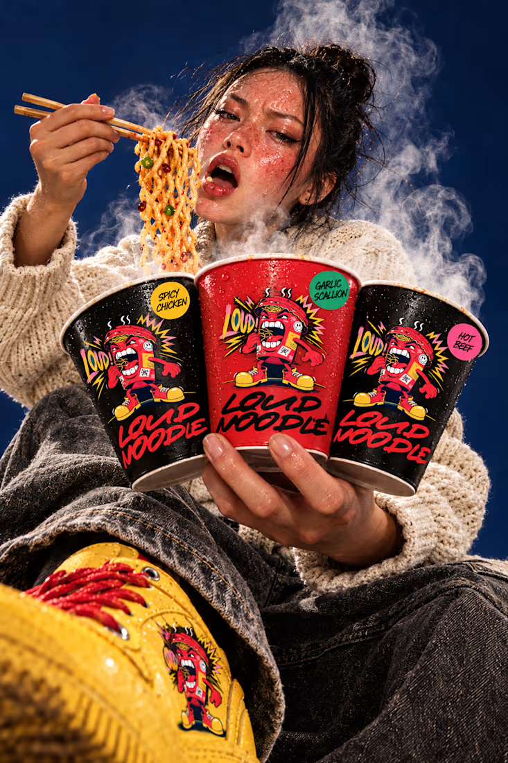
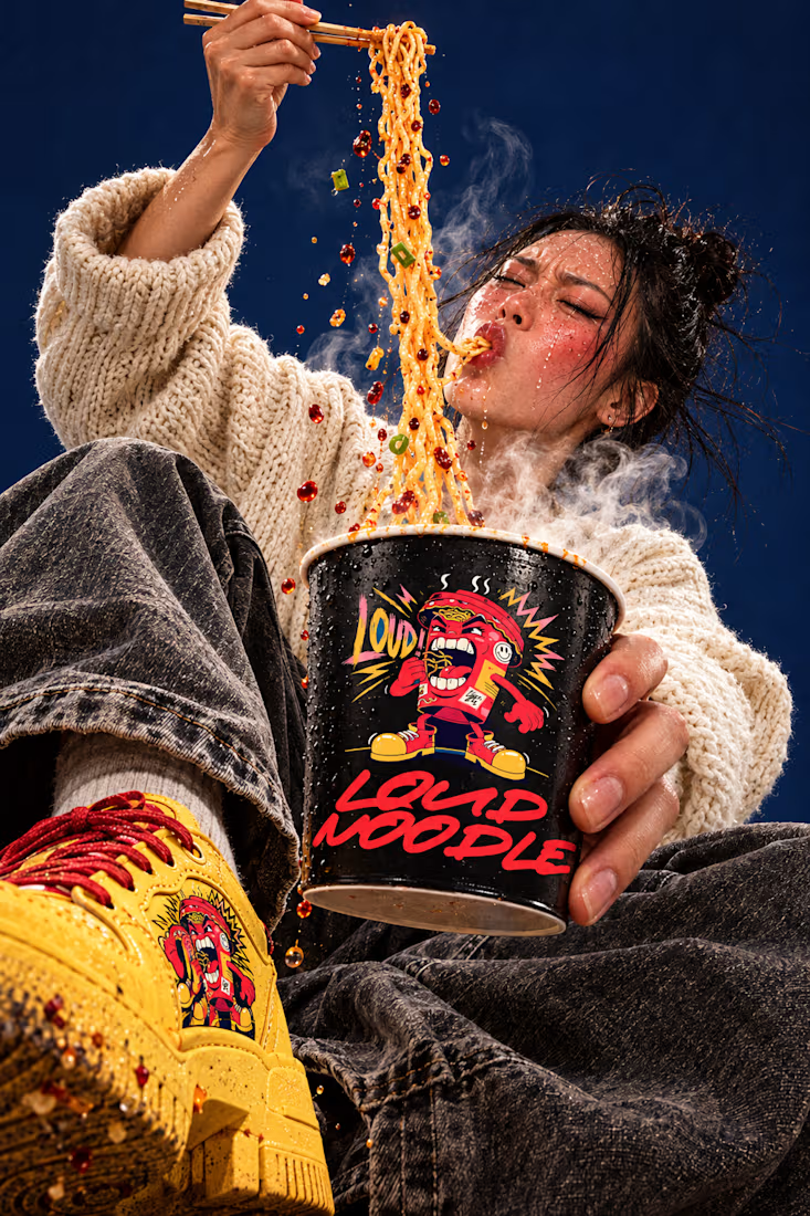
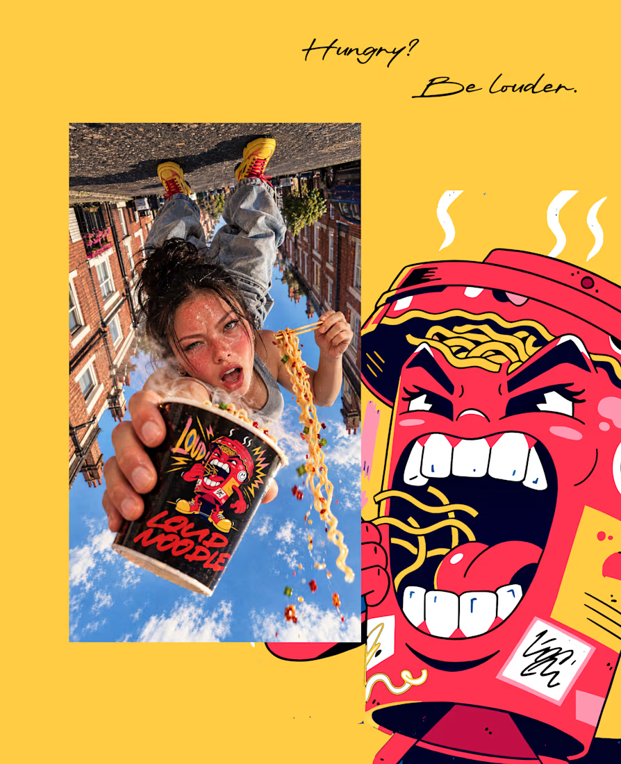
What do you do with a brand that’s 80% done and nobody asked for it?
I have a whole folder of them.
A name here, a palette there, a few campaigns that never saw daylight.
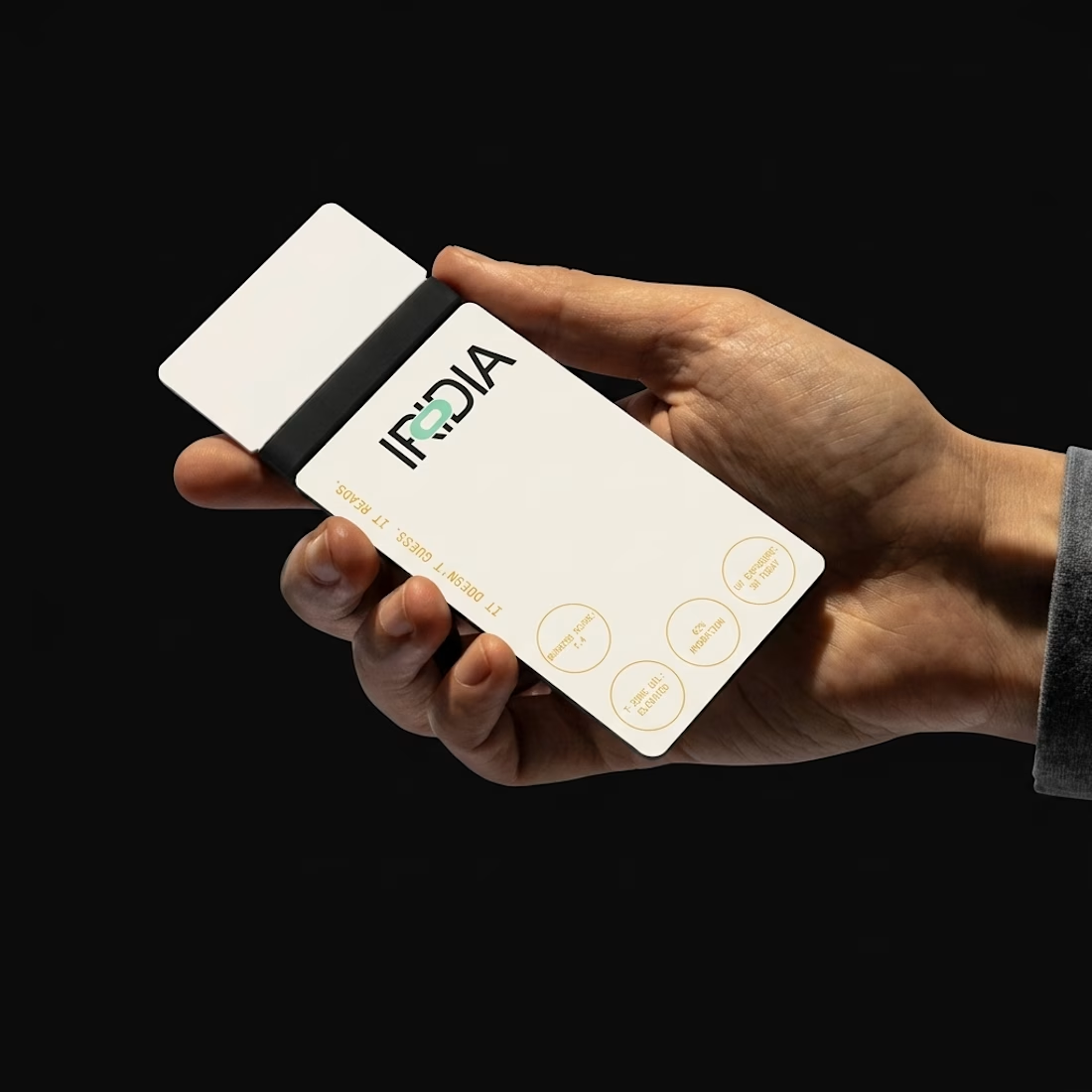
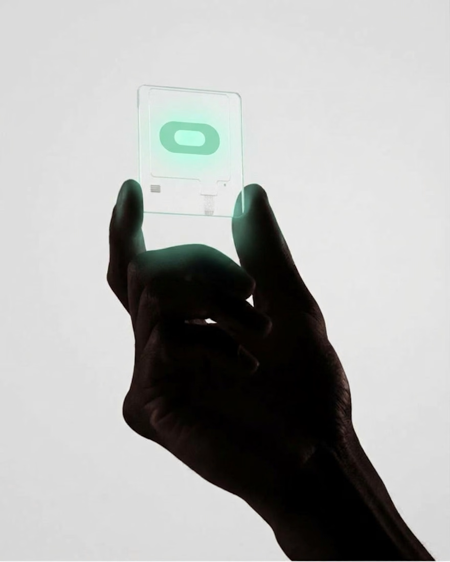
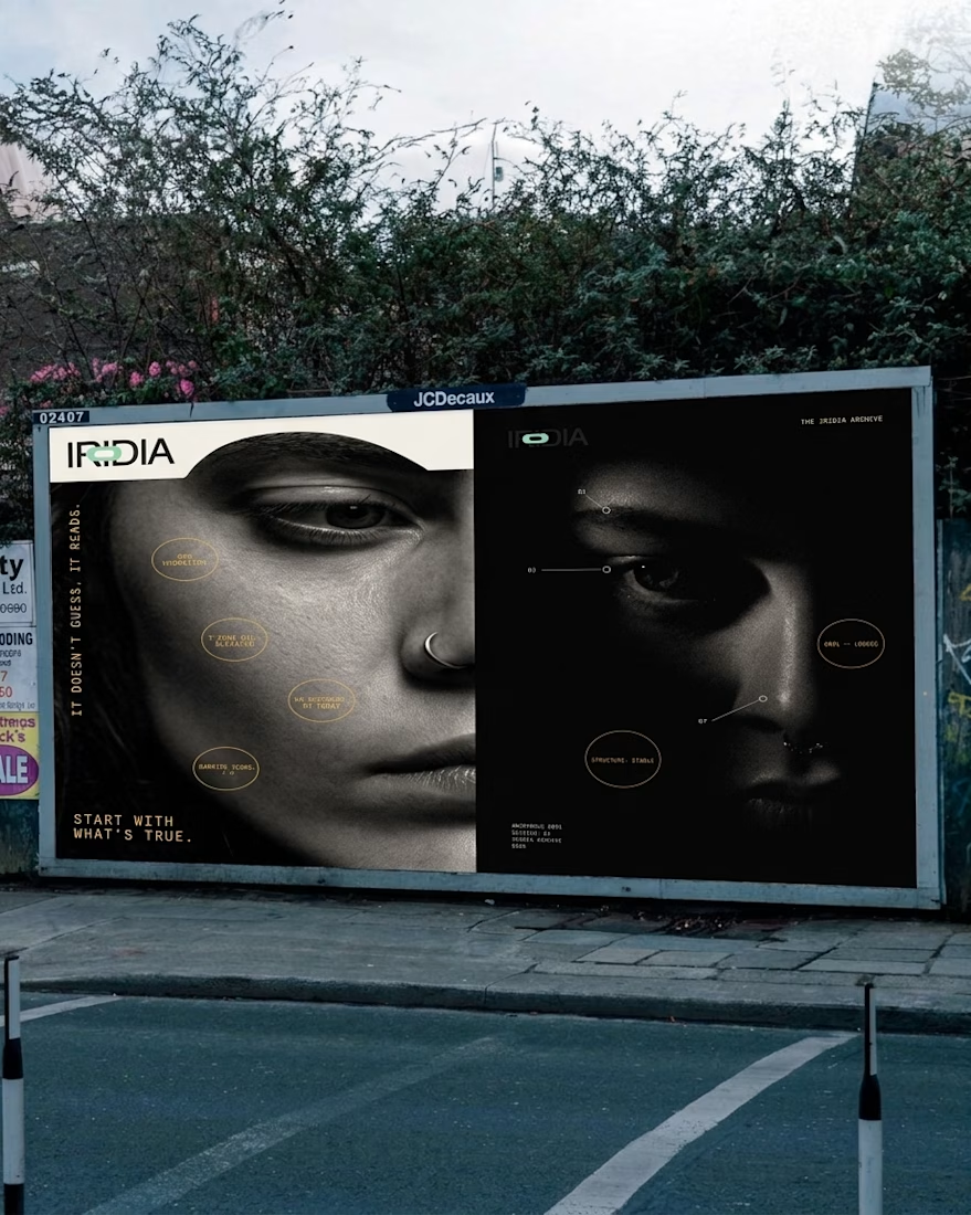
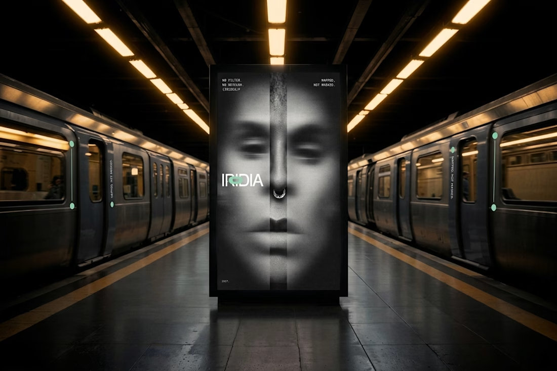
One of them finally got the full treatment. The Iridia case study drops soon.

Absolutely goated


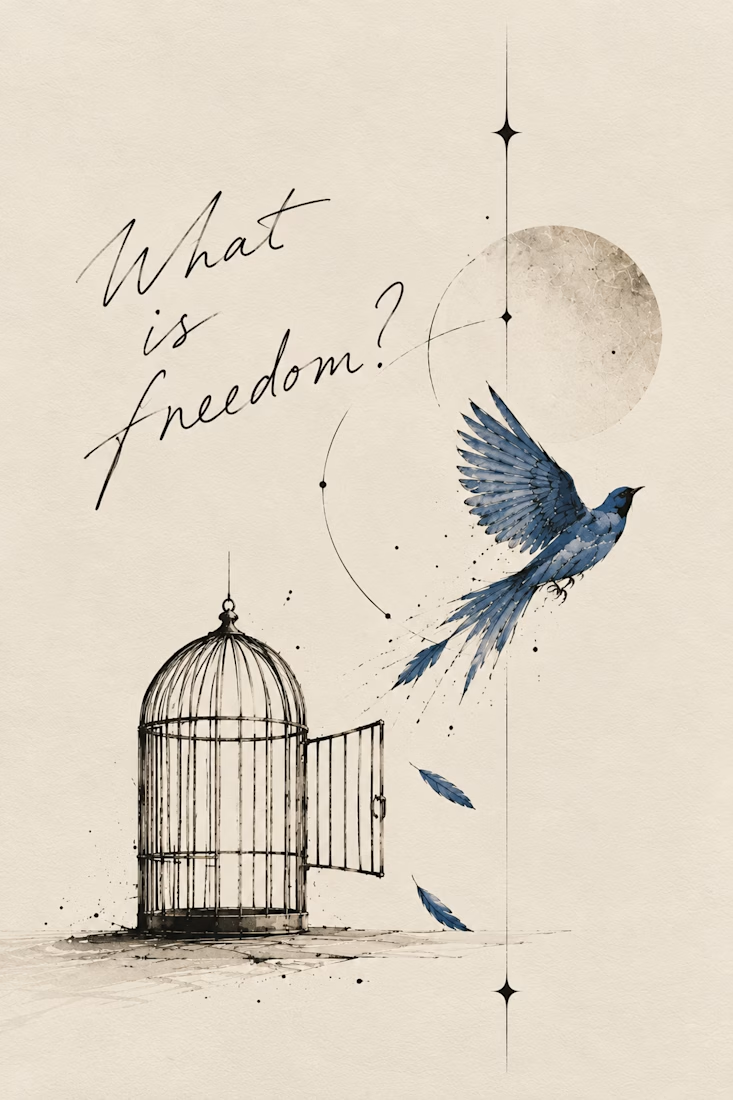
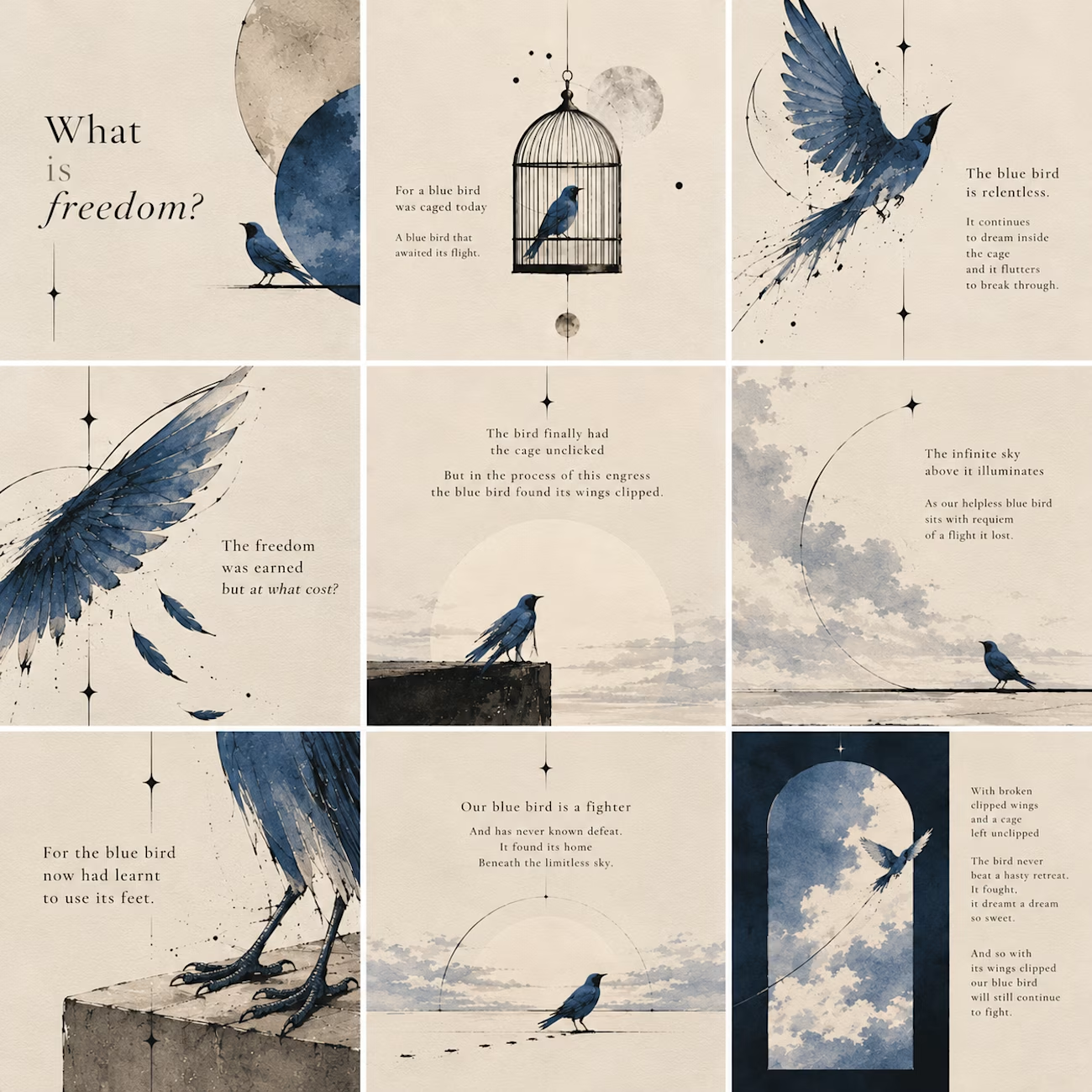
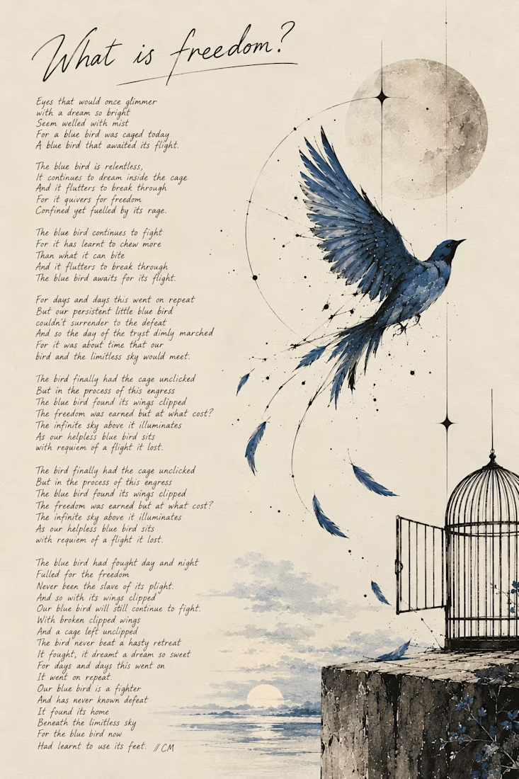
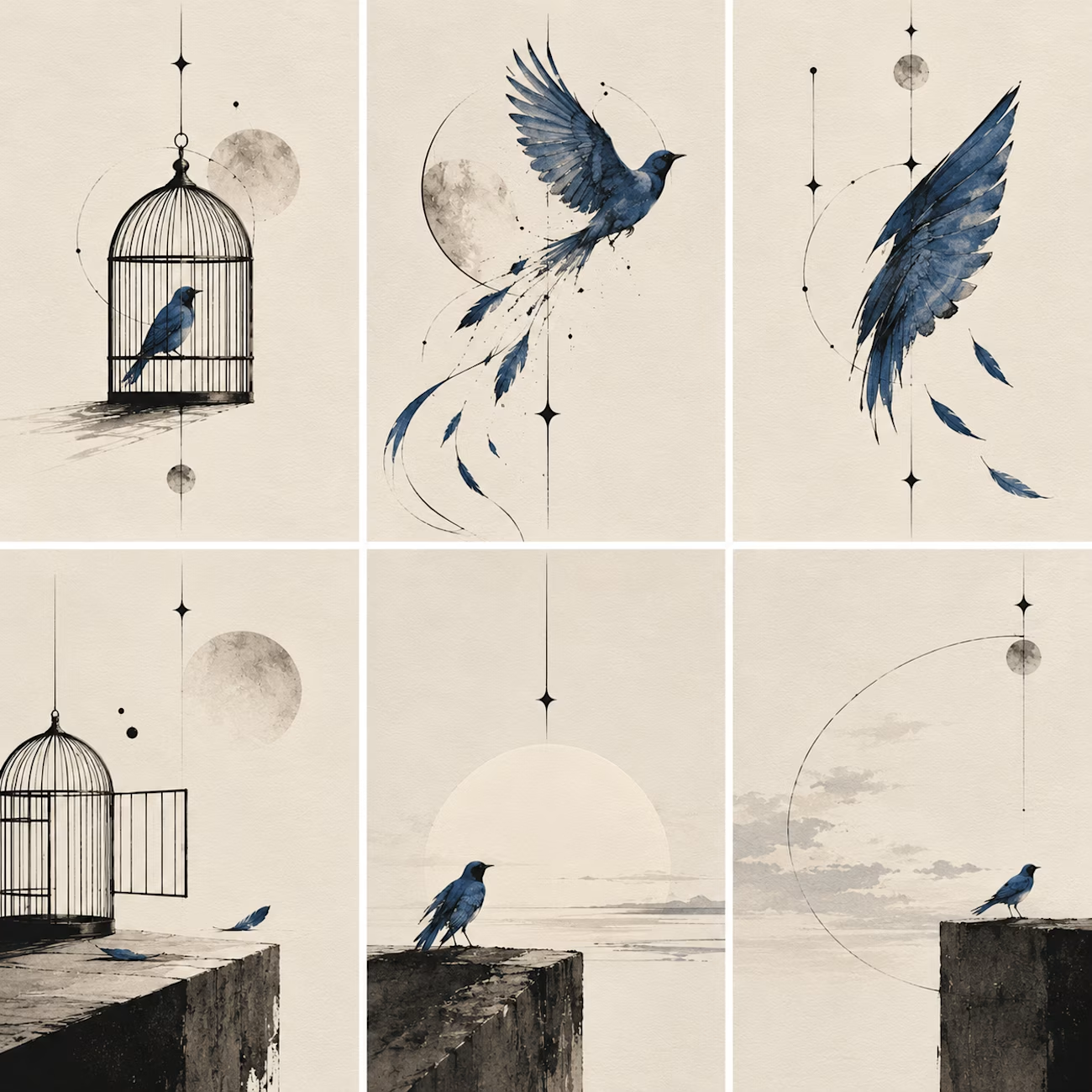
What happens when a poet picks up a pen and remembers she likes to sketch too:)
I write poetry over at @words.bycm on IG and since Inktober is here, I thought it was time to let that side of me out of its little corner of Instagram.
This is 'What Is Freedom?', a poem I wrote...

Kudos to you, you've really done a great work.