The network for creativity
Join 1.25M professional creatives like you
Connect with clients, get discovered, and run your business 100% commission-free
Creatives on Contra have earned over $150M and we are just getting started
Back to feedPost

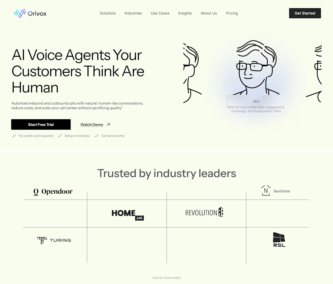
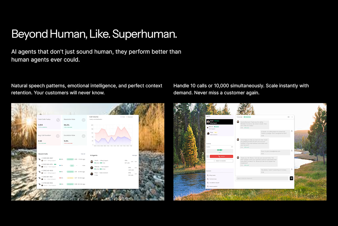
The goal here was to communicate trust and realism instantly. The headline leads with a bold, clear promise, while the clean layout and soft visuals reinforce a human, approachable feel rather than a “tech heavy” one.
I kept the interface minimal but intentional so the focus stays on credibility, clarity, and conversion, making the AI feel natural, not intimidating.


The network for creativity
Join 1.25M professional creatives like you
Connect with clients, get discovered, and run your business 100% commission-free
Creatives on Contra have earned over $150M and we are just getting started





Related posts

Vowelle was free for a while, but I’ve decided to make it a paid template.
It’s now available for $125 🤍
A premium bridal Framer template with CMS collections, filtering, favorites, booking flow, and lots of carefully crafted details.

Beautiful work

IPO Coins landing page web design 3D animation website icons


Great Design, R


Love to see the case study.