The network for creativity
Join 1.25M professional creatives like you
Connect with clients, get discovered, and run your business 100% commission-free
Creatives on Contra have earned over $150M and we are just getting started
Back to feedPost
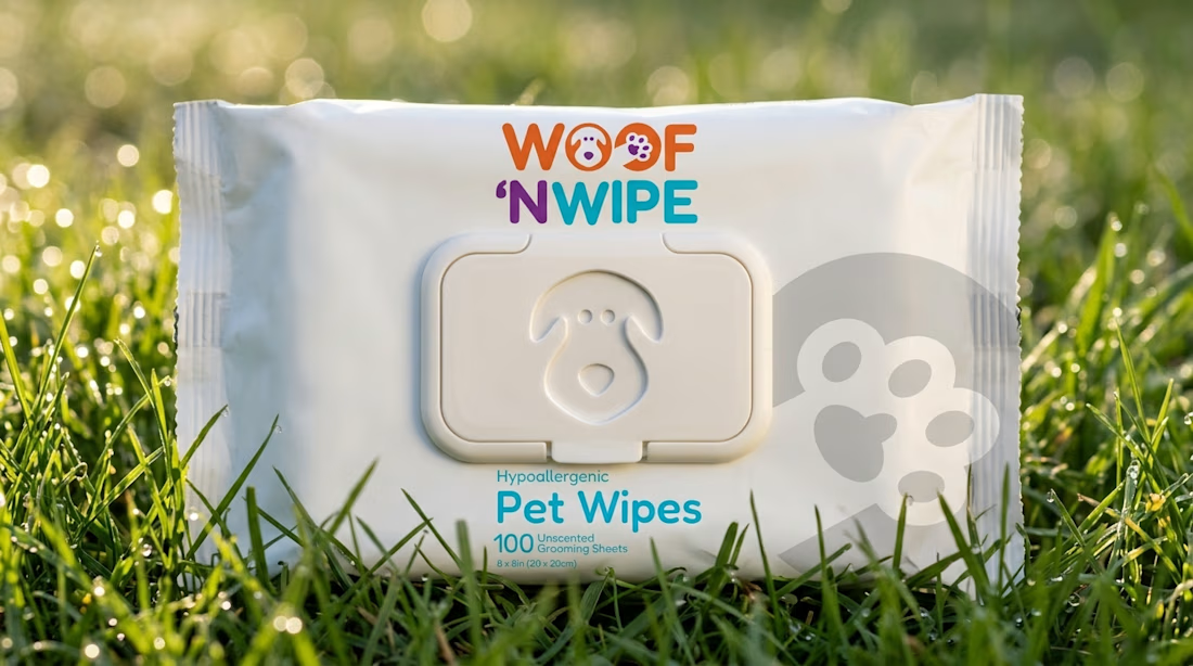
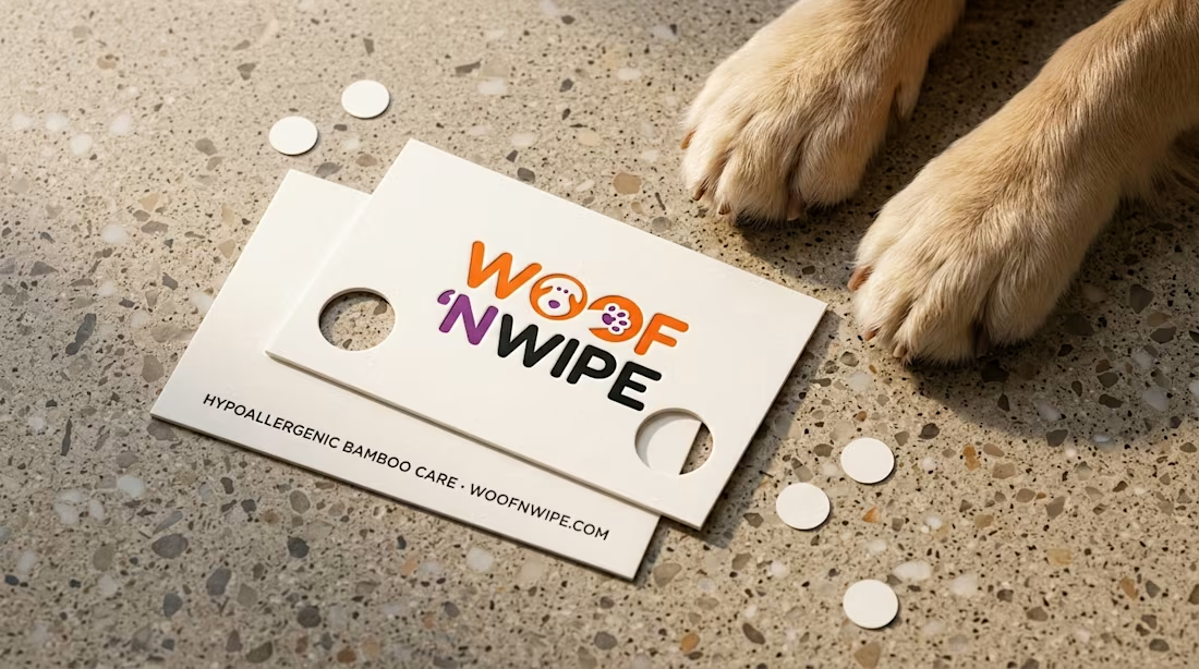
Fresh packaging identity release for Woof 'n Wipe.
My goal was to design a clean, tactile identity for hypoallergenic bamboo pet wipes, featuring embedded puppy and paw glyphs paired with a custom debossed flip-top lid.
Full 12-slide case study live on Behance: https://www.behance.net/gallery/257441155/Woof-n-Wipe-Hypoallergenic-Pet-Care-Identity
How do you balance playful personality with clinical trust in packaging design?

I'd keep the layout clean and let the paw glyphs carry the playfulness. You did that well here.

Appreciate the note, Rafee. It's always a fine line between playful and cluttered, so I really tried to let the marks do the talking. Glad you like the direction!
The network for creativity
Join 1.25M professional creatives like you
Connect with clients, get discovered, and run your business 100% commission-free
Creatives on Contra have earned over $150M and we are just getting started











Related posts


One letter. Eight personalities. 🔤
I explored the letter S in 8 different directions: soft and rounded, sharp and angular, bold and blocky, and fast like a bolt.
Same letter, same white-on-black treatment. The only thing that changes is the character.
Each mark could suit a different kind of brand, from tech and sports to fintech and lifestyle.
Which S would you pick, and what kind of brand would it belong to? Drop the number below. 👇
Looking for a logo mark or a full brand identity? My services are on my profile.


S letter designs is the best ❤️
Great job Shahwaiz🔥🔥

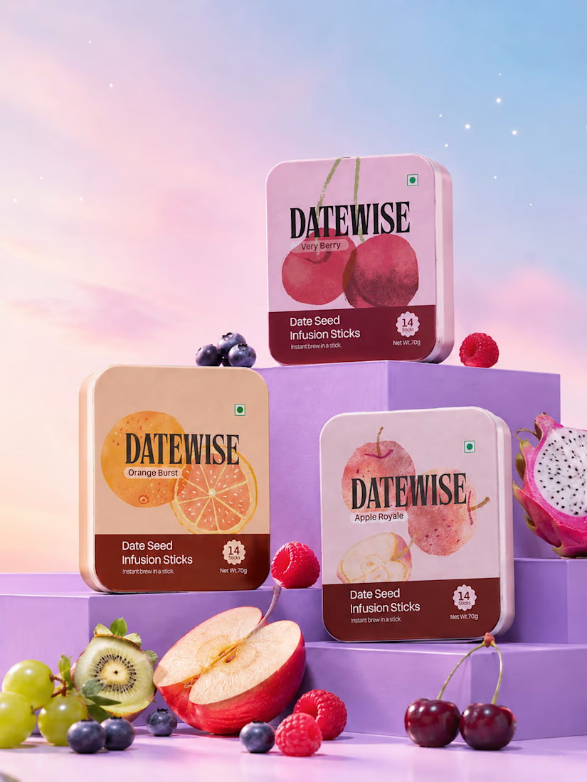
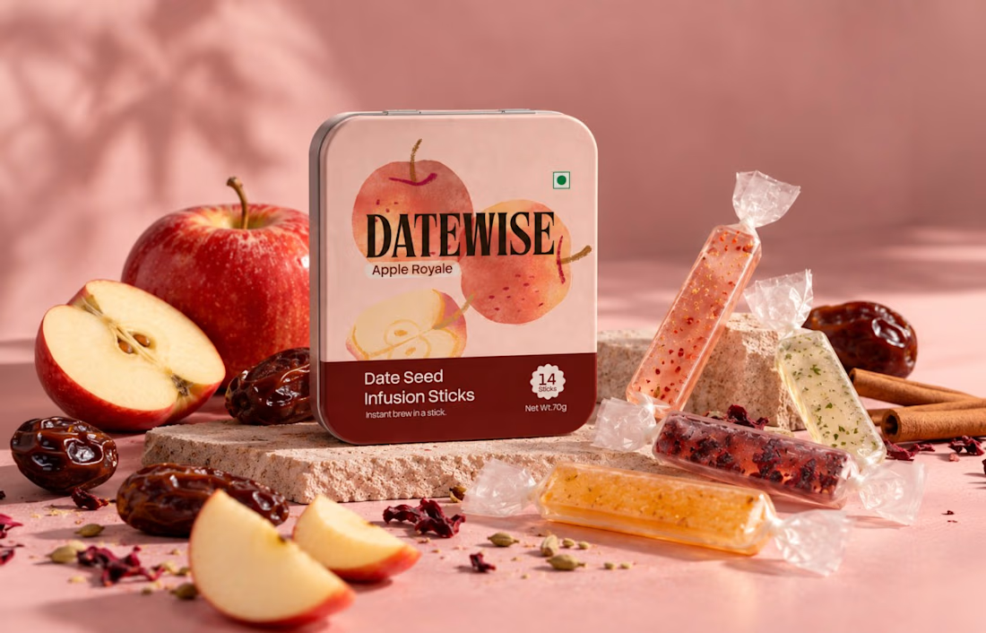
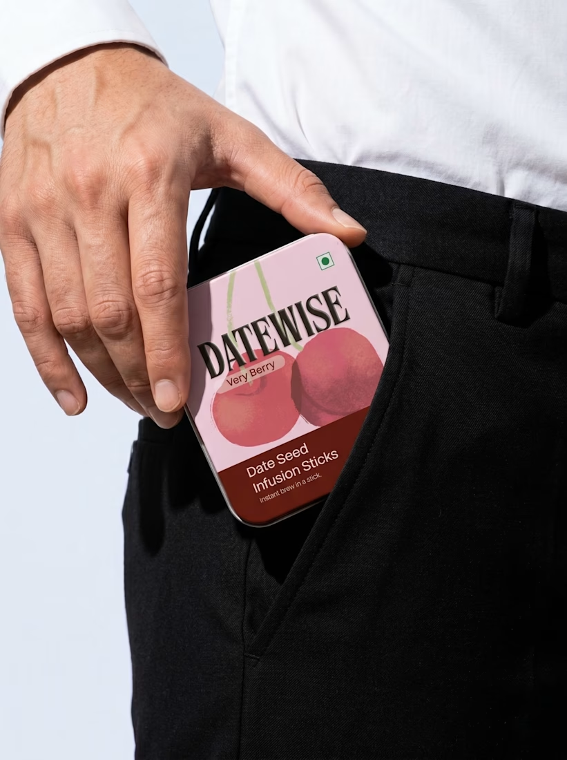
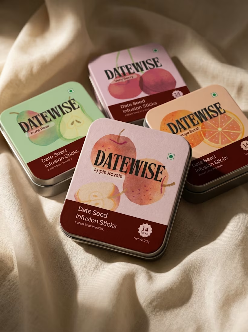
This image showcases a premium fruit-flavoured date seed infusion stick packaging design for a fictional brand called DATEWISE. The design combines modern packaging graphics, realistic 3D tin-can mockups, vibrant fruit photography, and a soft pastel environment to create a high-end commercial product presentation.
The packaging features three flavours: Very Berry, Orange Burst, and Apple Royale. Each rectangular tin has rounded corners, a pastel-coloured background, bold black serif typography, fruit illustrations, and a dark burgundy information panel at the bottom.
The products are arranged on layered purple display platforms, surrounded by fresh fruits such as apples, oranges, raspberries, blueberries, cherries, kiwi, and dragon fruit. The pink-to-blue gradient background, soft lighting, subtle shadows, and glossy surfaces create a luxurious advertising aesthetic.
Design style: Premium FMCG Packaging, 3D Product Mockup, Photorealistic Product Advertising, Pastel Colour Grading, and Editorial Art Direction.



So Good


A little excerpt from the brand guidelines for a recent project

The APS mark built from the four small symbols reads like a map legend, which suits a psychology service. Nice that the guidelines page shows it on the dark teal, most would have played it safe on white.