The network for creativity
Join 1.25M professional creatives like you
Connect with clients, get discovered, and run your business 100% commission-free
Creatives on Contra have earned over $150M and we are just getting started
Back to feedPost

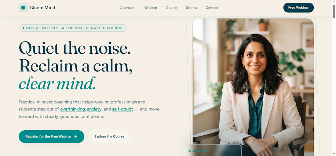
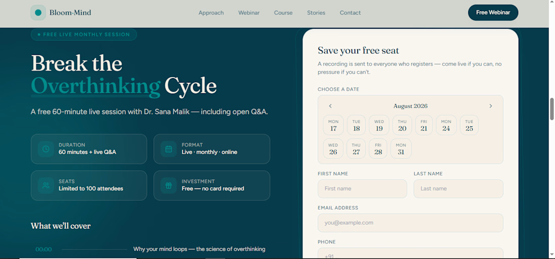
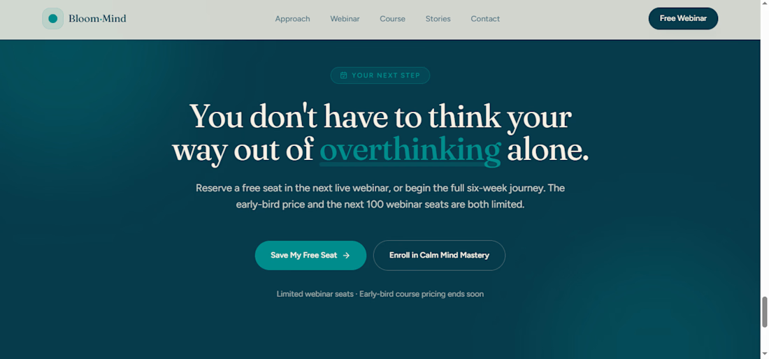
Built a complete, functional client website using AI-assisted generation:
Structured a detailed project brief covering niche, brand tone, and content requirements
Converted the brief into an AI prompt to generate a full multi-section website (hero, credibility, course details, testimonials, CTA)
Used iterative prompting to elevate the design from a generic AI look to a premium, custom feel
Connected the booking CTA to a live calendar system
Fully tested the flow — booking confirmation and lead capture into CRM
Live site: https://bloom-institute.vibepreview.com/
This shows how quickly a working, bookable website can go from brief to live — ideal for coaches, consultants, and small businesses needing fast turnaround without sacrificing design quality.
Open to AI-assisted website + funnel projects.
The network for creativity
Join 1.25M professional creatives like you
Connect with clients, get discovered, and run your business 100% commission-free
Creatives on Contra have earned over $150M and we are just getting started

Challenges
View all


Related posts

Introduced some springiness and parallax to image gallery on EnduroSat website.


AI Voice Agent for Real Estate Lead Booking
An AI-powered phone receptionist built for real estate agencies that answers inbound calls, qualifies leads in real time, and books showings directly to Google Calendar — all within the call itself, with no manual follow-up required.
The problem: Real estate agencies routinely lose leads to missed calls — after-hours inquiries, calls during showings, or overflow during busy periods. A slow callback often means the lead has already moved on to a competitor.
What it does:
Answers every call instantly, 24/7
Naturally qualifies the caller (buy/sell intent, area of interest, showing vs. agent call)
Collects contact details and preferred timing conversationally
Checks real-time calendar availability before booking
Prevents double-bookings and duplicate entries automatically
Confirms the appointment out loud before ending the call
Built with: Retell AI (conversational voice layer), n8n (workflow automation and business logic), Google Calendar API (scheduling)
Available for: Custom builds for real estate agencies, brokerages, or property management companies looking to stop losing leads to missed calls


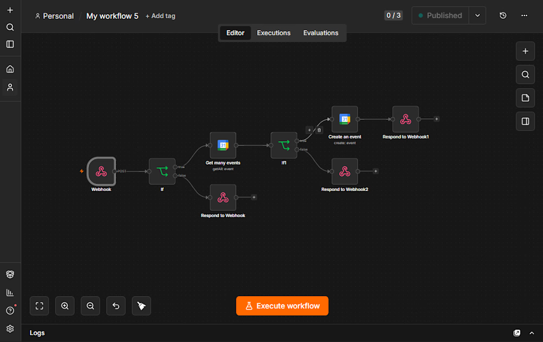

Beautiful workflow by the way. My nicheeee

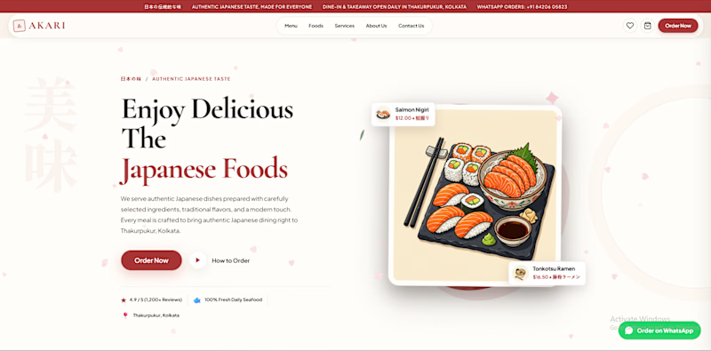
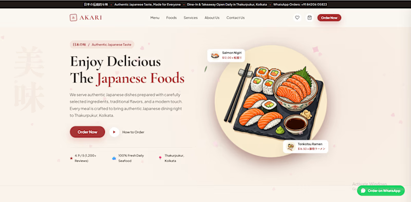
Which AKARI Design Looks Better? 🍣
I’ve been working on AKARI (あかり) — a Japanese food restaurant website that I’m building both as a real-shop-ready concept and as a showcase of my web design & development work.
I’ve made two different versions of the design, and I want the Contra community to decide which direction looks better.
🅰️ Option A
Design 1 — More bold, structured and brand-focused.
🅱️ Option B
Design 2 — More minimal, clean and modern.
🅲️ Option C
Neither? 😅
Tell me what you would change, add, or completely redesign. I’m open to ideas!
👇 Vote A, B, or C in the comments.
Which one would you choose for a Japanese restaurant?
🍣 AKARI — あかり
Authentic Japanese Taste, Made for Everyone.


6 voted
46%
7 voted
54%
13 votes
Closed

I’d lean toward Design A—the bolder structure gives the restaurant a clearer point of view, while the centered dish still keeps the page inviting. The restrained palette and generous whitespace make the food do the talking.