The network for creativity
Join 1.25M professional creatives like you
Connect with clients, get discovered, and run your business 100% commission-free
Creatives on Contra have earned over $150M and we are just getting started


The network for creativity
Join 1.25M professional creatives like you
Connect with clients, get discovered, and run your business 100% commission-free
Creatives on Contra have earned over $150M and we are just getting started
Challenges
View all


Related posts

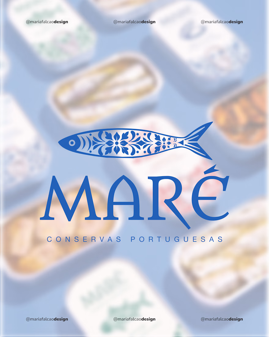
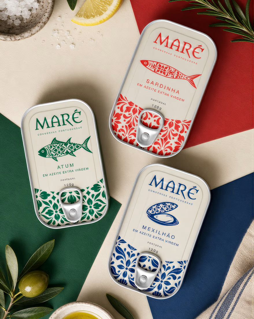
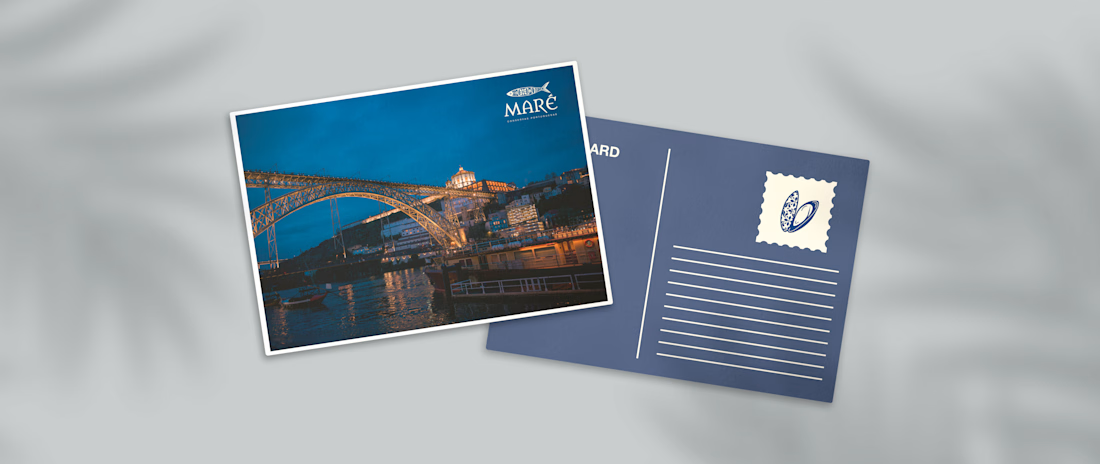
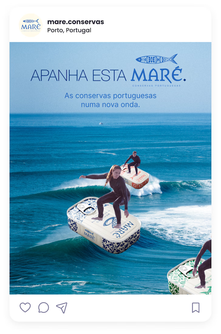
Just shared MARÉ, a contemporary Portuguese conservas branding and packaging project.
Inspired by Portuguese visual culture, this project combines tradition with a fresh and modern approach through pattern, color, and illustration.



Attractive Attentive Design for restaurant's brand

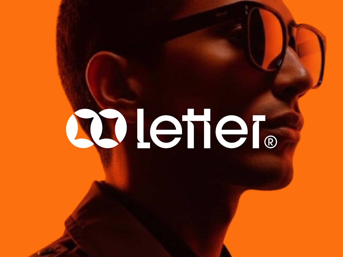
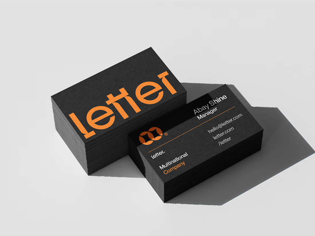
Letter — Visual Identity for a Multinational Company
For Letter, I built the mark around two interlocking loop forms — a subtle nod to connection and precision, the kind of detail that makes a logo feel deliberate at a glance.
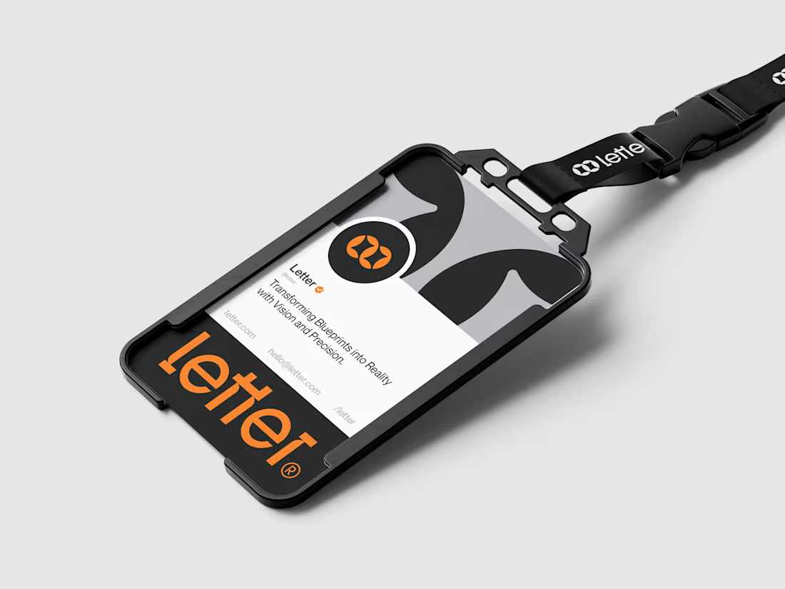
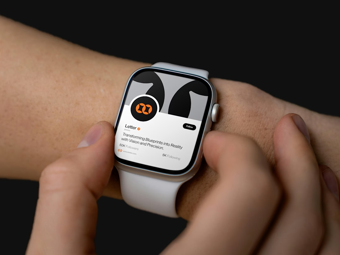
I developed the full system from there: wordmark, icon mark, a bold orange-and-black palette, and mockups across ID badges, business cards, lanyards, and even a smartwatch — showing the brand holding its identity everywhere it lands.
Transforming Blueprints into Reality with Vision and Precision.

Absolutely amazing work, well done!

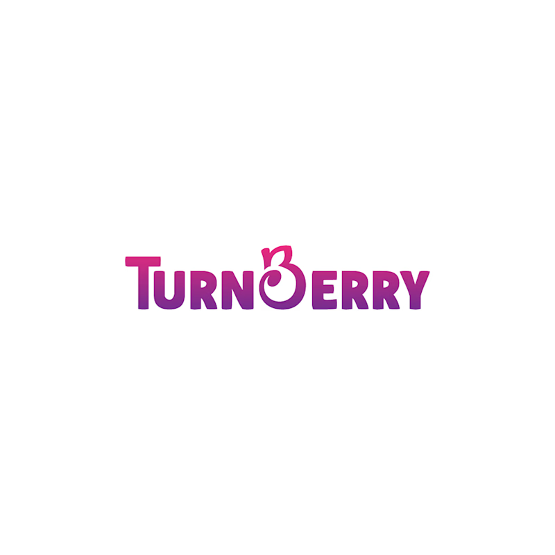
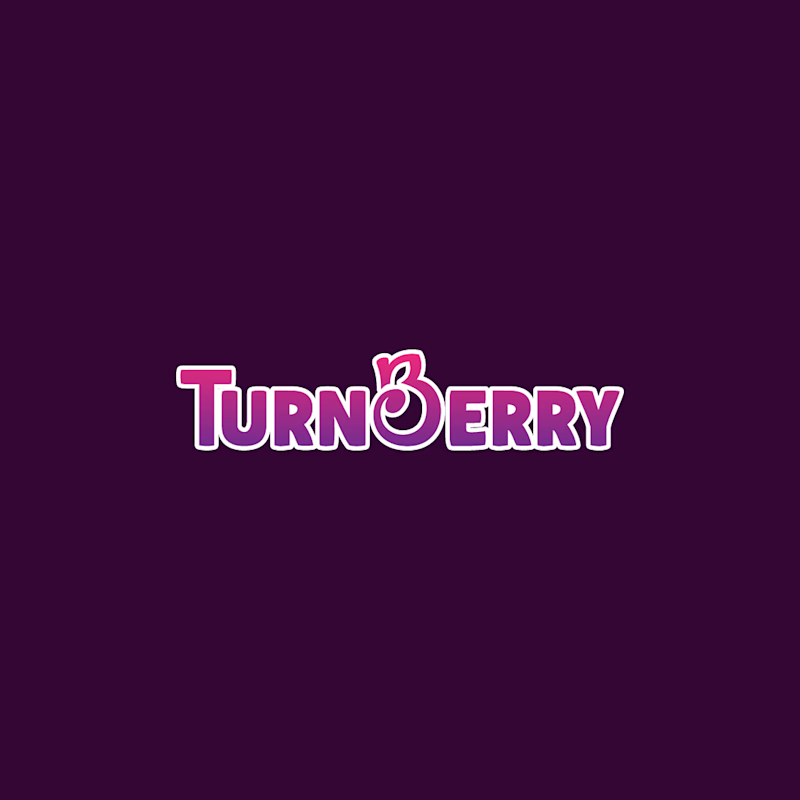
I see two simple directions here, but this choice will shape how the logo looks across the products later on. One keeps the logo without an outline, with white as the dominant background. The other adds a white outline, giving us more room to use purple, pink, or similar colors as the dominant background. Which direction feels more right to you?
3 voted
50%
3 voted
50%
6 votes
Closed

with outline highlights..