The network for creativity
Join 1.25M professional creatives like you
Connect with clients, get discovered, and run your business 100% commission-free
Creatives on Contra have earned over $150M and we are just getting started
Back to feedPost
Taste Test
Building out my girtonian branding and I've been working on a custom font. my main mark is the lowercase g and I've been obsessing over the finer details of the letter forms, which one should I continue with?
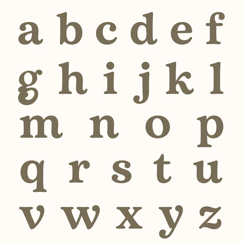
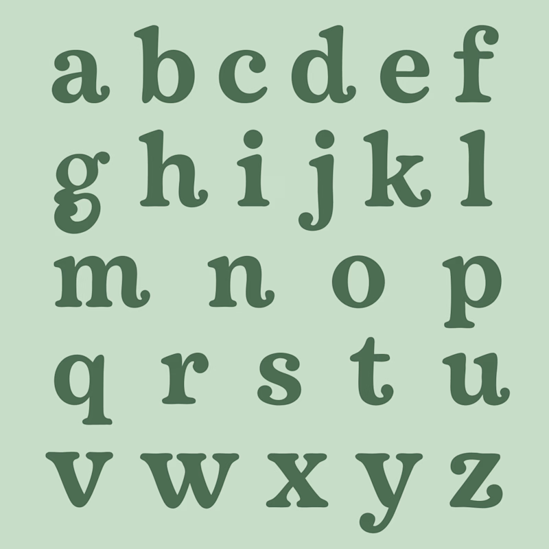
21 votes
Ends in 16h
I love option 1. I think it creates a nicer visual movement when reading it.
I've been working on these letterforms since 2010. It's been a slow but deliberate process, only working on it when I've felt called to design another letter. I'd love to add alternates for sure but I have a feeling the tedious part will be when I need to establish all the kerning rules in fontforge 😂
Both are excellently done but opt #1 for sure
Both looks insane but in my opinion the one on the right wins it.
The network for creativity
Join 1.25M professional creatives like you
Connect with clients, get discovered, and run your business 100% commission-free
Creatives on Contra have earned over $150M and we are just getting started
Related posts
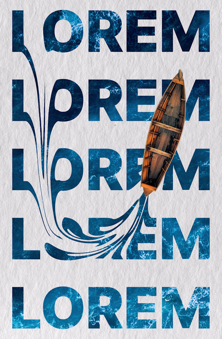
Lorem ipsum - is more than placeholder text.
It’s a way to test whether a layout works before the real content arrives.
– Spacing
– Typography
– Balance
– Flow
Sometimes the entire mood of a page starts forming at this stage.
And good design should work with different amounts of content.
When the structure is built properly, the page doesn’t break - whether the copy is short, long, or still unfinished.
Do you prefer working with placeholder text or adding real copy from the start?
Absolutely lovely.
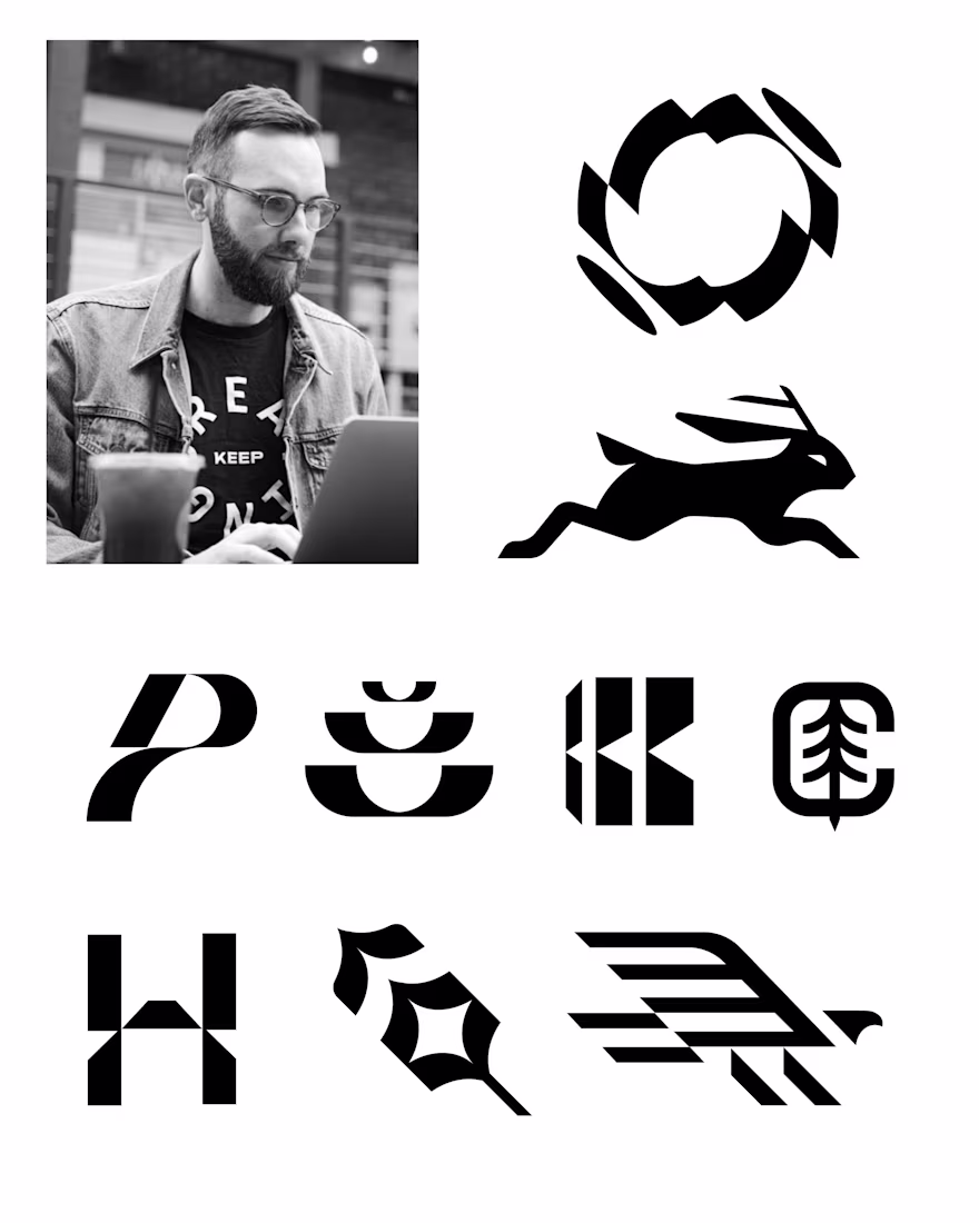
Here are are few of my favorite marks from over the past couple of years.
It’s funny, when I was starting out in my career and even in college, I was always intimidated by logo marks, but over time they are now my favorite part of design to tinker with. I love how this simple image can make or break the brand.
Creativity at it's peak
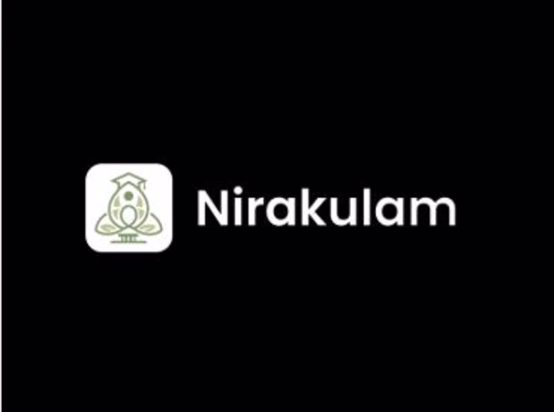
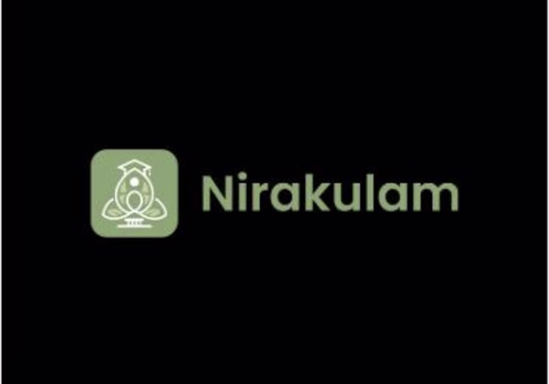
Same logo. Two different moods. 🎨
Testing contrast for Nirakulam colored vs white.
Drop your vote below 👇
#logodesign #brandidentity #contrasttest #nirakulam #uiux #designinspiration #branding
1 voted
50%
1 voted
50%
2 votes
Closed
Definitely white
Trending
Claude
Claude has entered the design space. How are you using Claude Design?
Contra University
Learn from expert creatives how to earn more using next-gen AI tools.
creativeaiflow
Creative AI workflows are evolving. What tools do you use, and what are their strengths and weaknesses?
portfolioreview
The best portfolios tell a story, not just show a grid. Share yours for feedback.
freelancerlife
Freelancer life is wins, pivots, and everything in between. What’s yours right now?