The network for creativity
Join 1.25M professional creatives like you
Connect with clients, get discovered, and run your business 100% commission-free
Creatives on Contra have earned over $150M and we are just getting started
Back to feedPost
Taste Test
Same logo. Two different moods. 🎨
Testing contrast for Nirakulam colored vs white.
Drop your vote below 👇
#logodesign #brandidentity #contrasttest #nirakulam #uiux #designinspiration #branding

1 voted
50%
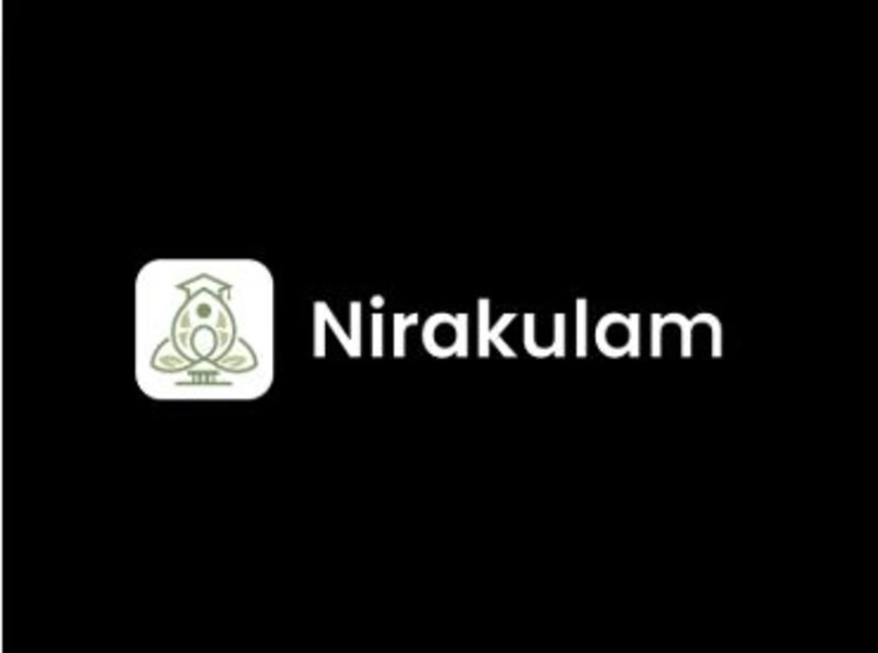
1 voted
50%
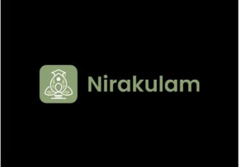
2 votes
Closed

Definitely white

Great Choice.
The network for creativity
Join 1.25M professional creatives like you
Connect with clients, get discovered, and run your business 100% commission-free
Creatives on Contra have earned over $150M and we are just getting started







Related posts

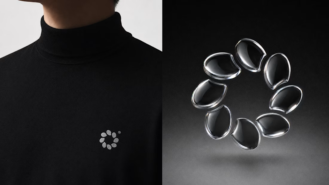
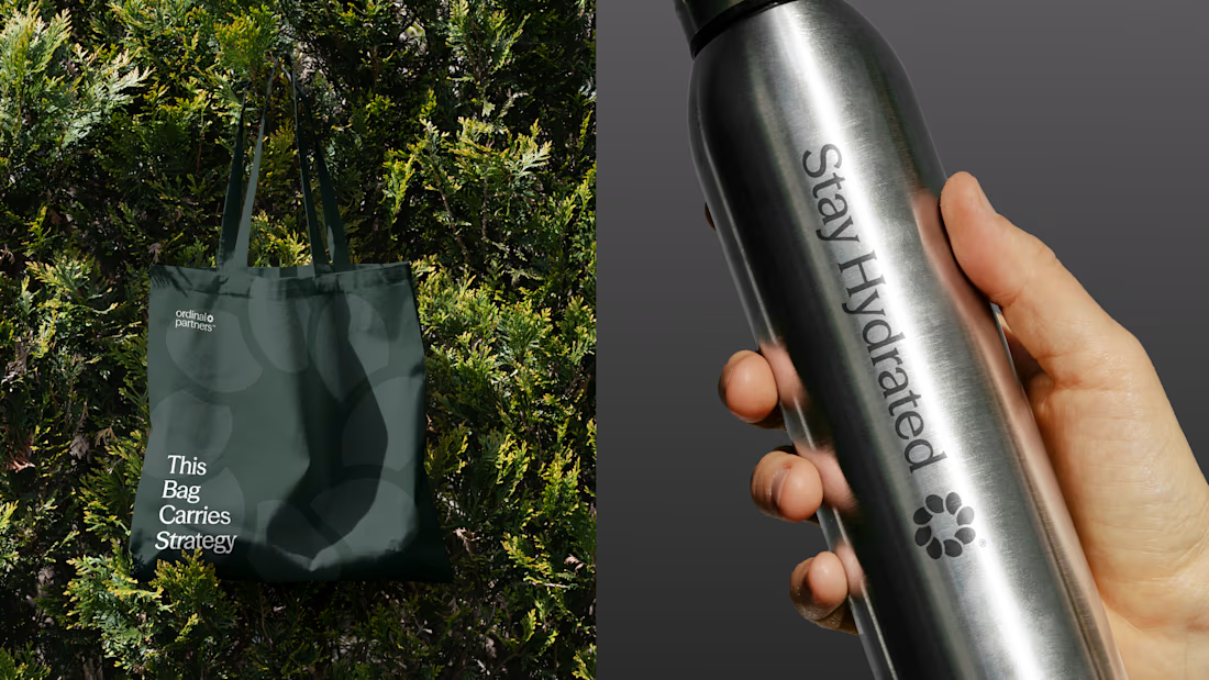
One brand, three different directions.
Sharing some of the logo exploration for Ordinal Partners.
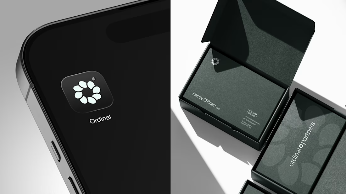
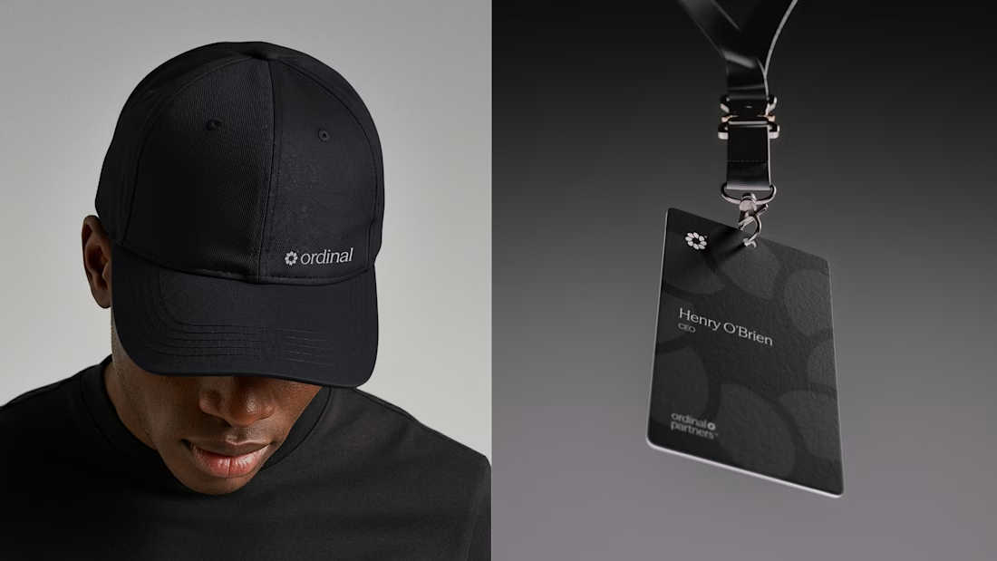

Visually appealing 🔥


Another set of mockups for Bakedwell


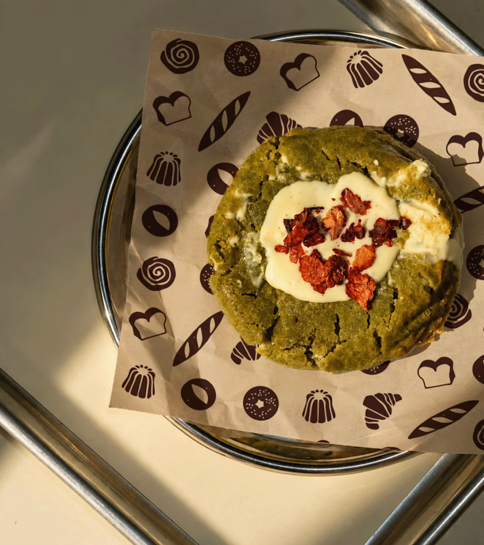
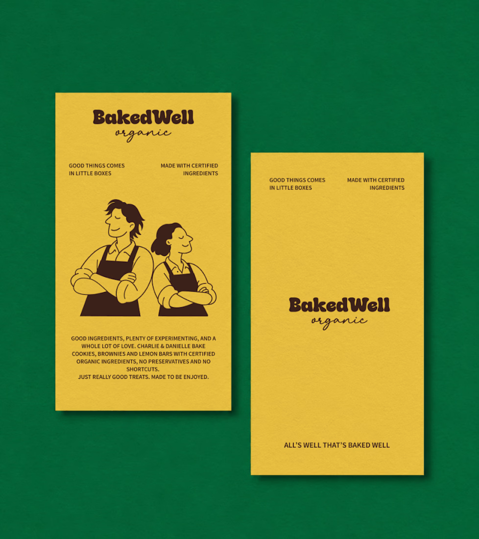
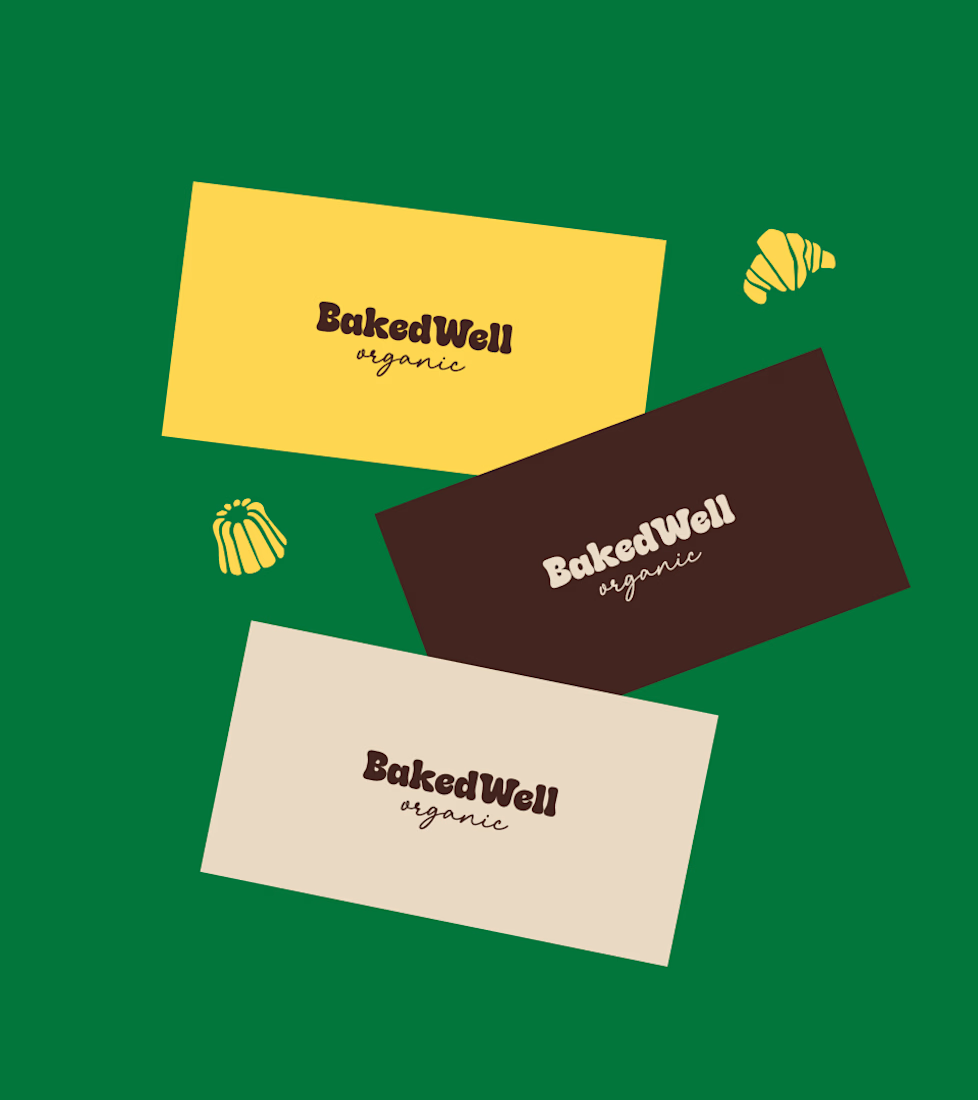
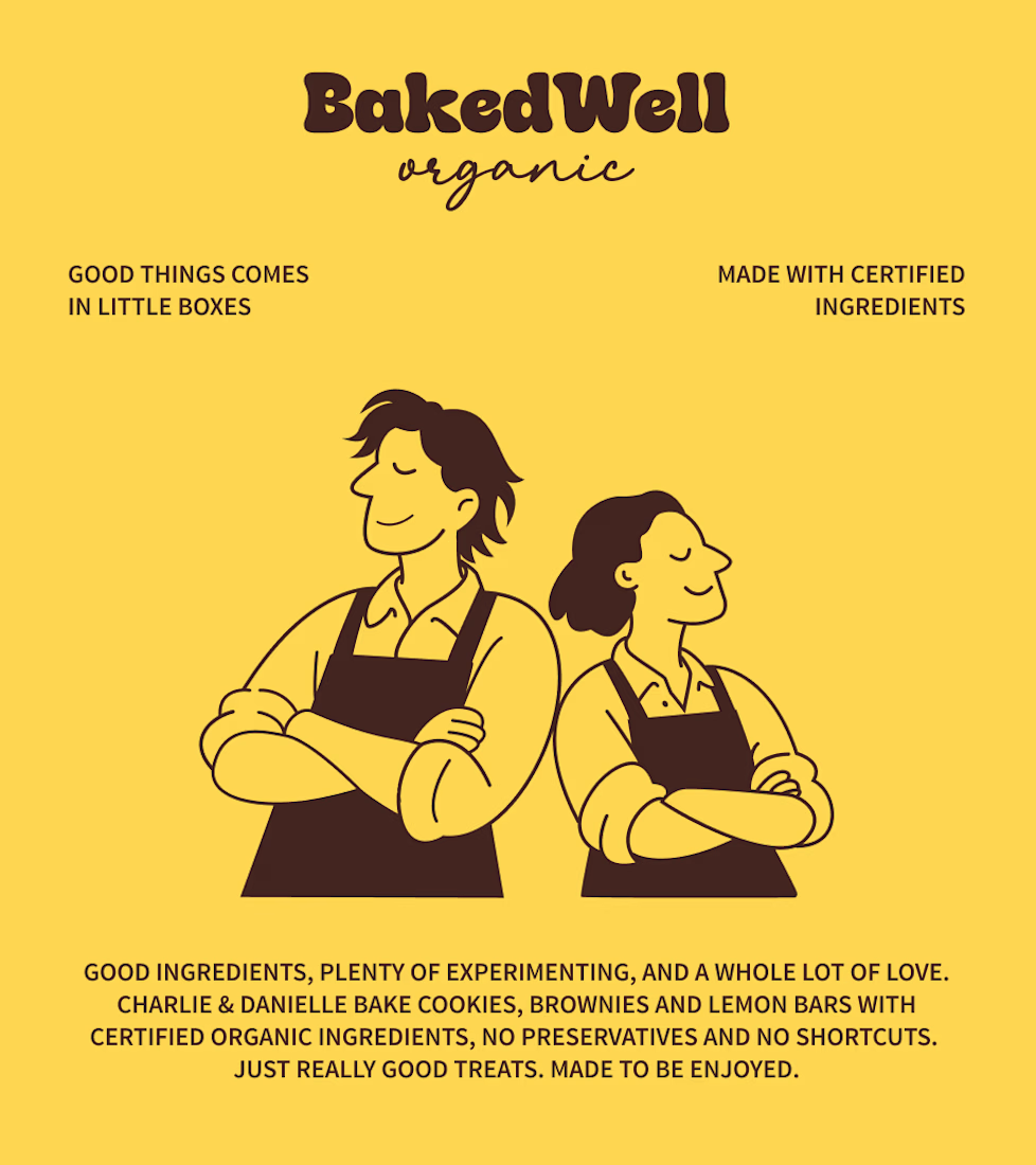

Forest green and mustard with the two bakers in flat illustration is a warm, confident pairing, and the cards read clearly. Contrarian take: the illustrated pair is the strongest asset here, stronger than the wordmark. If I owned BakedWell, I would put those two on the bag and the window and let the logo go smaller.

Recent work on MAE - Visual identity
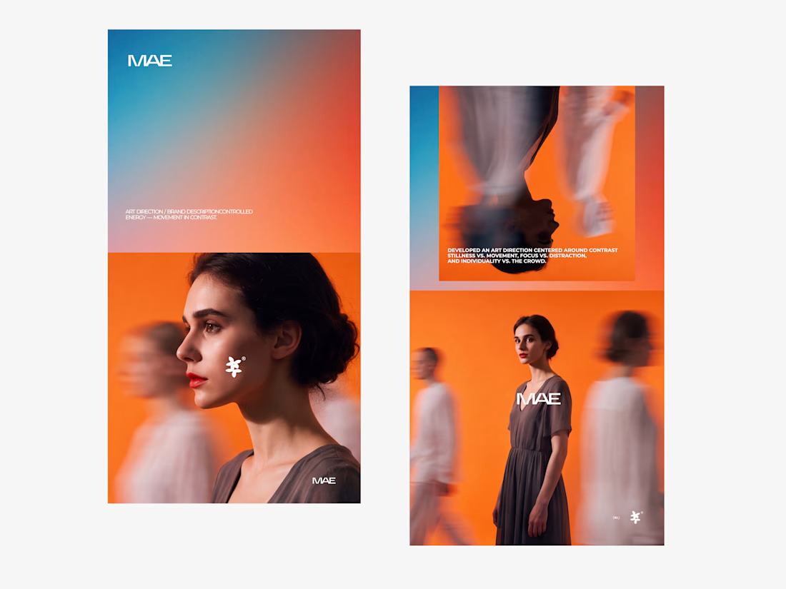

The motion blur on the figures gives the orange-to-blue gradient a reason to be there, and the small star mark stays readable on both the cheek and the shirt. Did the star come first as a standalone mark, or did it grow out of the photography direction?