The network for creativity
Join 1.25M professional creatives like you
Connect with clients, get discovered, and run your business 100% commission-free
Creatives on Contra have earned over $150M and we are just getting started
Back to feedPost


The restrained typography over the full-bleed imagery gives the property a calm, premium feel. I especially like how the motion lets the page reveal the spatial story without competing with the architecture.

Outstanding work
The network for creativity
Join 1.25M professional creatives like you
Connect with clients, get discovered, and run your business 100% commission-free
Creatives on Contra have earned over $150M and we are just getting started











Related posts


A Recent Framer-Based Brand Experience for a Real Estate Company


Super clean brand system! 🤌 Love the mint on dark contrast and how the mark works across touchpoints - that ID card mockup is chef's kiss. Great Framer execution for real estate!

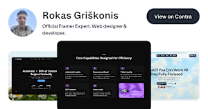
I’m Rokas - a Framer Developer & Official Framer Expert.
I turn Figma designs into production-ready Framer websites, customize templates, and fix/troubleshoot existing Framer sites.
Have a Framer project, need a template customized, or something fixed? DM me.
Portfolio: https://contra.com/rokas_griskonis1
contra.com
Rokas Griškonis - Framer Designer | Contra
I fix & develop Framer websites. Official Framer Expert. . View Rokas Griškonis’s Profile on Contra. The Independent-first, commission-free freelance marketplace shaping the future of work.

Official Framer Expert status plus the production-ready angle is a strong combo. Positioning around fixing and troubleshooting existing sites is smart, that is usually where the urgent, paid work lives.

MediCore Hospital — a healthcare Framer template for hospitals, clinics, and medical professionals.
Designed to make healthcare services easier to discover, information easier to navigate, and every first impression more reassuring.
Template link: https://framer.link/fndiyyo


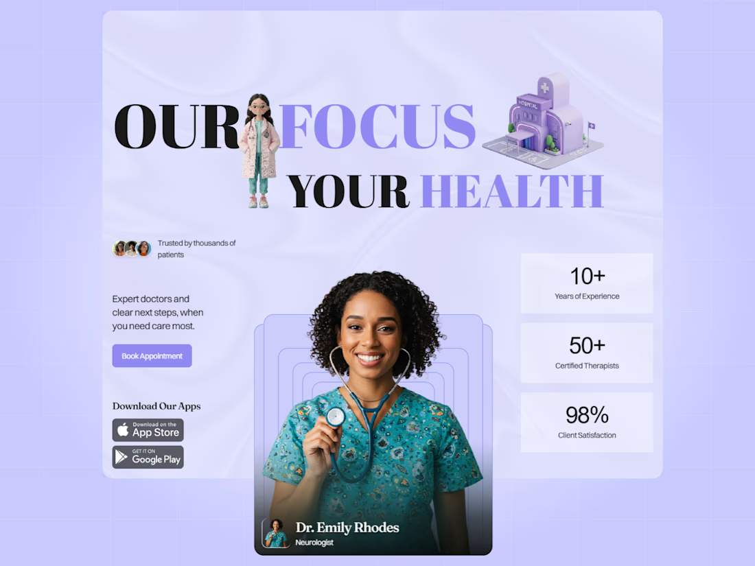
The OUR FOCUS YOUR HEALTH hero with the mixed serif treatment is a strong opener. Leading with trust signals like 98% client satisfaction and 50+ certified therapists is exactly the reassurance a healthcare site needs.


