The network for creativity
Join 1.25M professional creatives like you
Connect with clients, get discovered, and run your business 100% commission-free
Creatives on Contra have earned over $150M and we are just getting started


The network for creativity
Join 1.25M professional creatives like you
Connect with clients, get discovered, and run your business 100% commission-free
Creatives on Contra have earned over $150M and we are just getting started











Related posts

The team is cooking
Motion design for the logo we are making for Nation e-commerce


Wou




Aryna, that golden symbol pops so nicely against the plum background ✨

Do you think a good gradient can elevate a design’s mood?
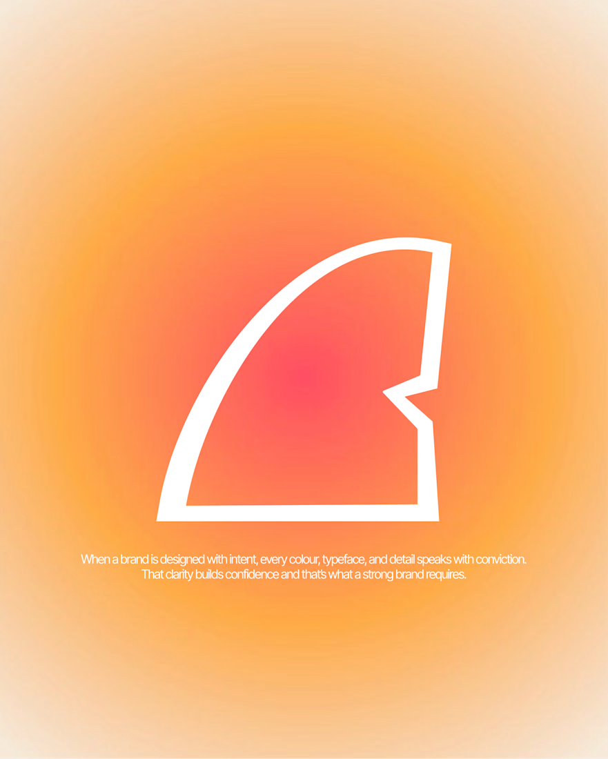
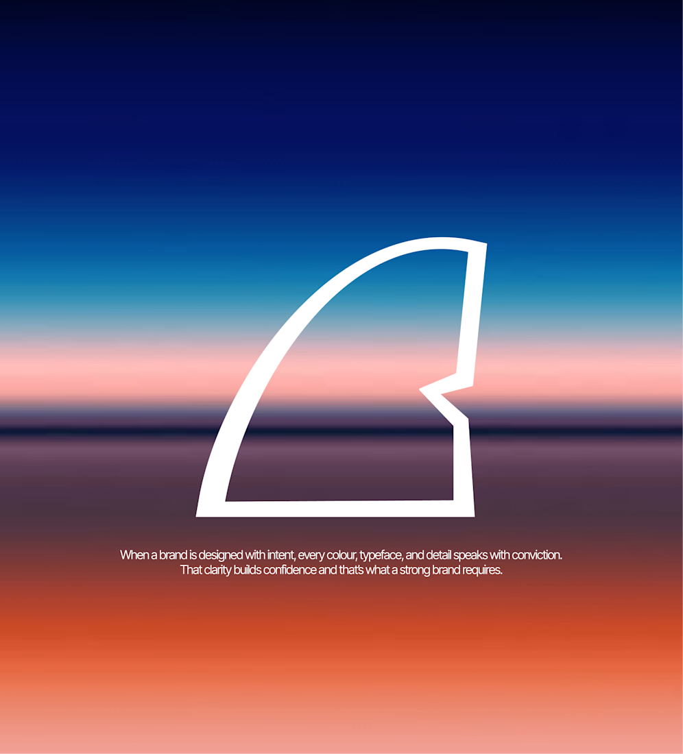
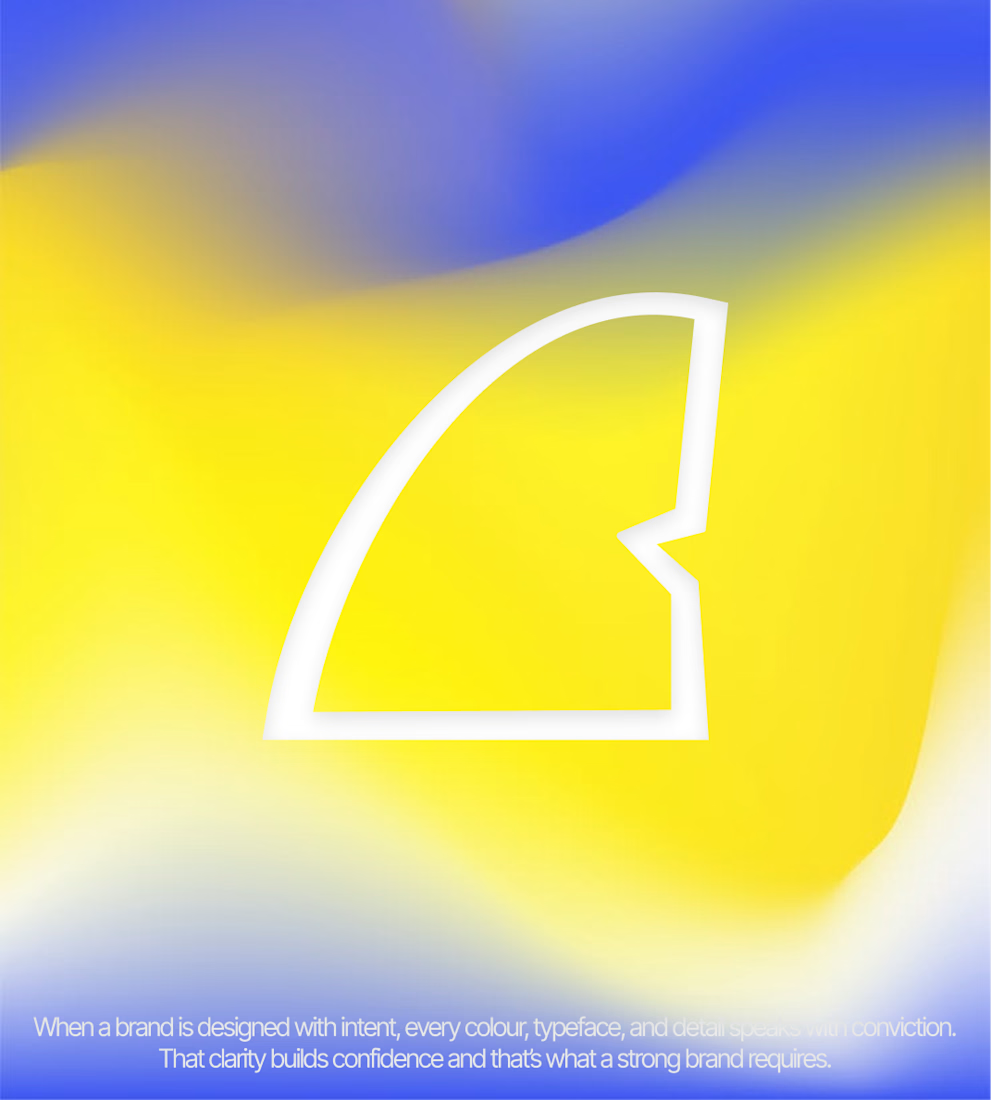
Here, I’m using Yellow Shark’s logo across three different moods, and its versatility allows it to work well with each gradient.
But it got me thinking: should a logo be designed to work across different gradients and visual styles, or should it stick to a more defined visual identity?
Would love to hear your thoughts!


That's really great Atin the idea of the logo wss great specially transparent shark tail that's great ❤️❤️
Great job Atin❤️❤️