The network for creativity
Join 1.25M professional creatives like you
Connect with clients, get discovered, and run your business 100% commission-free
Creatives on Contra have earned over $150M and we are just getting started
Back to feedPost

Here are some other flavor options I did for Sippy.
Alpine Lavender Cloud and Tropical Citrus Drift.
What do you think?
See you tomorrow!


The network for creativity
Join 1.25M professional creatives like you
Connect with clients, get discovered, and run your business 100% commission-free
Creatives on Contra have earned over $150M and we are just getting started
Related posts

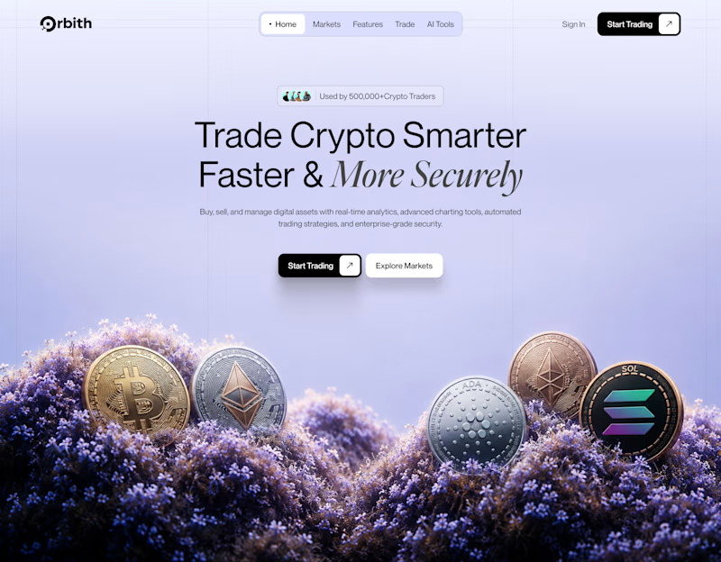
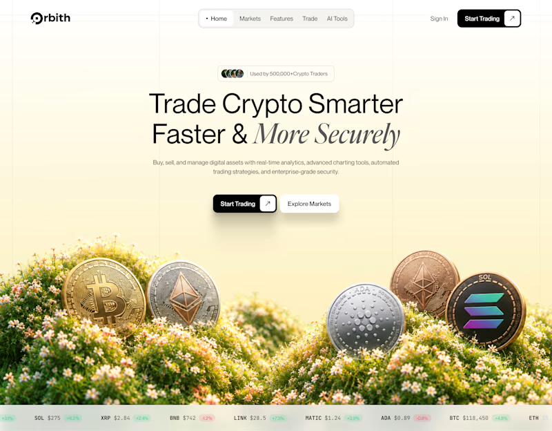
Your crypto landing page has 3 seconds to earn trust. Which direction gets it right?
One crypto homepage feels built for serious traders. The other makes crypto feel effortless.
Which one would make you click “Start Trading” without hesitation: #1 or #2?


10 voted
37%
17 voted
63%
27 votes
Closed


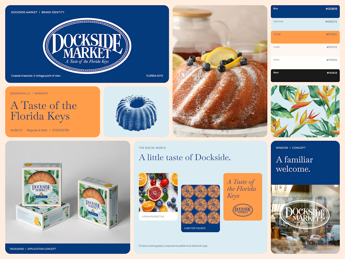
A brand identity inspired by the Florida Keys.
Dockside Market brings together vintage character and contemporary design, creating a visual identity that feels distinctive, warm, and full of personality.
From the iconic circular logo and editorial typography to the color palette, vintage-inspired illustrations, patterns, and packaging, every element works together to build a cohesive brand world.
This Bento brings the identity system together, showcasing how the brand translates across visual assets and real-world applications.
Brand identity, art direction & visual design.

Tremendous

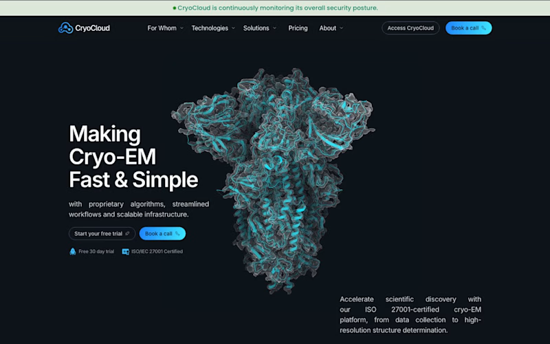
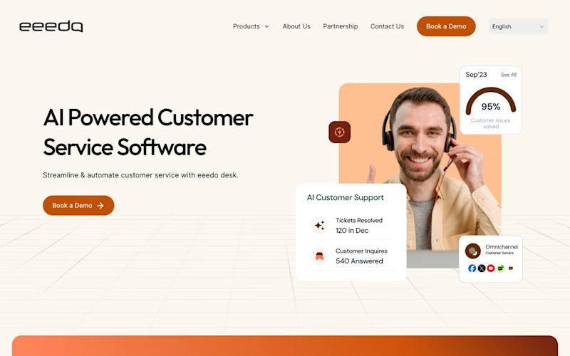
Two hero sections I built, two opposite moods. CryoCloud went dark and scientific so a cryo-EM lab trusts it on sight. eeedo went warm and light so customer support feels human. Same job for both: make a first-time visitor believe the product in a few seconds. Which one pulls you in more? Vote, and tell me what made you pick it 👇

3 voted
60%
2 voted
40%
5 votes
Closed