The network for creativity
Join 1.25M professional creatives like you
Connect with clients, get discovered, and run your business 100% commission-free
Creatives on Contra have earned over $150M and we are just getting started
Back to feedPost
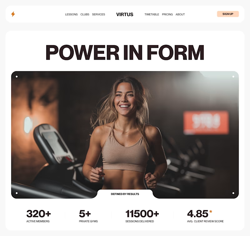
Taste Test


@Toms Stals Nice work!
Both options looks great, but I will prefer to see the Hero A, it's just fit more the energy of the gym.
Just a small change on the walking pad on background that are facing to the side and the person is running on the front (usually gyms have all walking pads on...

i love hero A section

A is amazing, you give all the information needed at first sight, this engaged and make the users scroll even further! Great job!!!

Going with A. The stats under the image add credibility without needing scroll

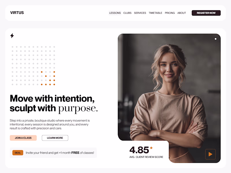
I’d lean toward Hero B.
The social proof metrics (sessions delivered + rating) are immediately visible and reduce trust friction. For conversion, that clarity usually beats a softer emotional hook.
One thing I’d test: making the primary CTA slightly higher contrast so it stands out more against the hero image.


Nice work!

Hero A has a wider image but Hero A has a more visible CTA which will work better in conversion. Love the concepts!😊

I’d go with Option A. It feels stronger and more motivating, and you immediately understand what the gym is about.


A wins. Strong emotion + social proof combo. Would love to see a micro-animation on load 👀

I love hero section A.

Hero A UI looks perfect, but I'm concerned about the UX. Both doesn't feel like a boutique, the imagery and the text, or was this AI-generated for a quick iteration?

I’m leaning towards Hero B. The typography feel much more aligned. It feels premium and focused!

Hero A


A is so unique

I would prefer "HERO A" more
Thank you all for voting and for the feedback, appreciate that!

@Toms Stals Both options look great, but I’d prefer Hero A it fits the energy of the gym better.
Just one small tweak: the walking pads in the background should face the same direction, with the runner in front.
The network for creativity
Join 1.25M professional creatives like you
Connect with clients, get discovered, and run your business 100% commission-free
Creatives on Contra have earned over $150M and we are just getting started
Related posts


Nice improvement! The after version feels much more structured and easier to scan, especially for a fitness/health site where quick navigation matters. Curious — did you focus mainly on improving the visual hierarchy or also optimize it for conversions like memberships or class bookings?


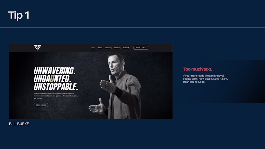
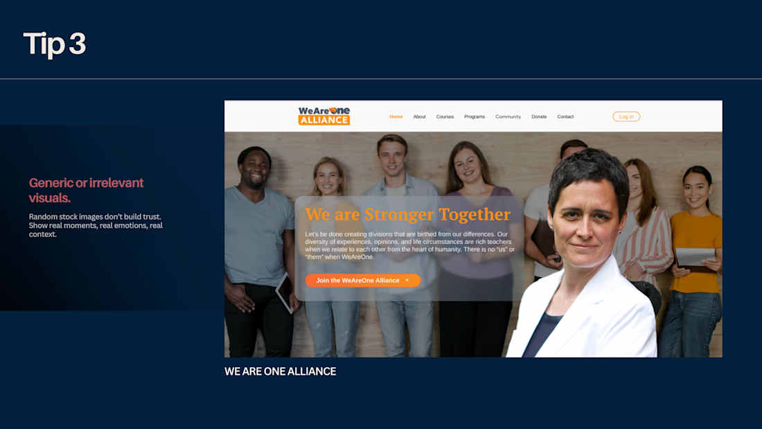
Top 3 Hero Section Mistakes on Course Websites
Those first three seconds decide everything – clarity is your biggest superpower.
1️⃣ Too much text.
If your Hero reads like a mini-novel, people scroll right past it. Keep it light, clear, and focused.
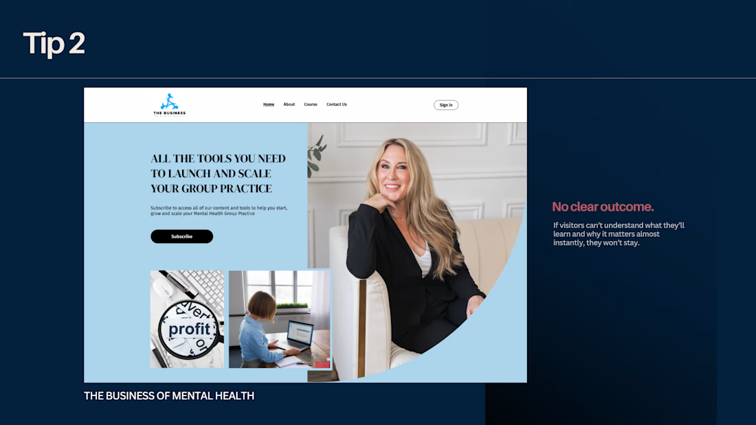
2️⃣ No clear outcome.
If visitors can’t understand what they’ll learn and why it matters almost instantly, they won’t stay.
3️⃣ Generic or irrelevant visuals.
Random stock images don’t build trust. Show real moments, real emotions, real context.
✨ A strong Hero section is simple, honest, and instantly understandable.


Great insights.

Recently, I worked on this website project. The initial designs were created in Figma, and the final website was built on Shopify.
Would love to hear what you think. Your feedback is always welcome


Love it ✨


Trending
maxearnings
The next frontier of payments is live on Contra. How are you maximizing revenue?
freelancerlife
Freelancer life is wins, pivots, and everything in between. What’s yours right now?
aidesignflow
AI tools are redefining how designer work. What does your workflow look like?
micrographics
Micrographics started as utility - barcodes, packaging, instruction labels. How would you use them?
aivideo
AI video tools are moving at warp speed. What tools are you using?