The network for creativity
Join 1.25M professional creatives like you
Connect with clients, get discovered, and run your business 100% commission-free
Creatives on Contra have earned over $150M and we are just getting started
Back to feedPost

Many e-commerce brands don’t have a product problem.
They have a presentation problem.
On Amazon, Shopify, or any online store, your product images often do the job of a landing page: they explain the offer, show the benefits, build trust, and help the customer decide faster.
That’s especially true for products like supplements, protein bars, wellness products, cosmetics, food items, and private label brands.
A strong listing image set should not just look good.
It should answer the questions shoppers already have:
→ What is this product?
→ Why should I care?
→ What makes it different?
→ How do I use it?
→ What are the key benefits?
→ Can I trust this brand?
For one of my recent projects, I designed Amazon-style listing images for a protein bar brand, combining:
→ clear product mockups
→ benefit-focused infographics
→ nutrition highlights
→ mobile-first layouts
→ comparison graphics
→ bold typography
→ strong visual hierarchy
The goal was simple: make the product easier to understand, easier to compare, and more attractive inside a crowded marketplace.
If you sell online, your listing images are not “extra graphics”.
They are part of the buying experience.
Better images can make your product feel clearer, more premium, and more ready to be chosen.
I help e-commerce brands create product visuals that communicate fast, look professional, and support stronger marketplace presentation.
Need product images for Amazon, Shopify, or your next product launch?
Let’s make your listing impossible to ignore.

Abousulty Right 👍
The network for creativity
Join 1.25M professional creatives like you
Connect with clients, get discovered, and run your business 100% commission-free
Creatives on Contra have earned over $150M and we are just getting started











Related posts

I've been working on Cervia, a @Framer website for a single product.
A good single-product site combines the landing page and the store in one page, so the call to action is the purchase itself. Visitors learn what the product is, see why it’s better, and add it to the cart without leaving the page.
The challenge is making one page do both jobs. It has to look like a landing page, with room to explain the product and show it well, and still work like a store product page, with the price, colors and Add to cart always close at hand.
Every extra step between arriving and paying loses some buyers, so I kept the steps to a minimum.


This is so well put Heron! 🔥 Single-product site logic is spot on - landing + store in one page removes friction, CTA is purchase itself. No wandering around. Visitors learn what it is, why it's better, add to cart without scrolling through 5 pages - that's conversion gold!...

In the lighting industry there are a lot of generic products, and the ones that sell don't always compete on technical detail.
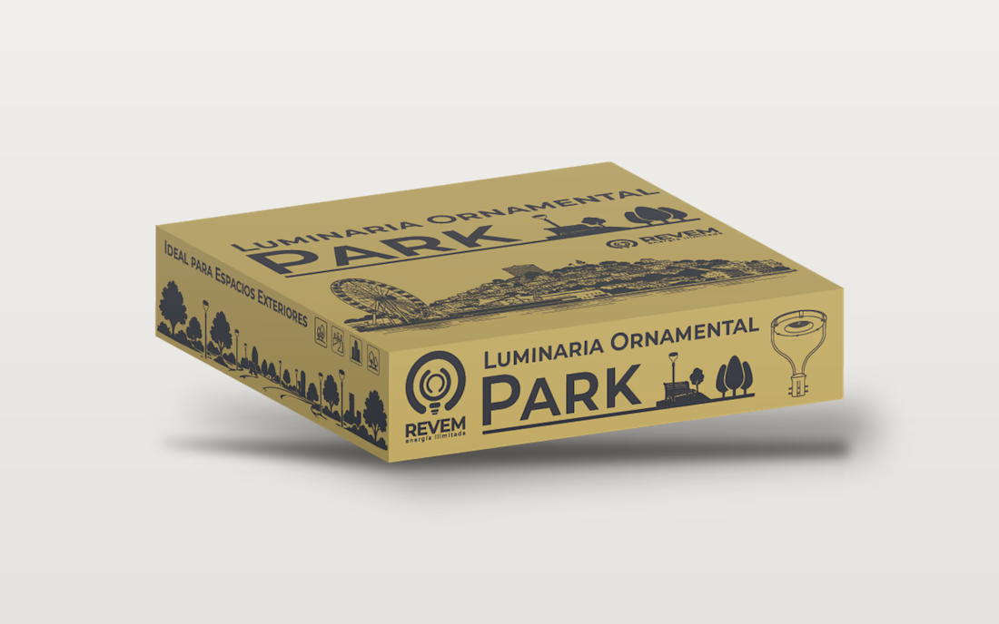
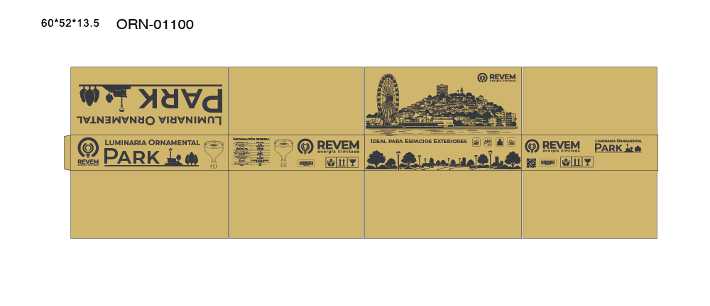
When I started designing here, I focused almost entirely on the technical side. Then, in a conversation with a stakeholder, an idea came up: our luminaires could light up some of the most popular places in Ecuador.
So I started adding illustrations of those places to the packaging of some products. The results have been good. People don't see just a technical product anymore. They see something they feel proud of, because relevant places from their country are part of it.
What can your product show that a simple image can't?


AI Luxury Product Photo & Commercial Ad Visual. Sample.


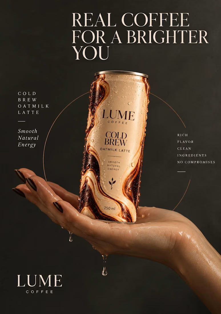

The marbled swirl on the LUME can and the condensation droplets on the hand make this feel like a real shoot, Ema. The Real Coffee for a Brighter You headline with the clean serif type gives it genuine luxury weight. Impressive sample.