The network for creativity
Join 1.25M professional creatives like you
Connect with clients, get discovered, and run your business 100% commission-free
Creatives on Contra have earned over $150M and we are just getting started
Back to feedPost

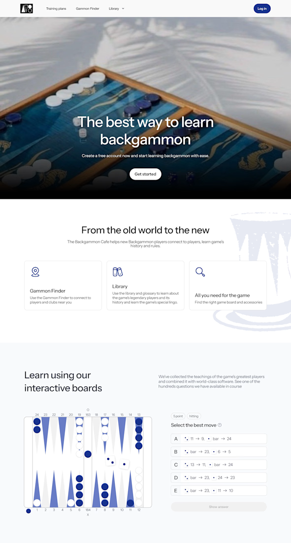
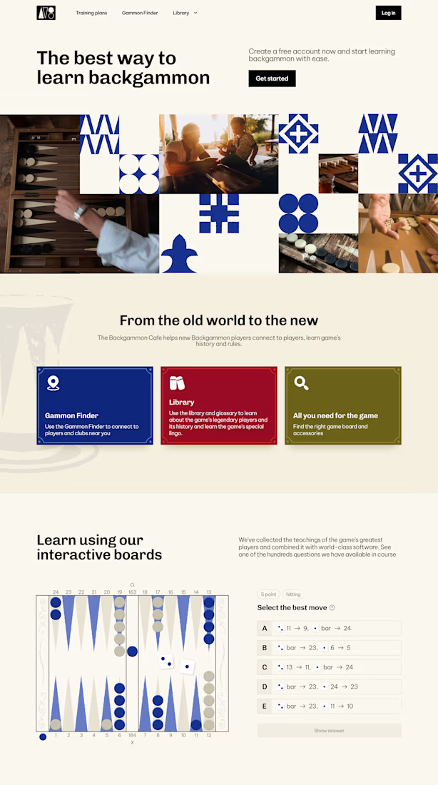
I've built enough Middle-East-facing products to know: "East" isn't a blue color swatch bolted onto a hero image. It's rhythm, texture, warmth the stuff a user feels before they can name it.
One of these two designs gets that in my opinion.
So the real question was never which one teaches backgammon better. It's which one makes a user feel like the brand actually knows this game's home turf.
If the client pushes back, which detail do you defend first ?

The network for creativity
Join 1.25M professional creatives like you
Connect with clients, get discovered, and run your business 100% commission-free
Creatives on Contra have earned over $150M and we are just getting started
Trending
retrofuturism
Share your favorite designs from the past exploring the distant future. Or your own take on the aesthetic 🚀
halftone
Dots. Texture. Grain. Let's see your designs using the halftone technique.

Midjourney
Creatives are showing off what they're making with Midjourney.
colorgrade
Video editors sound off: How do you enhance the mood of your video in color grading?


Related posts

I’ll always love designing cool bento sections.
There’s just something about conceptualising the idea, then obsessing over every tiny detail until everything feels just right.
That level of polish is unmatched 🙂↕️


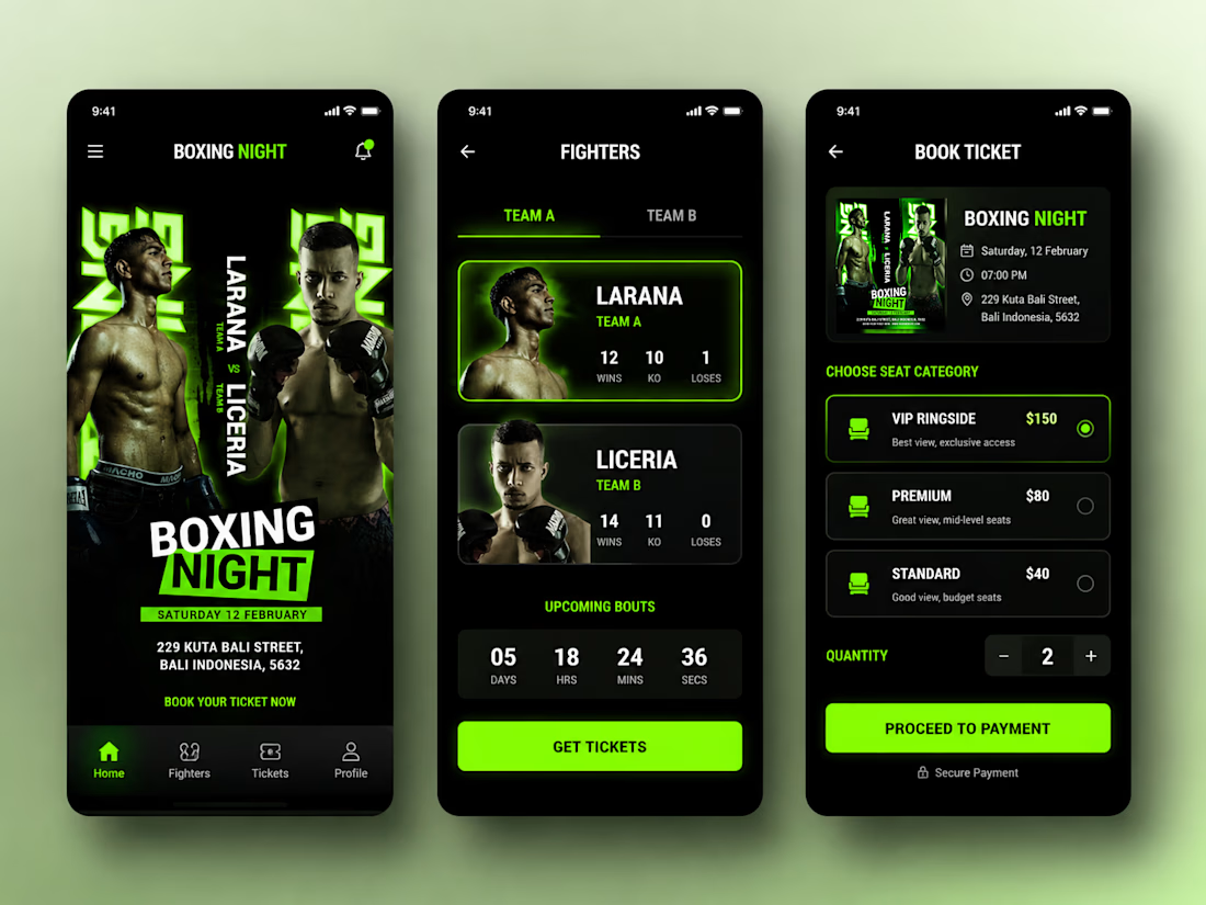
Boxing Night Mobile App UI Design
A bold mobile app concept for a boxing event experience, featuring fighter profiles, bout information, event details, and a seamless ticket booking flow.
The design combines a dark interface with energetic neon-green accents to capture the intensity and atmosphere of a professional boxing night.
Screens Included:
• Boxing Night Home
• Fighter Profiles & Stats
• Ticket Booking
• Seat Selection
• Event Details
Designed in Figma with a focus on modern visual hierarchy, usability, and an engaging sports experience.


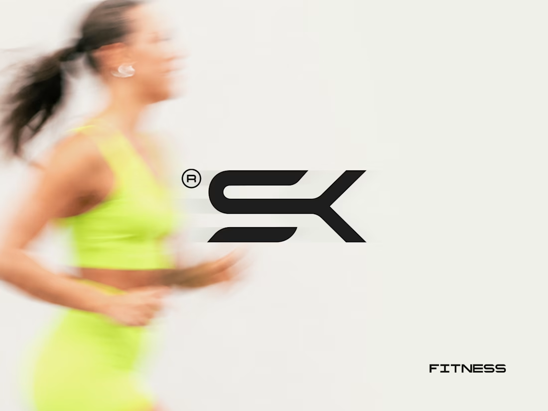
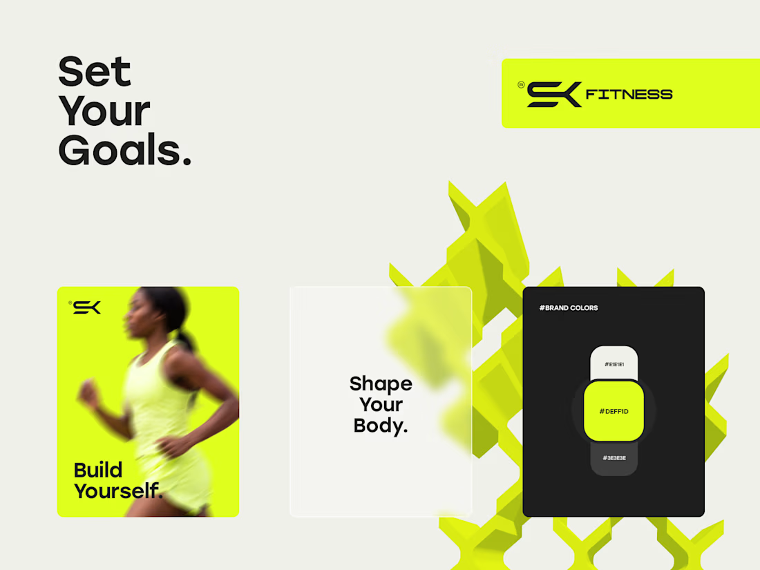
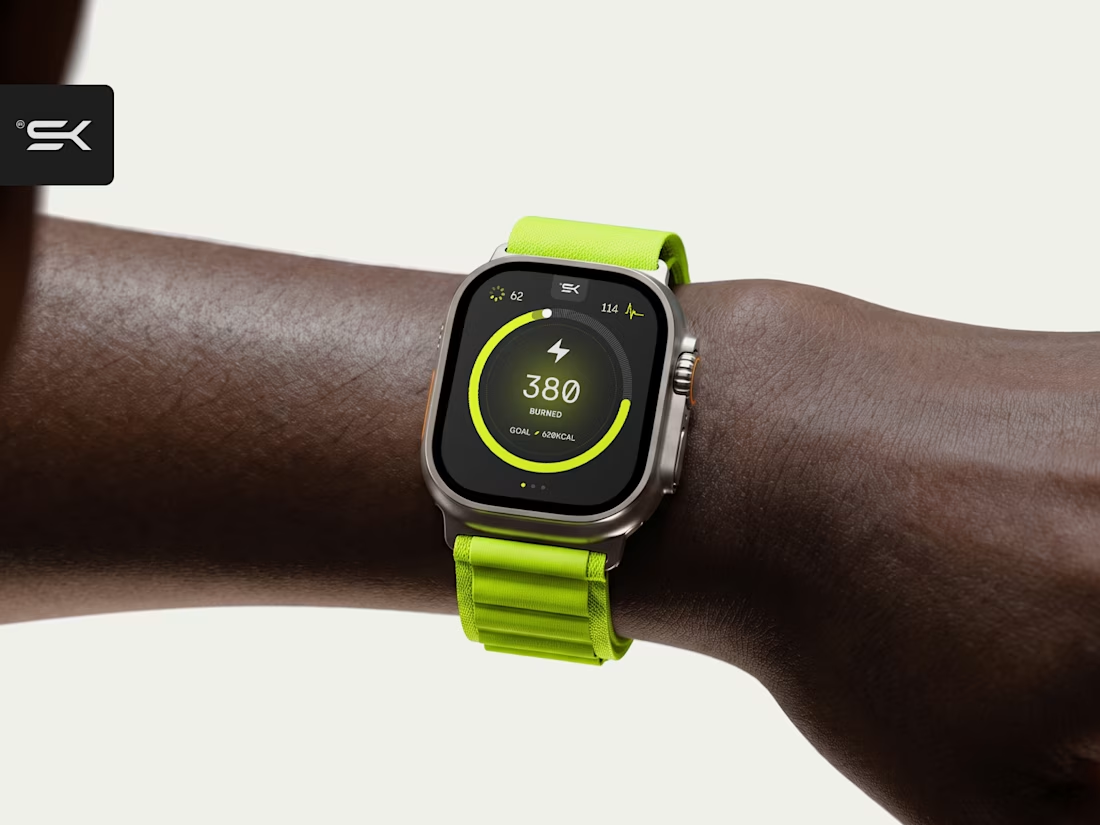
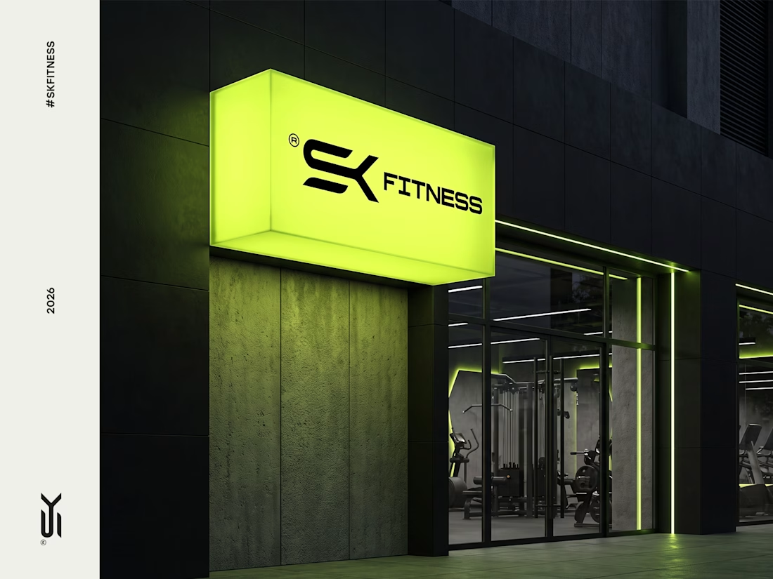
Brand visual identity for SK Fitness, a New York based fitness brand. The goal was to create a bold, modern look that reflects its strong yet health focused approach to building better bodies. We chose a bright green palette to bring energy, confidence, and a fresh edge to the brand.


This is sick, good work mann