The network for creativity
Join 1.25M professional creatives like you
Connect with clients, get discovered, and run your business 100% commission-free
Creatives on Contra have earned over $150M and we are just getting started
Back to feedPost
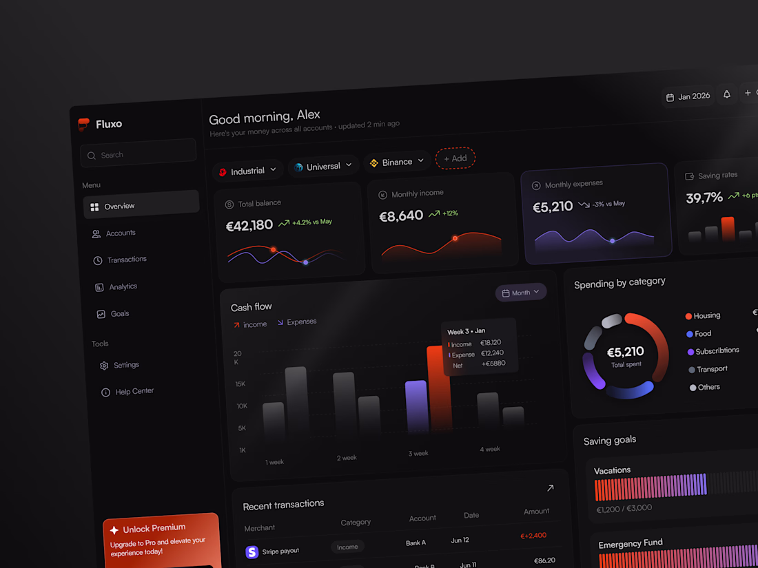
Fluxo | Personal Finance Dashboard 💵
Finance apps are one of the hardest UX challenges in product design.
It's working with stress, numbers, and decisions people actively avoid making. The design has to build trust — creating an app where users feel comfortable enough to hand over their most sensitive numbers.
What I look for in a well-designed money dashboard:
Clarity over completeness — show the 3 numbers that matter, not all 47 Visual hierarchy that guides — your eye should land on the most important data first Emotional tone — dark, clean, premium = I trust this with my money Micro-context — not just €5,210 spent, but -3% vs May tells a story
This Fluxo concept gets a lot right. Cash flow visualization, spending donut, saving goal progress — all scannable in under 5 seconds.
Yes, it's just a concept. But it's built on real interaction logic between a user and a product.
What types of financial products have you worked with? 💰
#FinTech #UXDesign #ProductDesign #UIInspiration #DashboardDesign
Great breakdown. "Clarity over completeness" is the golden rule for dashboards. The high-level metric cards and subtle data comparisons make the interface feel alive and actionable, rather than just a wall of numbers. Looks incredibly clean!
Thank you very much for your feedback 🔥
It means a lot to me 😍
I've worked on a debt recovery dashboard for my product company from scratch to the finished product. It was a real challenge for me, as this is my first commercial experience after my design courses.
your job is inspiring!
Wow! What a brilliant experience! I’m sure it was a huge boost for you as you start out in your career. Well done! Thank you for sharing 😍
Stunning dashboard design! 🖤 The visual hierarchy here is top-notch. You completely nailed the dark, premium tone - it instantly gives a feeling of security and professionalism. The micro-context data points like the monthly trends make a huge difference in UX storytelling. Beautiful and thoughtful concept!
You nailed exactly what I was going for - that balance between premium feel and actual usability. The micro-context was really intentional, because raw numbers without comparison don't tell you anything meaningful 😍
Really appreciate you taking the time to look closely! 🙌 ❤️
Wow, this looks fantastic 🔥 Finance dashboards are one of the toughest UX challenges, and you’ve done an amazing job balancing clarity, usability, and a premium feel. Really impressive work!
Diana, thank you! Your opinion means a great deal to me, as you’re a real expert when it comes to the UX side of the product.
Thank you sooo much 🥹❤️
Excellent work
Thank you 😊
Wow, i like it so much🔥
thank youuu 😍
This is super... everything is well designed and structured
The network for creativity
Join 1.25M professional creatives like you
Connect with clients, get discovered, and run your business 100% commission-free
Creatives on Contra have earned over $150M and we are just getting started
Related posts
I built Interactive Earth History Explorer for the Config Makeathon.
Interactive Earth History Explorer
The web app allows users to travel through Earth's history by scrolling through a timeline and interacting with a 3D globe. Users can explore:
Geological eras and major Earth events
The evolution of life on Earth
Ancient civilizations and historical milestones
Important locations associated with historical events
Multimedia content such as images, animations, and descriptions
—————————
Target Users
Students and educators
History enthusiasts
Parents looking for interactive learning tools
—————————
Traditional methods of learning history and geology are often:
Text-heavy and difficult to visualize
Presented as static timelines that lack interactivity
Disconnected from geographical context
——————————
Solution
The web application provides an immersive and interactive learning experience by combining:
🌍 Interactive 3D Globe, 📅 Scrollable Timeline, 🖼 Rich Content Cards, ✨ Immersive Storytelling
————————
My process: Pen and paper → Figma make → Using Figma make to generate ideas → Prompting it out as perfectly as I can get it to work → Connected to Figma server → Deployed
live site : https://lnkd.in/g7RFUR5t
This is sooo cool man..... is it possible fr me to like check it out i mean the live preview
For the #ConfigMakeathon, I created Book Trace. It is a reading journal app that helps you capture thoughts while you read, and leave a personal trace when you finish.
[Concept]
Book Trace turns the experience of reading into something you can hold onto. Instead of forgetting what a book meant to you, you leave a Trace — one sentence, one emotion, one word. The app also reads what you wrote and tells you what kind of reader you are, with book recommendations matched to your type and genre.
[Project Overview]
For this submission, I designed:
- Onboarding flow;
- Still Reading experience with in-the-moment note capture;
- Finished flow with the full Trace journey;
- Reader Identity system with personalized recommendations;
- Library with saved traces;
- UI Kit and design system.
[Workflow]
I built the full product from concept to prototype in Figma. UI Kit, component library, and interactive flows all in one file.
[My Experience]
What I loved most about this challenge was how it pushed me to think about the full user journey, not just screens, but emotions. Book Trace started as a simple idea and grew into something that feels genuinely personal.
Figma made it possible to move from rough concept to polished prototype without ever leaving the workspace.
Thank you to the Figma team for a challenge that made me build something I actually want to use!
Live project
LinkedIn post
Community link
If this resonates with you, a like, comment goes a long way. Thank you 🙌
Amazing!
Cool
Trending
Claude
Claude has entered the design space. How are you using Claude Design?
Contra University
Learn from expert creatives how to earn more using next-gen AI tools.
MagicPath
The canvas is infinite, and exploration is becoming the workflow. How are you using MagicPath?
creativeaiflow
Creative AI workflows are evolving. What tools do you use, and what are their strengths and weaknesses?
freelancerlife
Freelancer life is wins, pivots, and everything in between. What’s yours right now?