The network for creativity
Join 1.25M professional creatives like you
Connect with clients, get discovered, and run your business 100% commission-free
Creatives on Contra have earned over $150M and we are just getting started
Back to feedPost

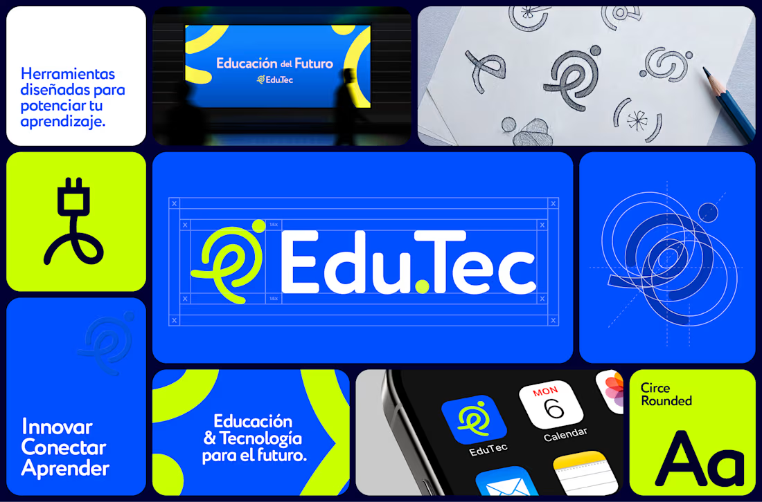
One of my last works in 2025 was a new identity for Edu.Tec
The aim was to build a visual system for a brand without an existing presence in the EdTech sector. I focused on a distinctive mark and a modern visual language, where structured elements convey a sense of reliability and innovation
Explore the full case study Check it out
The network for creativity
Join 1.25M professional creatives like you
Connect with clients, get discovered, and run your business 100% commission-free
Creatives on Contra have earned over $150M and we are just getting started





Related posts

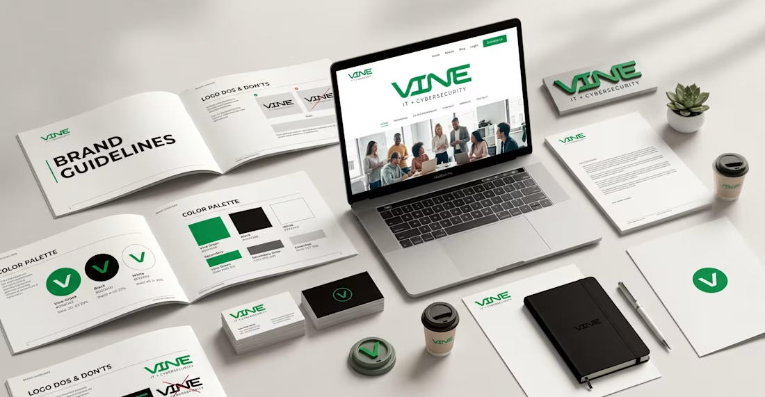
💻 Recent Work | Brand Identity Design for Vine IT
Recently completed a brand identity project for Vine IT, creating a modern and professional visual system designed to reflect the company’s technology-focused identity.
The goal was to develop a cohesive brand presence that feels credible, contemporary, and adaptable across digital platforms, presentations, marketing materials, and other business touchpoints.
I focused on creating consistency across the visual language, with thoughtful attention to typography, color, logo application, graphic elements, and overall brand direction.
Project: Brand Identity Design
Client: Vine IT
Services: Brand Identity • Visual Direction • Typography • Color System • Brand Applications
Another project focused on turning a company’s vision into a clear, consistent visual identity that can grow with the brand.
#BrandIdentity #BrandDesign #VineIT #TechnologyBranding #VisualIdentity #GraphicDesign #Branding #CreativeDesign #LogoDesign #DesignPortfolio

Visual identity in motion. Turning fast casual Mexican street food into an iconic, high-contrast design system.

Riwo: Bicycle Brand Landing Page Design
The Spark
Riwo wanted to stand out in a crowded cycling market where every website looks the same: white backgrounds, endless product grids, and spec sheets nobody reads. They didn't just want a site. They wanted a first impression people would remember.
My Take
I started with one question: what does it feel like to ride? Not the gear, not the numbers, but the moment you lean forward, grip the bars, and focus on the road ahead. That feeling became the whole design direction.
What I Built
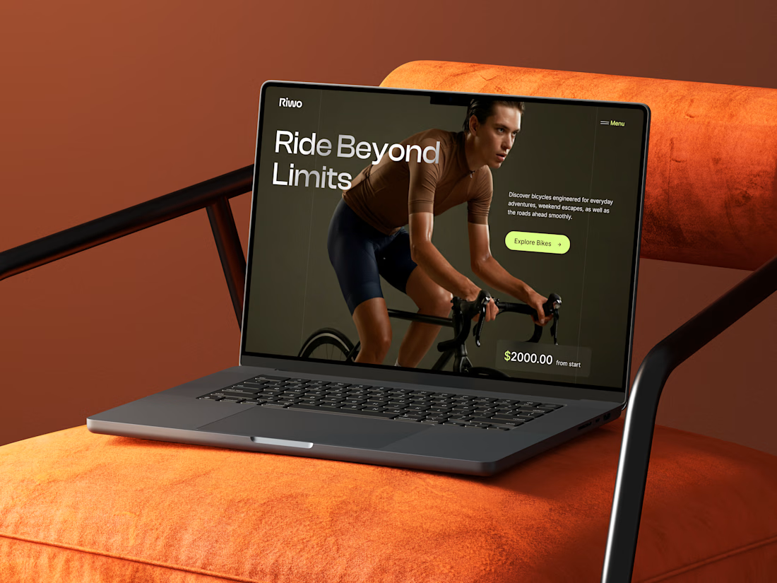
A hero with attitude: The rider's intense, focused expression tells the brand story without a single paragraph.
Warm, grounded colors: Deep olive and earthy brown give the page a premium, editorial feel, far from the typical neon-and-chrome cycling look.
A lime-green spark: One bright accent on the button, menu, and price pulls attention exactly where it matters.
Typography with confidence: The large, clean headline "Ride Beyond Limits" sets the tone: bold, modern, and motivating.
Simple, clear path: One message, one price anchor, one button. No clutter, no confusion.
The Outcome
A landing page that feels premium, moves with energy, and guides visitors straight to the bikes. It gives Riwo a strong visual identity and a hero section that works as both a brand statement and a sales tool.



This design has a really strong sense of rhythm. The spacing between sections and components creates a natural flow that makes the interface easy to follow.