The network for creativity
Join 1.25M professional creatives like you
Connect with clients, get discovered, and run your business 100% commission-free
Creatives on Contra have earned over $150M and we are just getting started
Back to feedPost
Taste Test
1 is cool
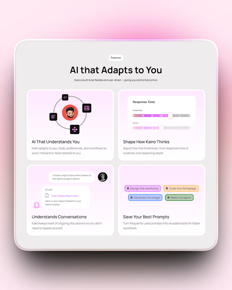
I’d go with Option 2. The layout feels a bit more balanced.
Thank you for the feedback!
Glad it resonated.
Since the layout is exactly the same in both, in your opinion what makes the layout in option 2 feel more balanced?
Refined professional execution 😍
Thank you!
Option 2 for sure. The spacing feels more breathable and polished. The pink gradient glow is a nice touch too!
Thank you Stephanie!
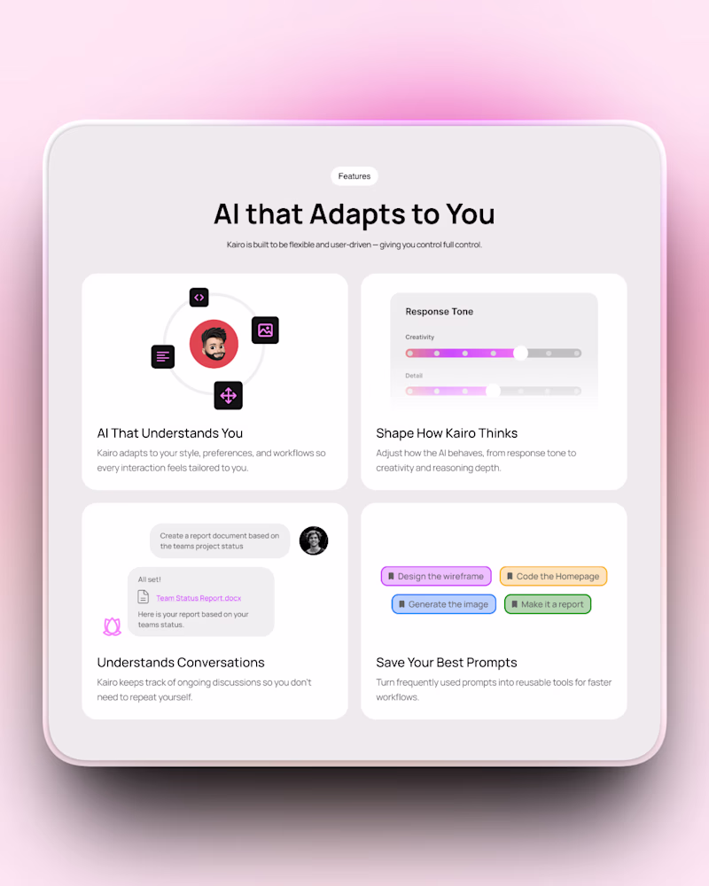
Based on the images, option 1 looks a bit boring while option 2 looks fresh
Thanks for the feedback!
Nice work Tarun! I like Option 1, it feels more balanced.
Thank you Ardian!
Super work
Thank you Koushik!
Option 1 is better with the white background which gives charity and harmony.
Thank you!
Option 2
I like the inner gradient of option two more!
Thank you for the feedback!
😊
Option 2 because i think the gradient is a bit distracting in option 1
Are you talking about option 1? Option 2 is the one with the gradient
option 1
I automatically read it, assuming option 1 is left
option 2 feels so much more polished 🙌 that pink gradient glow and the spacing is just chef's kiss. the AI that adapts to you concept is really well communicated!
Thank you for the feedback Faith!
The network for creativity
Join 1.25M professional creatives like you
Connect with clients, get discovered, and run your business 100% commission-free
Creatives on Contra have earned over $150M and we are just getting started
Related posts
How do you make a landing page feel like a product — not a pitch deck?
For UNUS, we designed a landing page concept built around clean structure and premium visual storytelling.
The core of the experience is a set of 3D animated cards and icons, designed to communicate value instantly — with depth, clarity, and a strong product feel.
Instead of overloading the page with text, we used motion and hierarchy to guide attention naturally: sharp sections, controlled spacing, and visuals that actually support the message.
Built to feel modern, confident, and conversion-ready.
Created via our design subscription.
FANCY is currently available for new projects.
I am really loving this.
Elevating branding, web design and development for Stormi Capital – a music distribution platform empowering independent labels, distributors, and professional artists who want to operate at the highest level without surrendering their rights or control.
Built with Framer and great songs in the background.
Harmonious and high-impact.
Trending
FLORA
Reusable workflows are replacing one-off prompts in creative AI. Share what you're building in FLORA.
Contra University
Learn from expert creatives how to earn more using next-gen AI tools.
creativeaiflow
Creative AI workflows are evolving. What tools do you use, and what are their strengths and weaknesses?
portfolioreview
The best portfolios tell a story, not just show a grid. Share yours for feedback.
freelancerlife
Freelancer life is wins, pivots, and everything in between. What’s yours right now?