The network for creativity
Join 1.25M professional creatives like you
Connect with clients, get discovered, and run your business 100% commission-free
Creatives on Contra have earned over $150M and we are just getting started
Back to feedPost
Taste Test


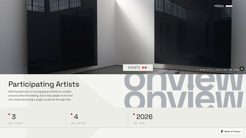
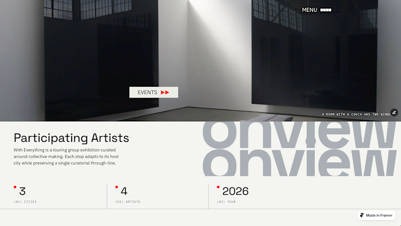
I have been experimenting with this layout for an art exhibition website. Out of around 10 versions I'm down to these two.
I nee to add a logo and I will most likely change the menu icon.
I quite like the rest tho may change the title font too.
What do you like and what would you change?

4 votes
Ends in 1d

Looks great especially Option 2. A quick piece of feedback on the EVENTS button its current spot right on the edge of the image feels a bit off center. Moving it entirely into the text area might give the whole page a tighter structure.
Thanks for the feedback. Im not happy with the button position. Can't decide if it looks too cramped.
The network for creativity
Join 1.25M professional creatives like you
Connect with clients, get discovered, and run your business 100% commission-free
Creatives on Contra have earned over $150M and we are just getting started
Related posts


Two homepage concepts for film production studio - which one do you choose? 🧐


38 voted
57%
29 voted
43%
67 votes
Closed


amazing!


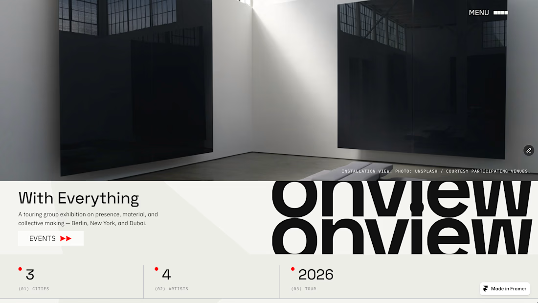
For the next Framer template release, I’m trying something new.
Alongside the template, I’ll give away a Codex / Claude prompt that helps you rebuild the homepage direction and adapt it for your own project.
To get it, support the template on its Framer Marketplace page: like it there and leave a real comment with what you’d adapt it for.
Then I’ll send the prompt after launch.
Dropping tomorrow.
This is one-shot btw ↓

This is nice!

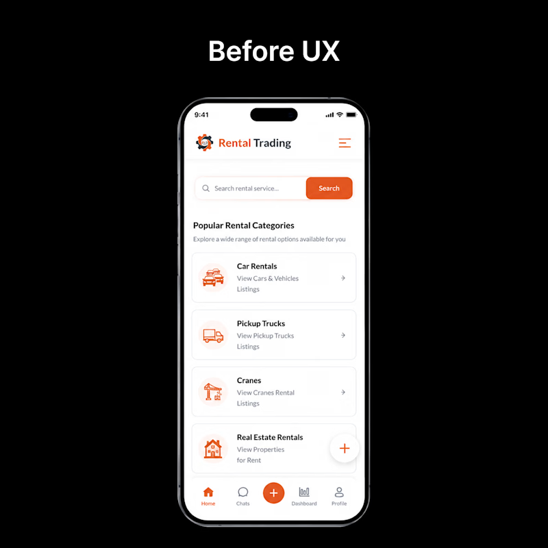
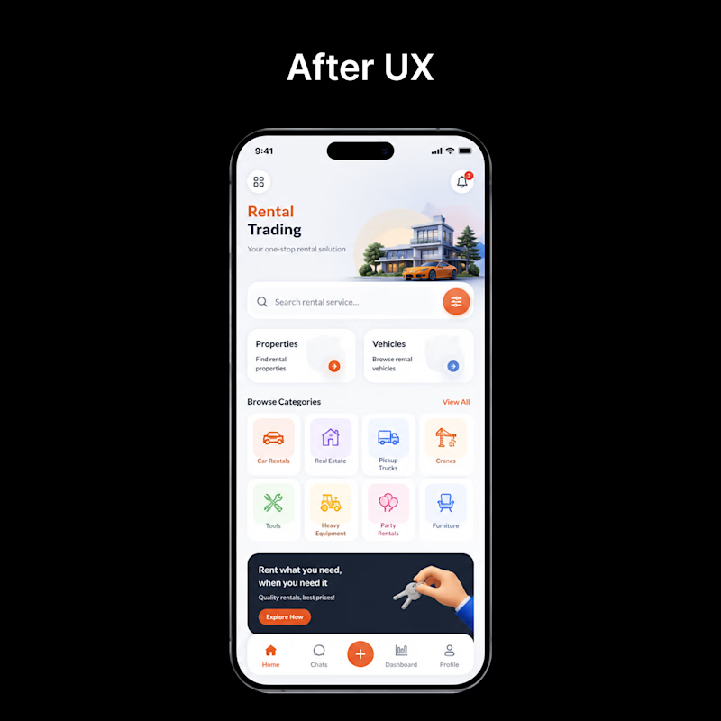
👀 Before vs After — Which UI would you choose?
Every redesign is more than just a visual upgrade—it's about creating a smoother, faster, and more intuitive experience.
🅰️ Before: Functional, but cluttered and harder to navigate.
🅱️ After: Cleaner layout, improved hierarchy, better usability, and a modern visual style.
If you were using this app for the first time, which version would you prefer?
👇 Vote in the comments:
❤️ BEFORE or 🔥 AFTER
1 voted
4%
24 voted
96%
25 votes
Closed

Pure design bliss.






Trending

Claude
Claude has entered the design space. How are you using Claude Design?

Contra University
Learn from expert creatives how to earn more using next-gen AI tools.
fifaworldcup2026
The World Cup is here and the whole world's watching. How are you designing for the world stage?
creativeaiflow
Creative AI workflows are evolving. What tools do you use, and what are their strengths and weaknesses?
freelancerlife
Freelancer life is wins, pivots, and everything in between. What’s yours right now?